COPIC AWARD 2021:
First Round Results Announced!
We are delighted to announce the COPIC AWARD 2021 winners. The fourth year of the AWARD has received more than 5,000 wonderful entries, far more than last year. Thank you to everyone who participated in the COPIC AWARD 2021.
Winners
Grand Prize

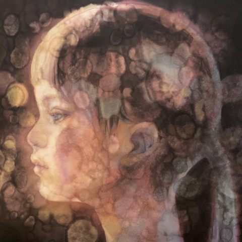
-

V12
Pale Lilac -

E51
Milky White -

B60
Pale Blue Gray
Second place

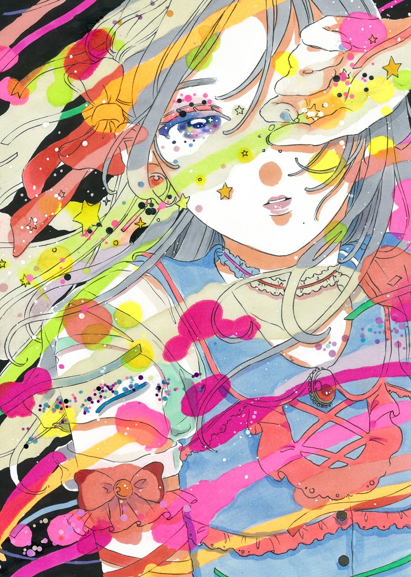
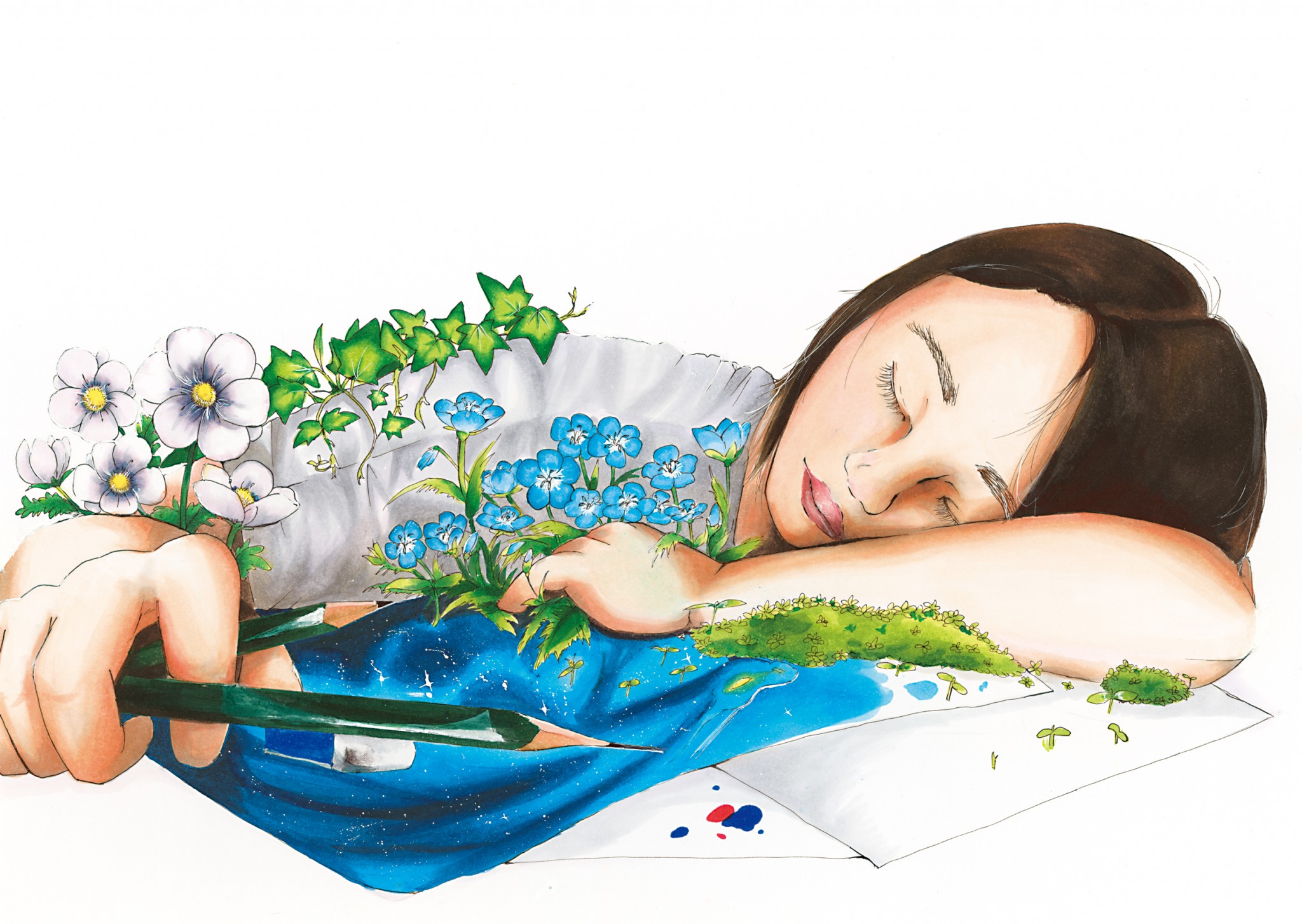
I was mesmerized by this piece at first glance. The picture captures the fleeting glow, the atmosphere, and even the emotions of the person staring at this character. The experimental technique is also effective in creating the world of this artwork.
(Yabumae)
While many of the entries have stable compositions, the artist captures a moment of movement. That is very impressive.
I'm curious to know why the artist focused on this moment. The artist purposely disrupts the picture and layers the details to bring the whole thing together just before it gets completely collapsed.
(Matsushita)
Second place

-

RV02
Sugared Almond Pink -

RV17
Deep Magenta -

RV25
Dog Rose Flower
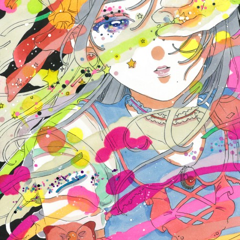
I thought that piece was filled with the primal joys of ingenuity, showing the pure delight of drawing or the fun of playing with stickers. It inspired me by making me remember the fun I had in my childhood - The happy feeling when I tried ink spattering, filled an entire paper with one color, and so on. That piece reminded me of the joy of creating art.
(Harada)
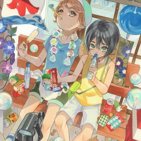
This artwork is brimming with freedom! As the title suggests ("WE ARE PINK!"), this illustration has the power to make everyone who sees it smile by depicting their favorite things in their favorite color, pink. It's also interesting that even the judges, who have been using Copic markers for years, can't figure out how the artist made this piece.
(Nezu)
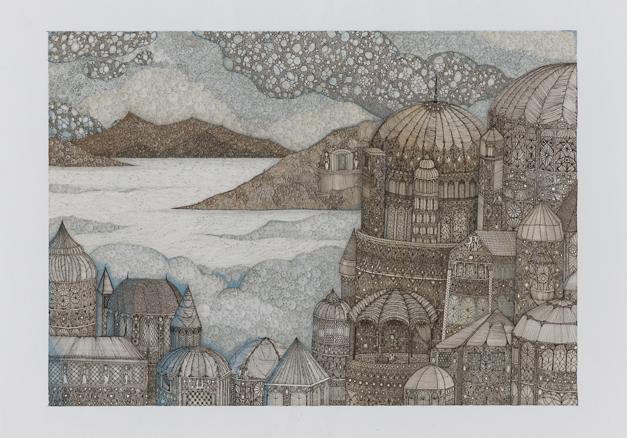
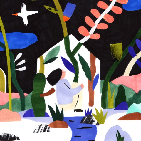
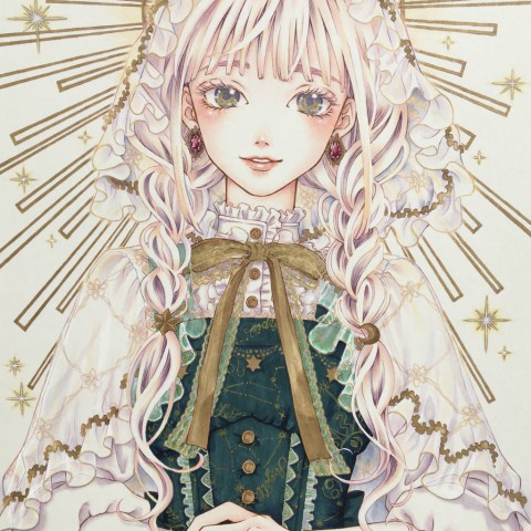
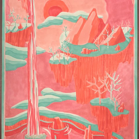
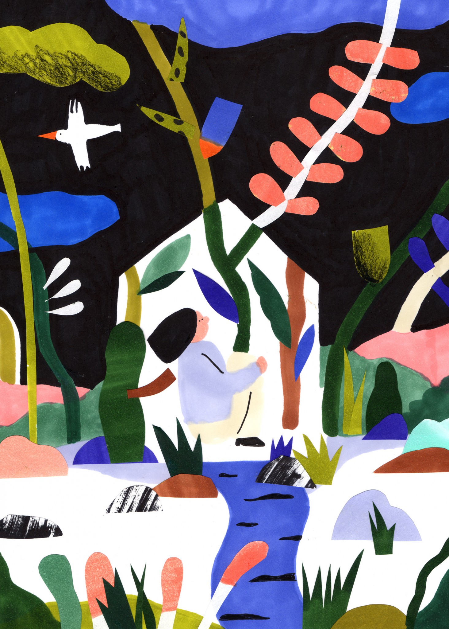
Future Generation Art Prize(Youth Award): Grand Prize
-

B32
Pale Blue -

W3
Warm Gray No.3 -
E51
Milky White
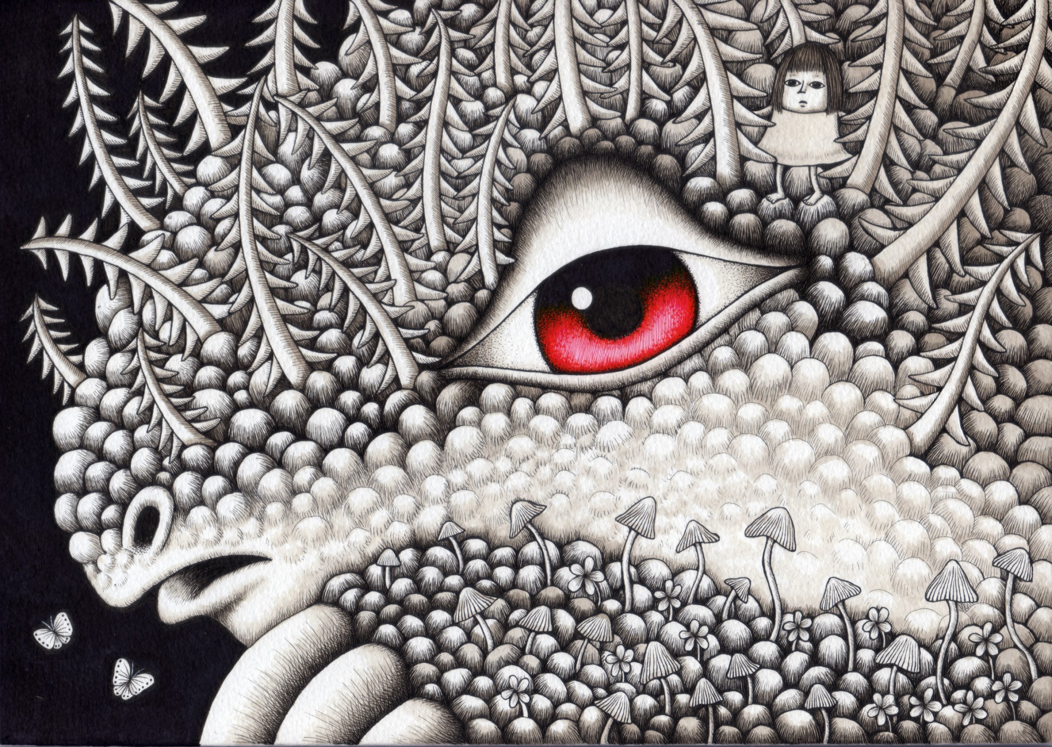
Although this is a quiet landscape painting expressed with precise lines and subtle color changes, it also has the power to make you imagine the story of each person depicted. I can strongly feel the artist's passion in this work.
(Nezu)
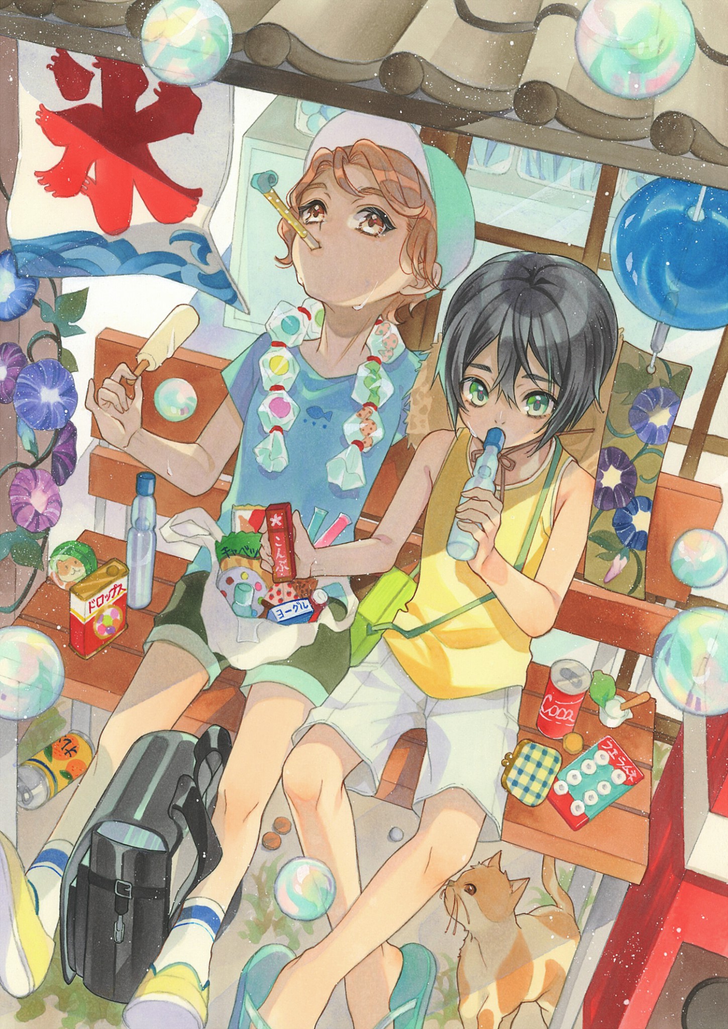
Judges' Awards selected by Oh! great
-

BG11
Moon White -

R24
Prawn -

E40
Brick White
I like the mood of the whole artwork. The artwork gives you a feeling that only sunny summer days can provide, and the way light is reflecting and shining in the artwork. Just by looking at the reflections of the light, memories of the past come back to me, making me emotional. I think many Copic users draw comics and illustrations. One of the many reasons I chose this piece is that this artwork felt the most representative of this field.
Judges' Awards selected by Kota Nezu

-

R02
Rose Salmon -

YG11
Mignonette -

BG15
Aqua
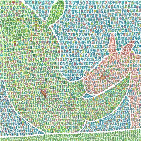
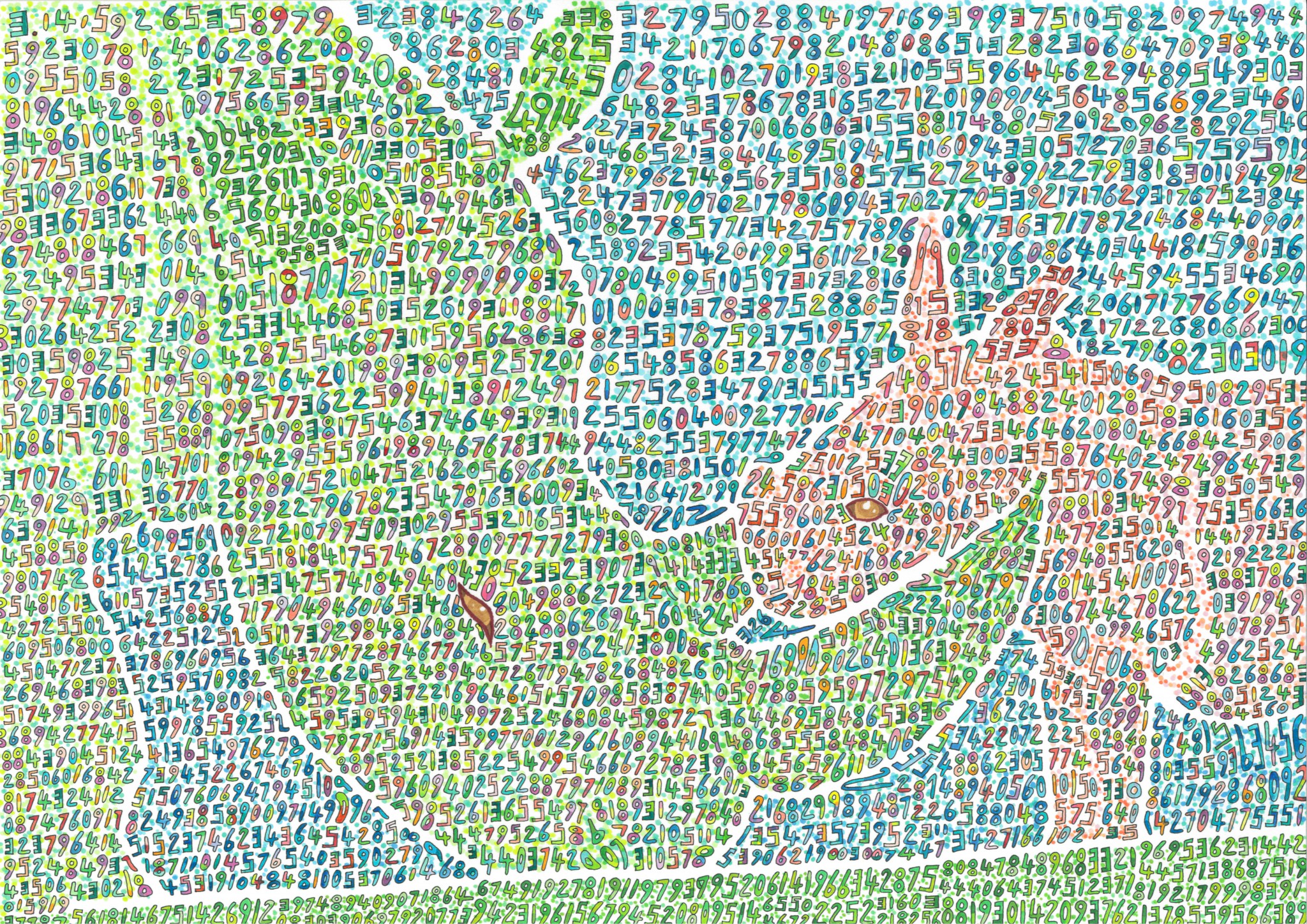
I thought it was a really interesting piece. After reading the artist's comments, I learned that it was a work about so-called "synesthesia" (a neurological condition in which characters and numbers appear to be colored). The artist has taken that worldview and turned it into a work of art.
The motivation for drawing this artwork was like, "even if my world looks different from other people, that's okay. I think it is beautiful, and I want everyone to know that kind of world."
I think this is a very lovely work, including that background. That is the reason why I selected this artwork.
Judges' Awards selected by Chiaki Harada

-

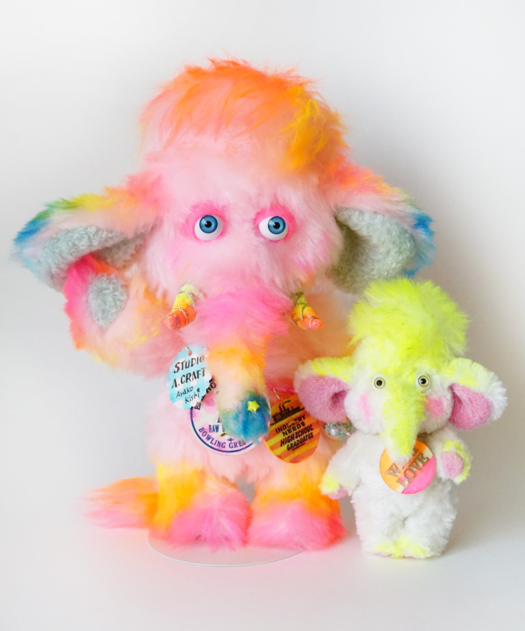
FRV1
Fluorescent Pink -

FYR1
Fluorescent Orange -

FYG1
Fluorescent Yellow
I wanted to see three-dimensional artworks made using Copic. Among them, this one had a strong concept. I chose this piece because it had a proper set of characters (a cute mammoth family), which I found very interesting. I also like colorful things. This work is happy and colorful, so it caught my eye.
Judges' Awards selected by Kei Matsushita
-

G16
Malachite -

R08
Vermilion -

E31
Brick Beige
While many entries incorporate intricate works and details into a single work, this piece had a completely different approach. So, I chose this work as a judge's prize in the sense of casting a vote for its potential.
I think this was the only work that took the approach of using Copic change the character of the medium of paper. I think the approach of using Copic to dye paper and draw on it was presented as one of the new ways to use Copic.
Judges' Awards selected by Tomoko Yabuma
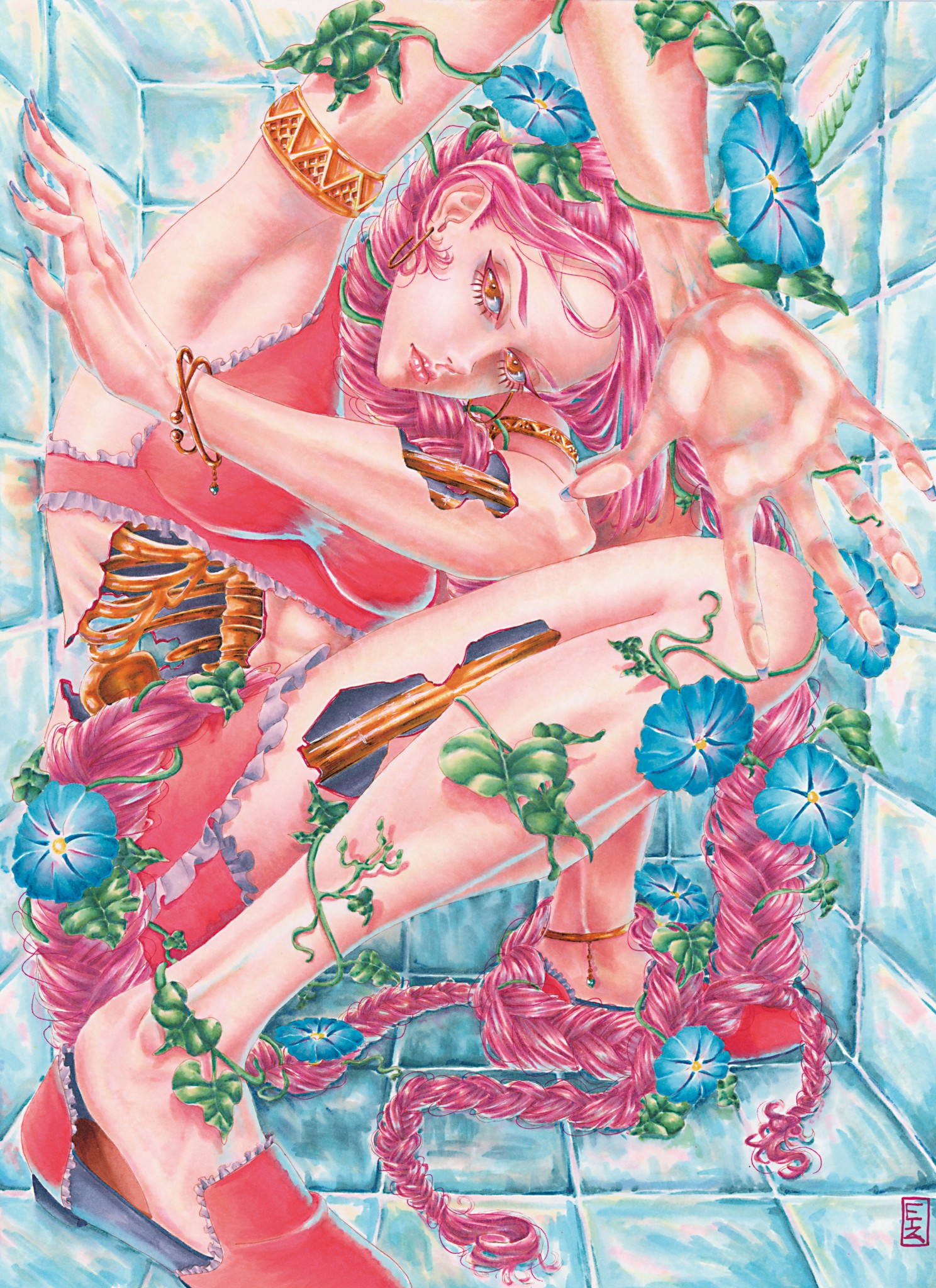
-

RV10
Pale Pink -

YR30
Macadamia nut -

BG000
Pale Aqua
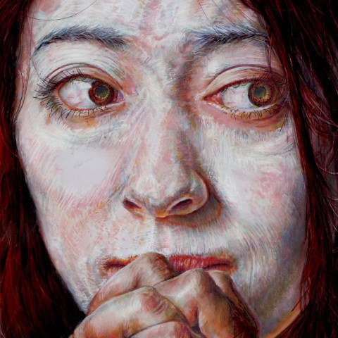
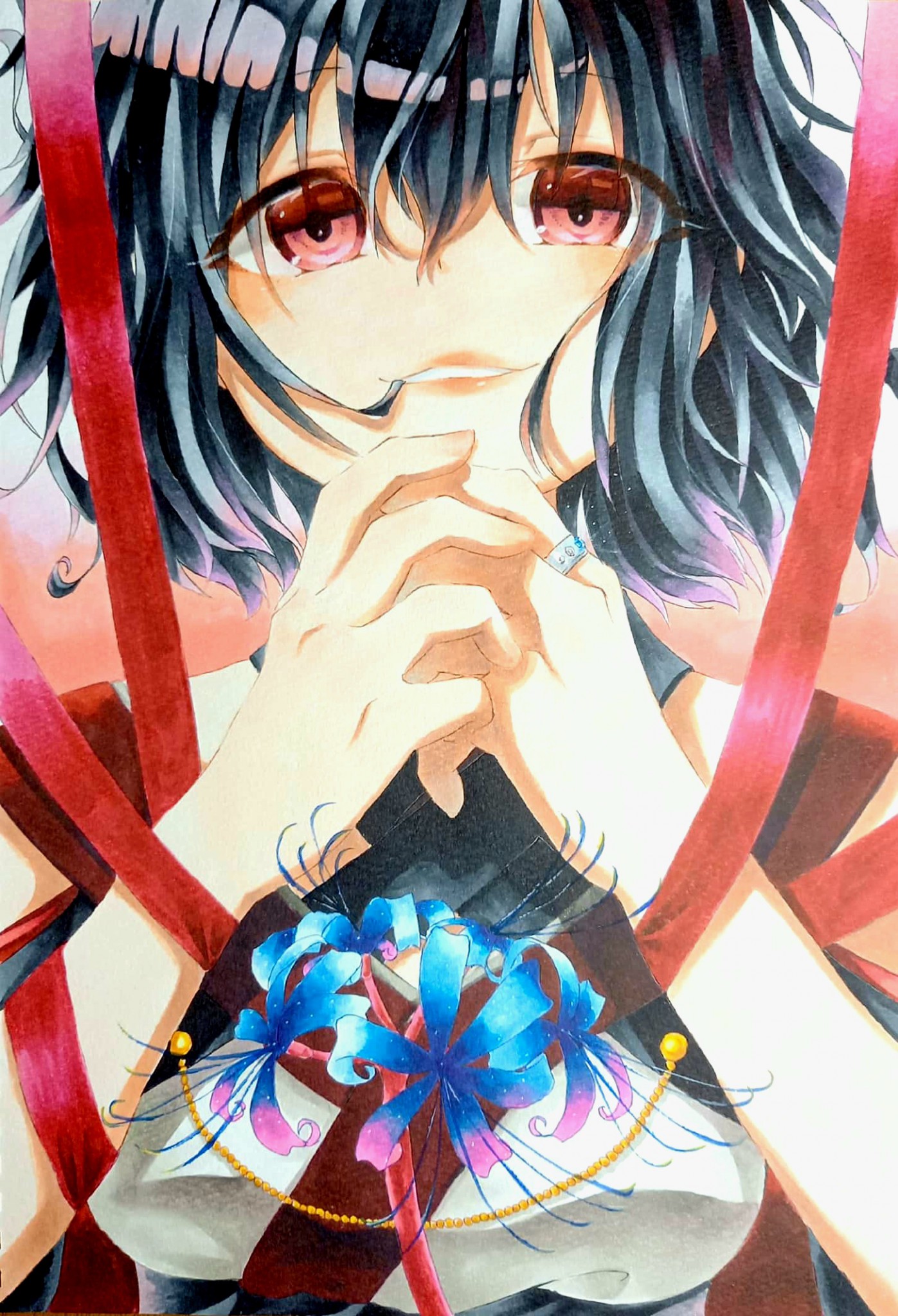
I felt that this was a unique work among the entries because the character seemed to have a strong will. My first impression was that she was only being looked at by us one-sidedly, but the power of a woman looking back at us with a strong gaze conveyed a message. Of course the work itself is very powerful, but I selected it for the Judges' Prize because I could feel the artist's thoughts and feelings through the picture, even though I was judging from a distance.
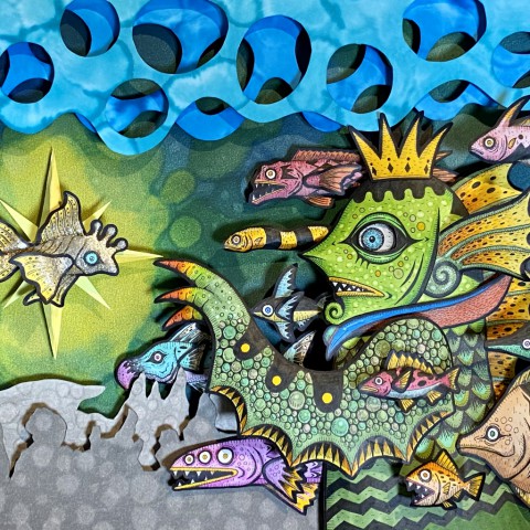
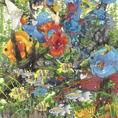
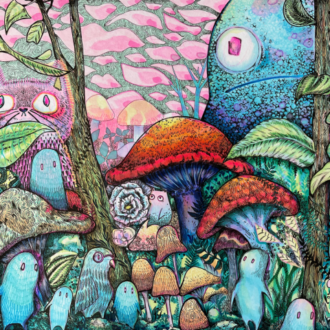
pixiv Award

-
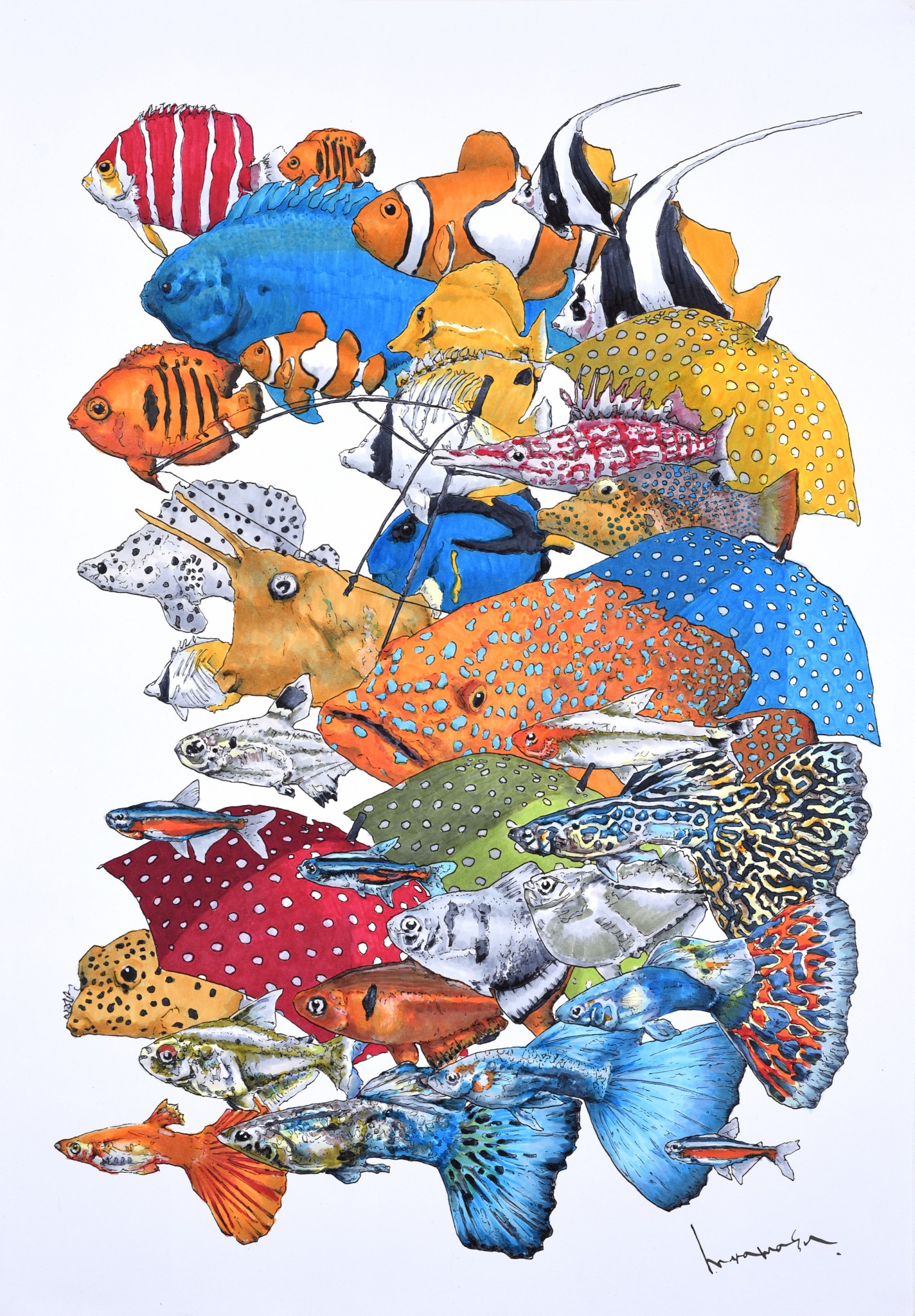
YG03
Yellow Green -

E71
Champagne -

T5
Toner Gray No.5
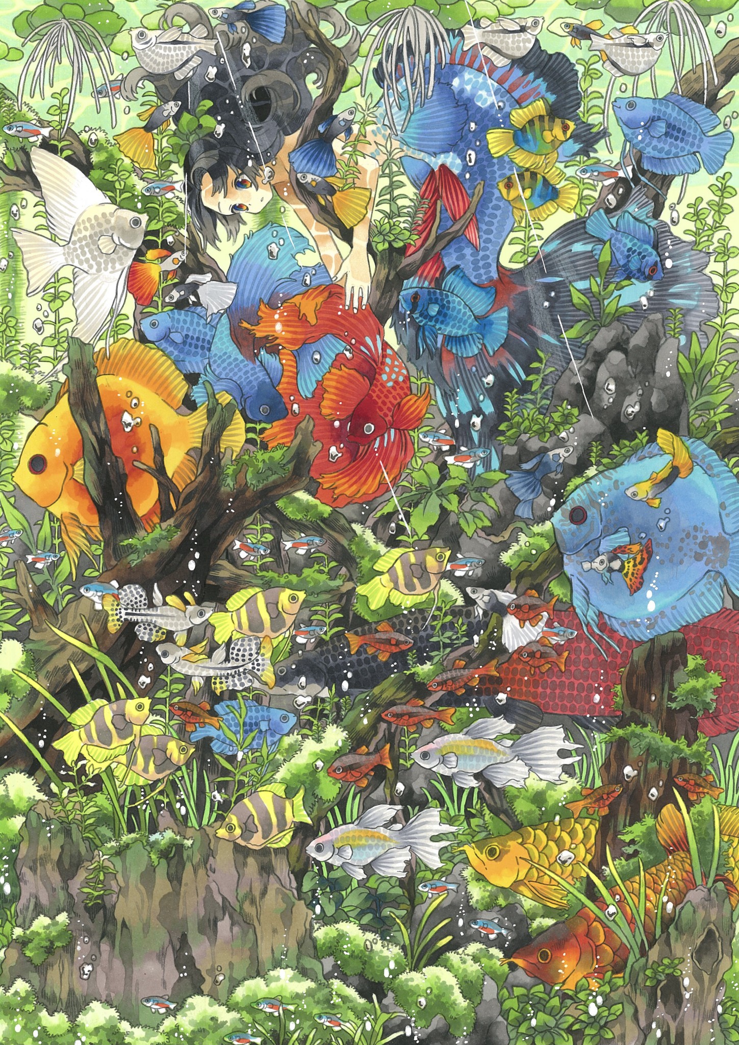
There are many elements and colors utilized in this work, and while it is difficult to achieve a balance in composition, the elements are portrayed with meticulous accuracy. If you look at this illustration closely, you can see a cute character peeking out from the school of fish. Thanks to its lovely composition, this piece has discoveries for both the audiences who see it from a distance and up close. I selected this piece for the pixiv Award because even though it is in the water, I could feel a sense of warmth in this beautiful artwork.
Social Media Award
-

B99
Agate -

B45
Smoky Blue -
BG78
Bronze
The artist's technique of enjoying the accidental nature of alcohol ink art, controlling it, and expressing it accurately, is sprinkled throughout this wonderful piece. The use of four different ink tones to depict the waves displays the majesty and transparency of the sea. The spattered effect creates a sense of realism and transmits the strength of nature, making the viewer feel as if they were in the midst of the waves.
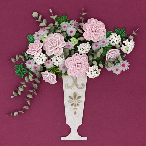
Craft Award selected by Japan Hobby Association

-

RV000
Pale Purple -

V0000
Rose Quartz -

V000
Pale Heath
The beauty of the overall composition and the sense of balance caught my eyes.
I also thought the exquisite shading technique of the rose flowers and leaves was spectacular.
Every time I looked at every corner of the work, I was moved by the artist's thoughts, and it made me feel as if I was working with them. The more I look at this artwork, the more I feel its gentle warmth, making my heart light up. I would never get tired of looking at it.
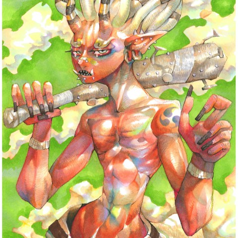
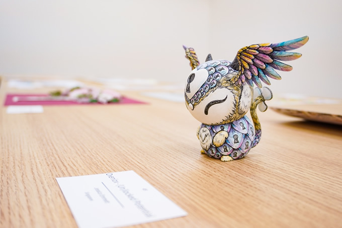
Craft Award selected by Too Corporation Americas

-

Y00
Barium Yellow -

BG02
New Blue -

BV01
Viola
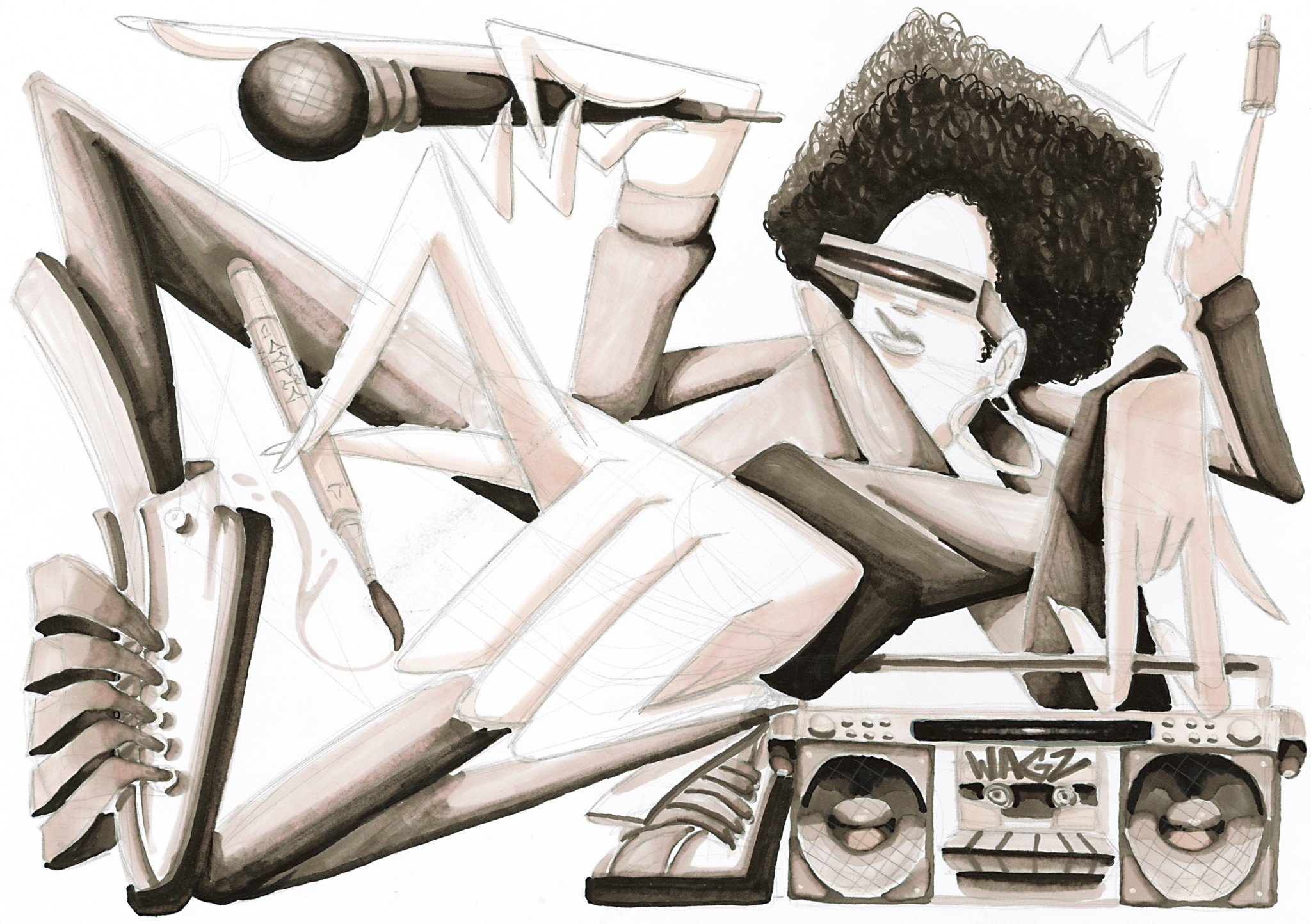
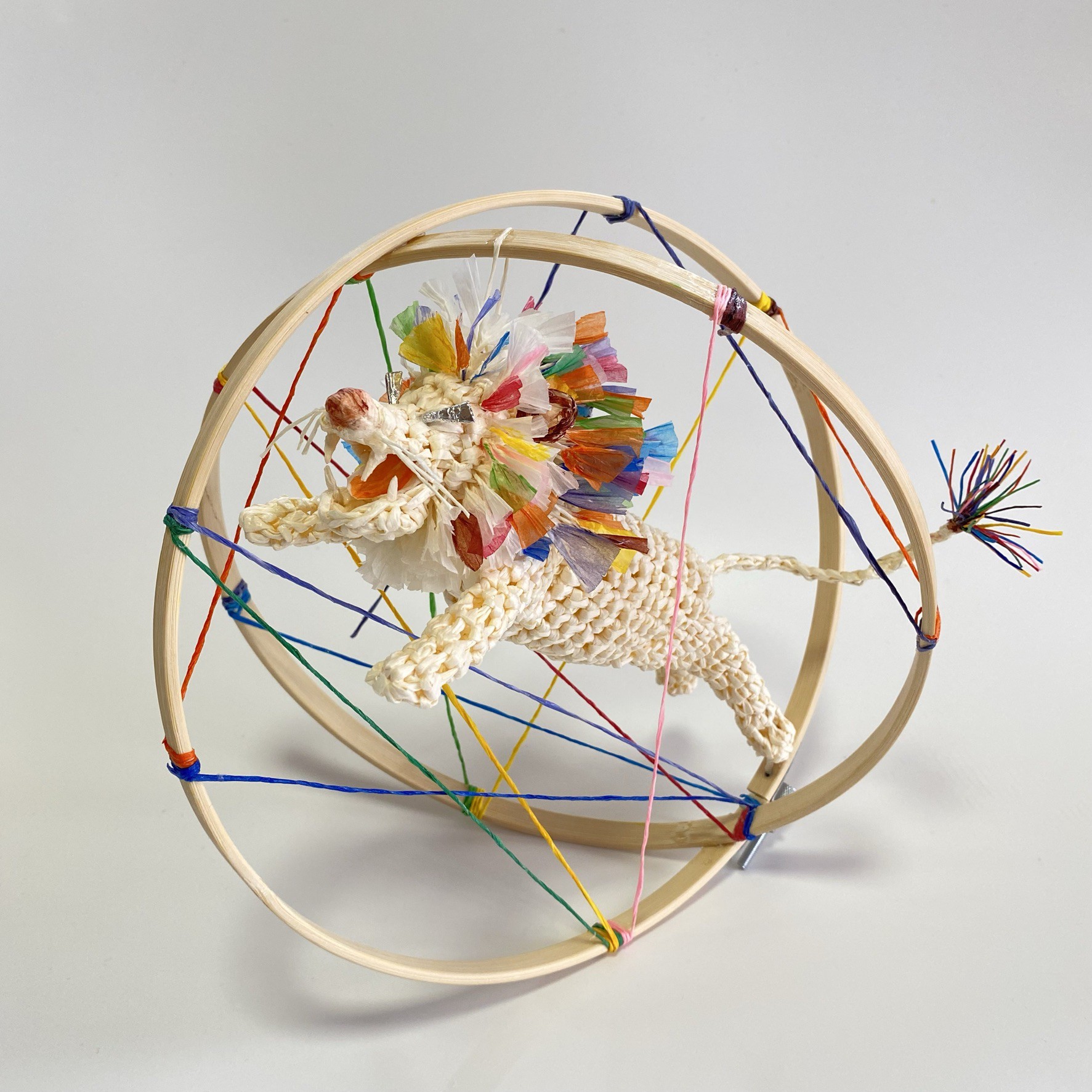
What sets Emmett's piece apart from the others is how well it's executed, how original the concept is, and how sculptural it is.
she created a completely new animal with a story behind its conception.
This is truly a three-dimensional piece of art, and I found myself wanting to see all sides of this piece, not just the front. What also impresses me about Emmett's work is how well she used the multiliner pens to create depth. The feathers on the wings capture a true bird-like whispiness to them, as well as the fur patches on the creature's chest, arms, feet and ears.
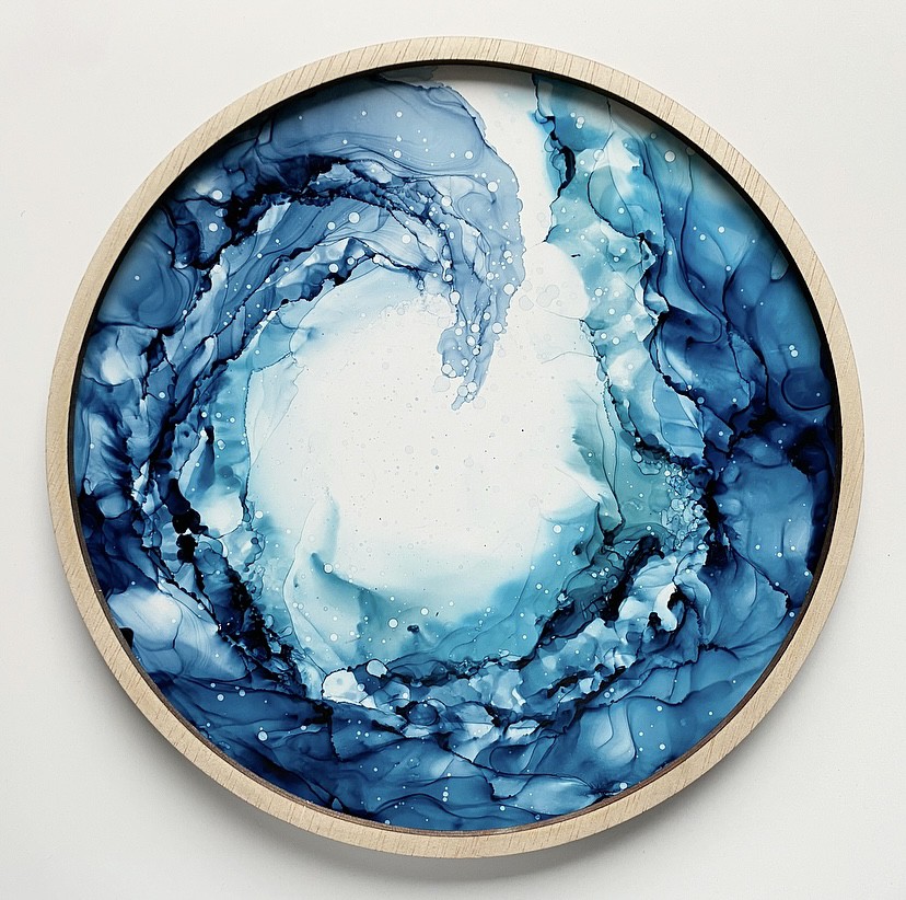
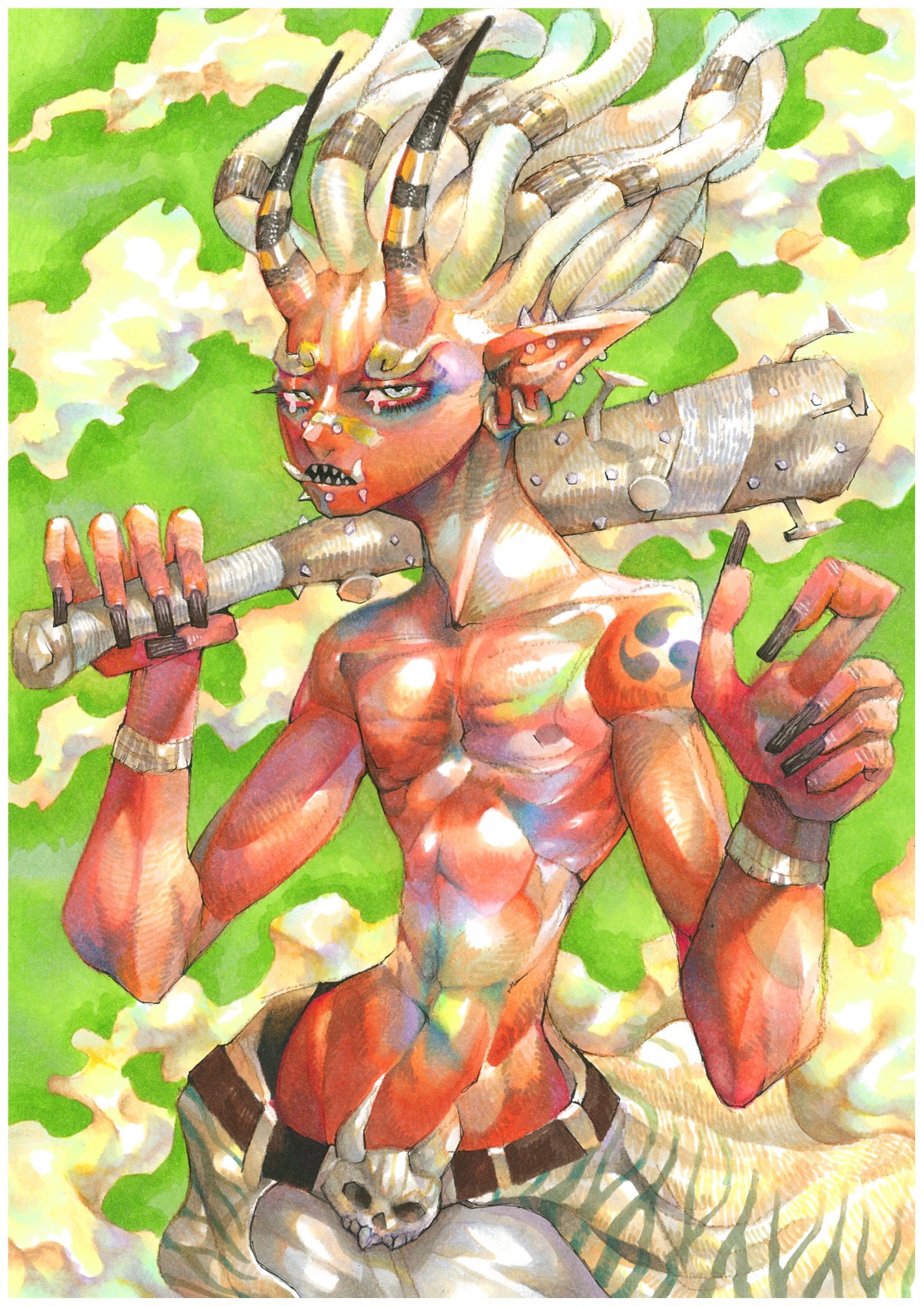
Special Award selected by Holly Nichols
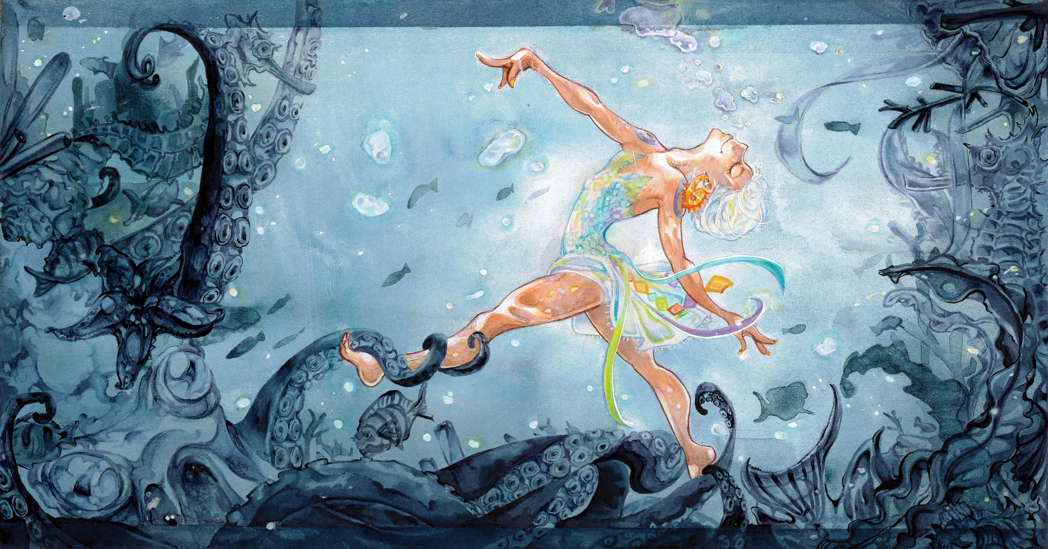
-

BV20
Dull Lavender -

BV23
Grayish Lavender -

BV29
Slate
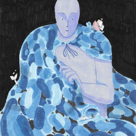
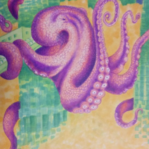
There are so many reasons why I selected this piece. It really stood out to me; I think the number one is the glow they have created within the subject. There is a center, this dancer in front of this glowing background, they apparently in underwater and the dancer’s leg is being intertwined with the octopus. It looks like there’s stillness joy as dance and the beautiful extension and they’re just free and moving, and they have a giant smile on her face, around them there is darkening yet and though the scenery is bringing joy, these warm color, deep kind of oblivious attitude around them and they seem completely unfazed by it. I really like this contrast, not only of color lights and dark but also in the subject, of the joy and the centers around by this unknowing landscape around them so I am very proud of this piece, such a wonderful discovery for me to see and I’m so inspired by your work, congratulations.
Regional Awards: APAC
-

FY1
Fluorescent Yellow Orange -

FV2
Fluorescent Dull Violet -

YR02
Light Orange
This piece is an excellent example of Copic markers quirks. The skilled gradation of colors and the expression of light and shade shows the artist's ability to create profound descriptions and imagination. The warm yellow tones and the contrasting purple shades create a dramatic mood, and we felt that the artist was expressing the theme of this work through these tones and the bright yellow.
(TAIWAN/AHT)
There are many outstanding features especially the use of light and shadow to create a sense of whimsical realism. There is extraordinary detail in the hair and facial features. A very talented artist who is clearly able to enhance her artwork through her skill and use of Copic.
(Australia/X-Press Graph-X)
Regional Awards: EME
-

W5
Warm Gray No.5 -

C3
Cool Gray No.3 -

E35
Chamois
Blending is very good. The picture is very detailed. Lightning and shadows are amazing. The theme of the picture is also interesting - meeting point of the past and the future, the role of new technologies, nostalgia for old times etc.
(Azerbaijan/Ecaz)
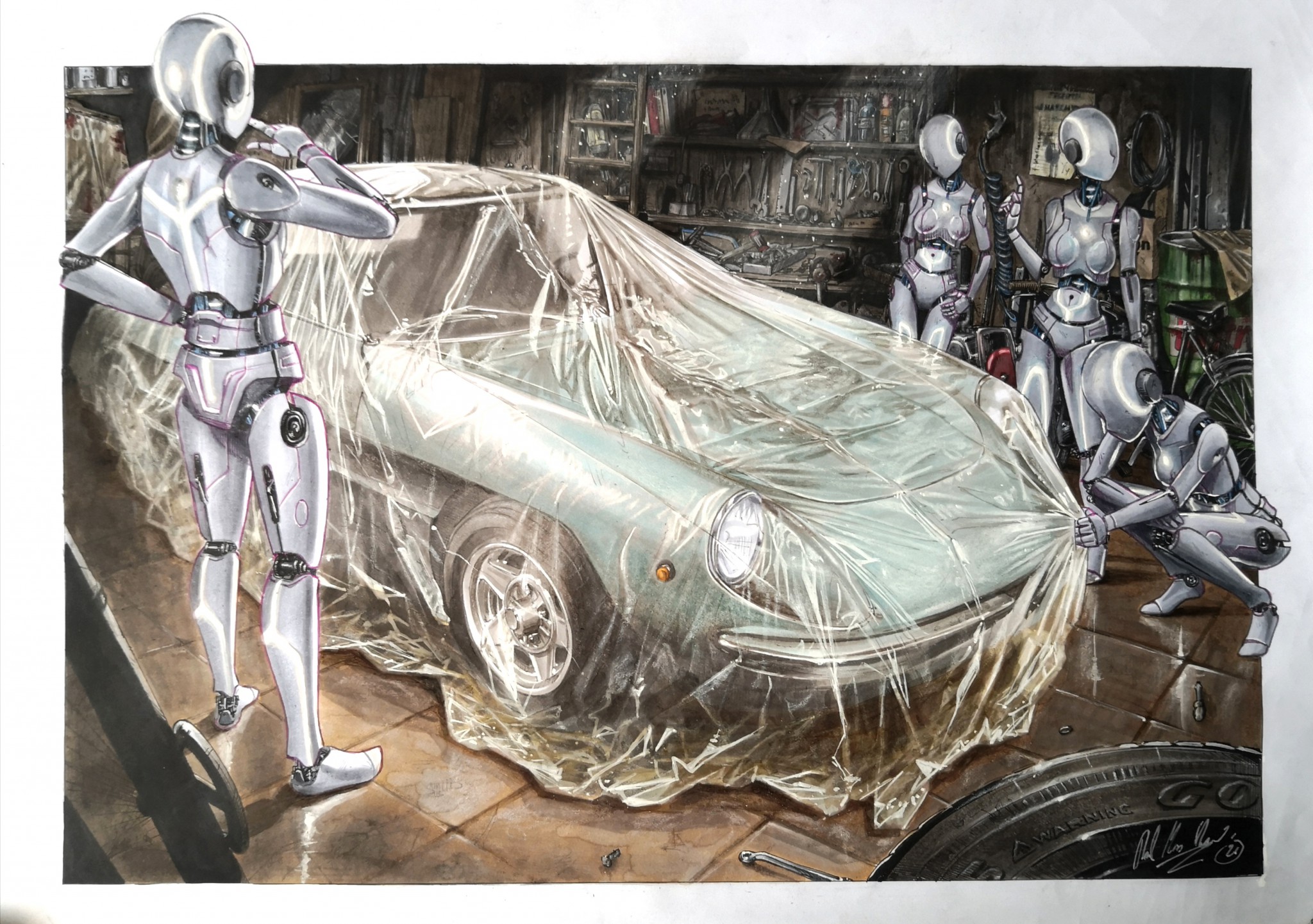
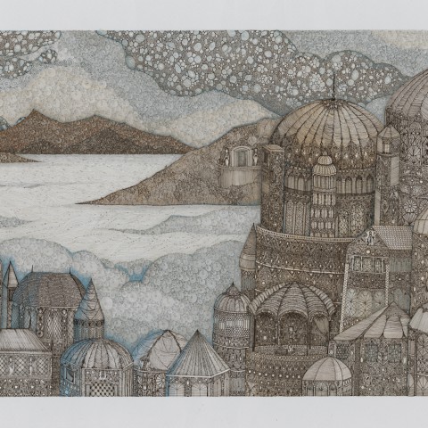
Connecting the Past and the Future.
In a distant future, robots discover an artwork of Italian design. The message passes through a masterful attention to detail and nuances. The effect of the cloth over the car is even more difficult to achieve because it changes the volume and the original color of the object. Truly a work that combines the concept with a great imagination and technique!
(Italy/ Mundel srl)
Regional Awards: NA

-

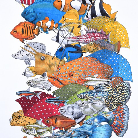
B00
Frost Blue -

G09
Veronese Green -

T6
Toner Gray No.6
The attention to detail in not only the crocodile, but also the fish and the water are outstanding. It’s very difficult to create a composition with that much detail where each of the objects still stands out on their own.
In addition, the variety of coloring techniques Ms. Robinson executed in this piece made it stand out to me among the rest. There is very smooth blending in not only the water/background but throughout the entire piece, there is the use of a Opaque White in the water to create an extra level of depth in showing light reflection, and there is great additional texture made with stippling on both the croc and the fish.
(US/Too Corporation Americas)
Regional Awards: LATAM
-
BG000
Pale Aqua -
B00
Frost Blue -

110
Special Black
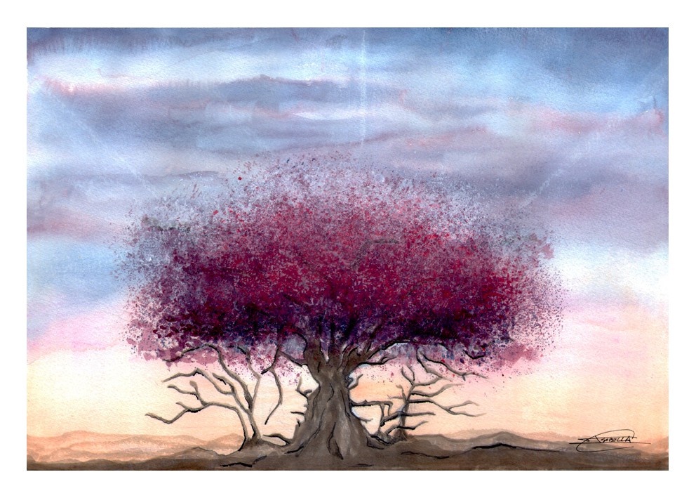
The technique used reflects how the jacaranda is. This tree is typical of Argentina and the most striking thing is the color. The artist managed to translate the strength of the colors of the jacaranda in his work. A truly beauty.
(Argentina/Drechsler)
Regional Awards: Africa
-

C00
Cool Gray No.00 -
C3
Cool Gray No.3 -

C9
Cool Gray No.9
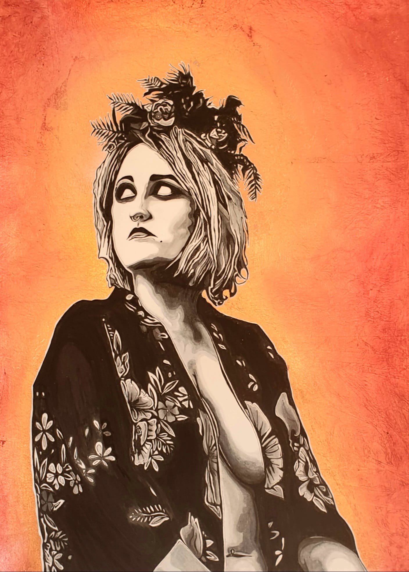
We love the contrast between the eye-catching, gold background and the subdued grey tones of the lady. The detail in the lady's dress is also exceptionally rendered. This is a really beautiful piece, reflecting some real talent.
(South Africa/X-Press Graph-X Supplies)
Finalists
-
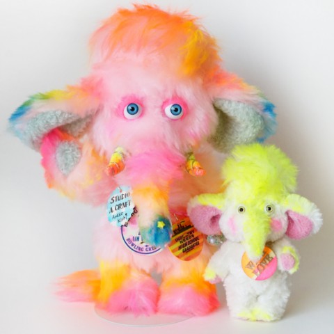
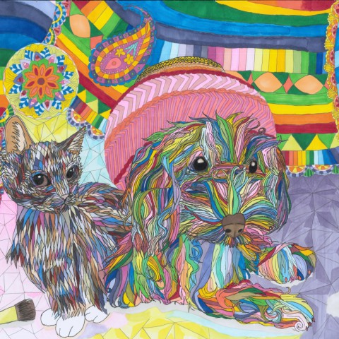
- Colorful rainbow mammoth
- きしあやこ(Japan)
-


-
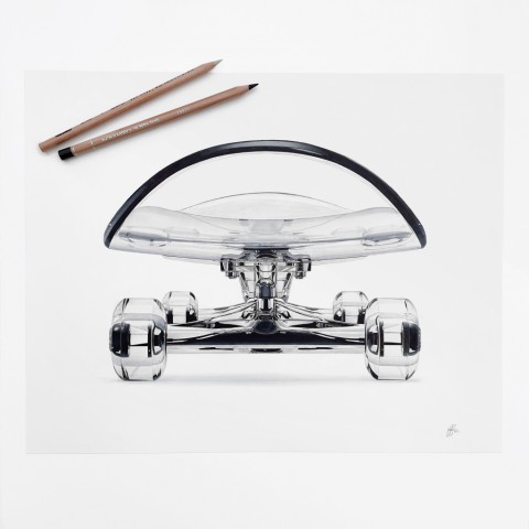
- Glass Skateboard
- Patrick Christian(United States of America)
-
-
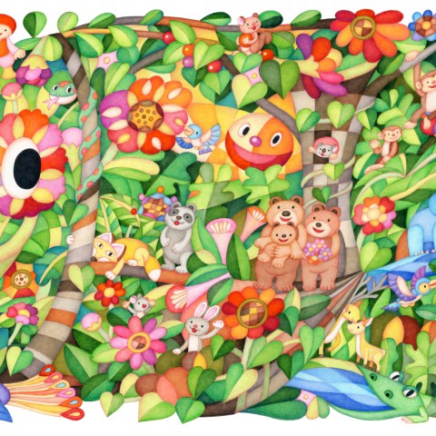
- パラダイス
- 岡 直(Japan)
-
- サカナ、微カナ傘
- ムラマスカツユキ(Japan)
-
-
- dream
- beal(France)
-
-
- HOLY FISH
- ニシカワアイ(Japan)
-
-
- Into the Wild
- Carolina Wagner Fragomeni(Brazil)
-
- 鬼は泣かぬ
- スモサモ(Japan)
-
-
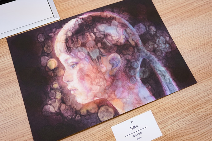
- 月魄Ⅱ
- ななみりお(Japan)
-
-
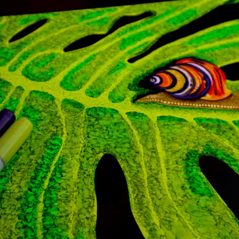
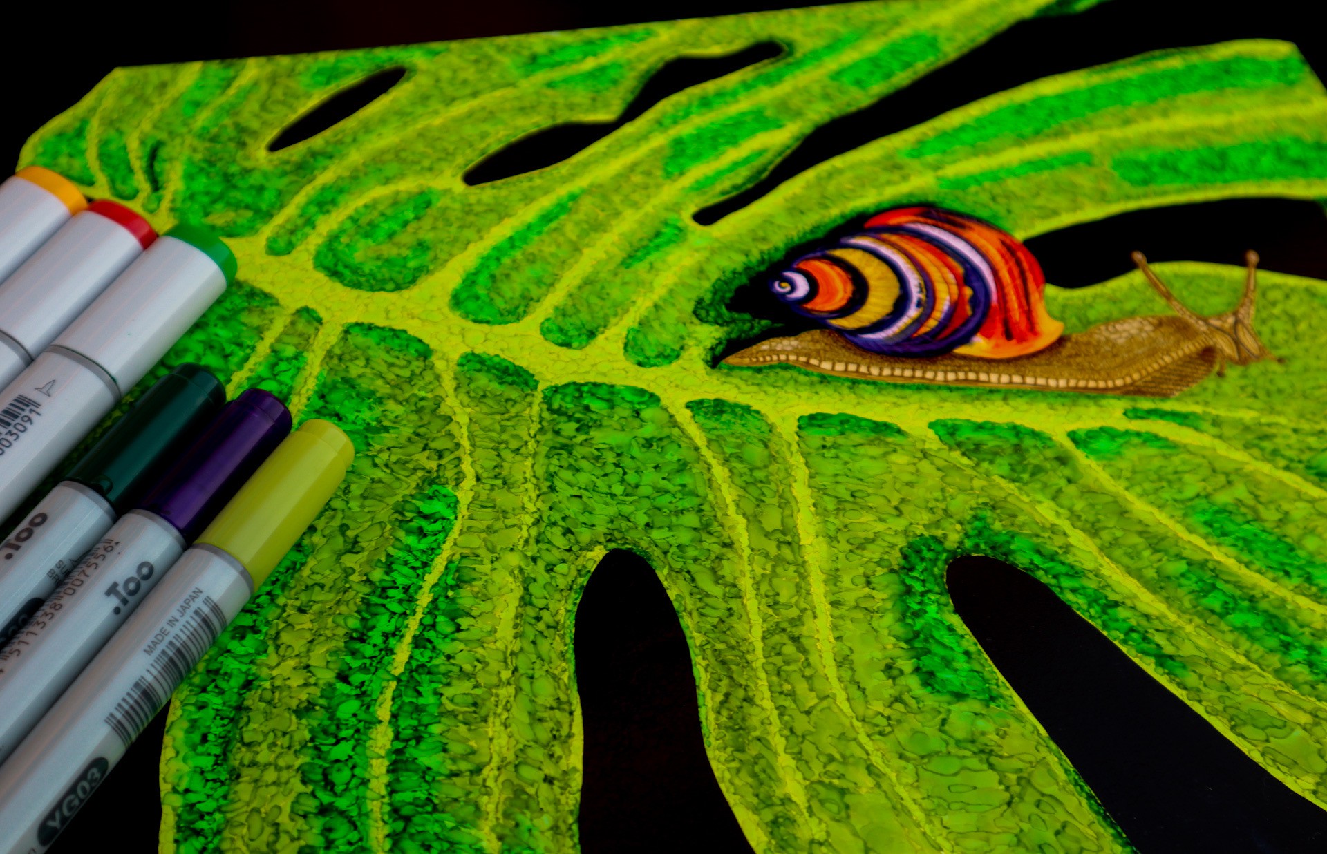
- The Psychedelic Snail.
- Liza-Marie Strydom(South Africa)
-
-
- seaweedart
- komon(Japan)
-
- Opening of Hope
- icotopia(India)
-
-
- OCEANO
- Gabriel Cândido(Brazil)
-
-
- It's okay to be different.
- 内園 明日美(Japan)
-
-
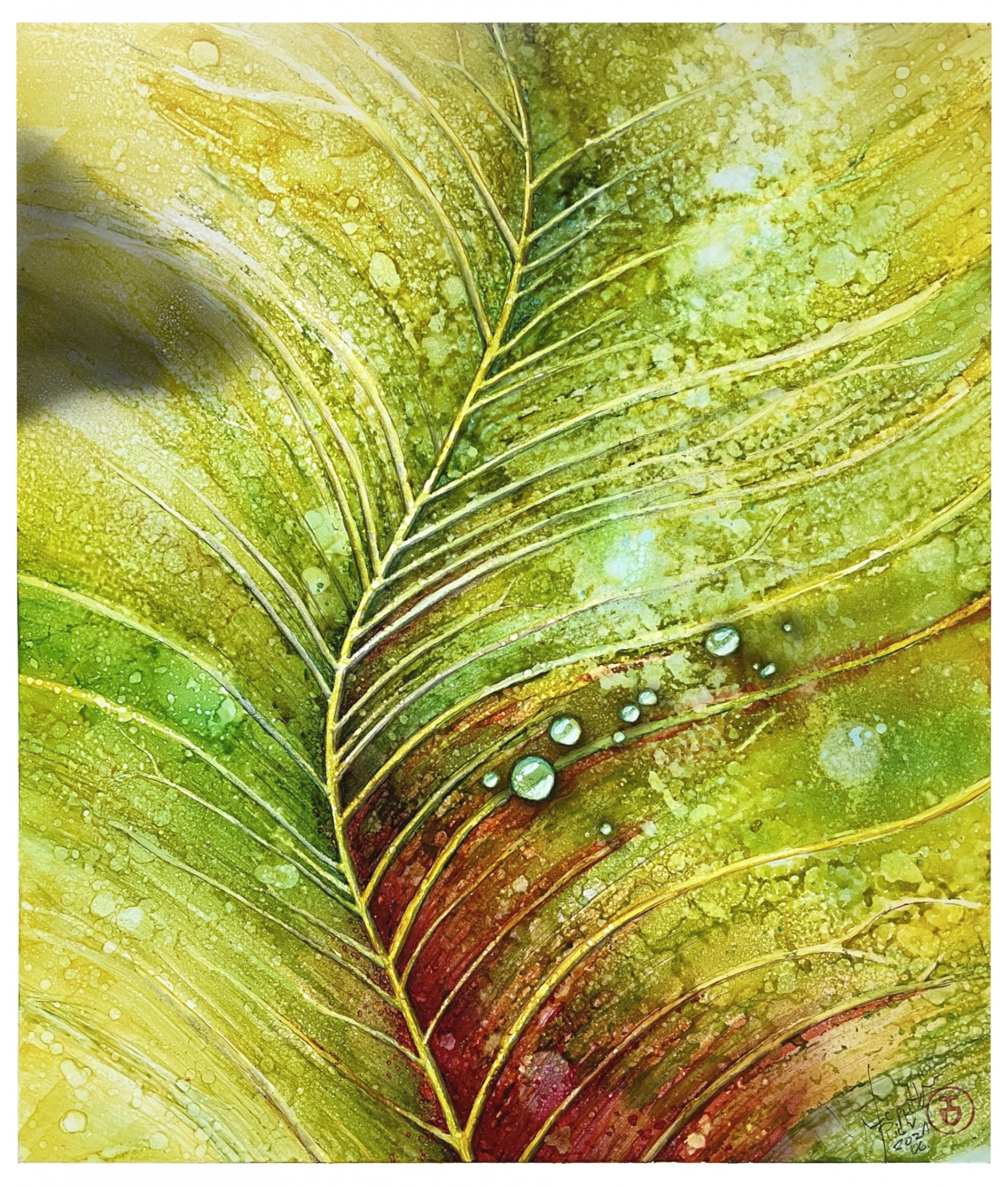
- Leaf#01
- Piotr Lopatka / Ostrow Wielkopolski(Poland)
-
-
- 彼岸
- かぴばらさん(Japan)
-
-
- Coneja Matriarca
- Claudioalerce(Chile)
-
-
- Gothic & Lolita Girl
- さあや(Japan)
-
-
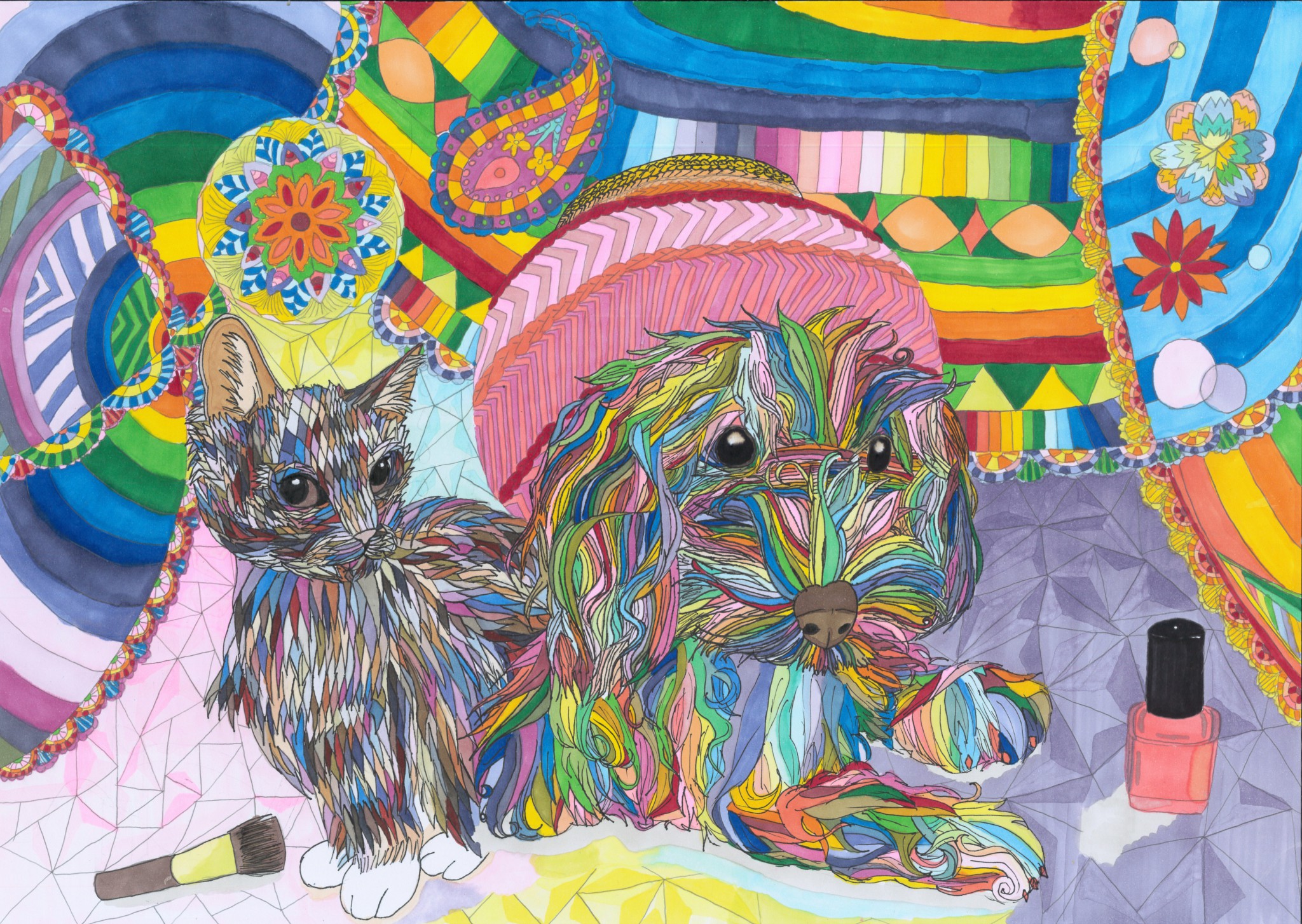
- 猫と犬
- さくら(Japan)
-
- Sustainable Cat
- tone tone(Japan)
-
-
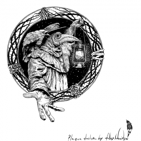
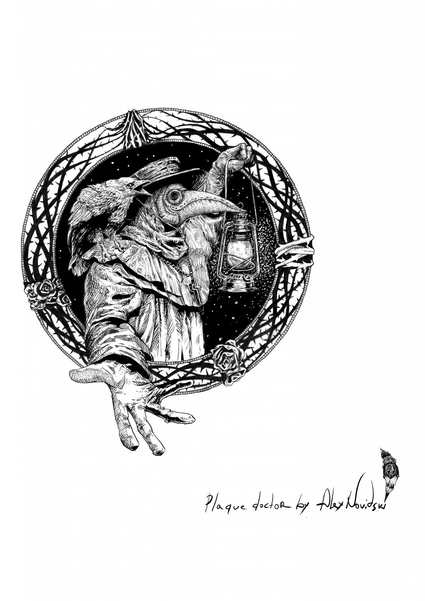
- Plague Doctor
- Alex Novitski(Poland)
-
-
- ときめき / Spark Joy
- Prime たかのなおこ(Japan)
-
-
- みえないものと
- はたやま(Japan)
-
- 暖かい水の中
- 梅桜(Japan)
-
-
- Express YourSoulSelf
- Wagner Wagz(Brazil)
-
-
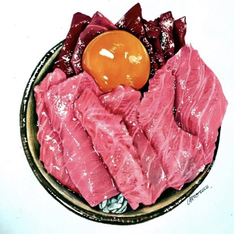
- Donburi
- Art_chak(Hong Kong)
-
-
- 春光
- Capricorn123_(China)
-
- smile
- Tanika(Indonesia)
-
-
- 夏休みのぜいたく
- りーりん(Japan)
-
-
- Orașul zeilor
- Bădescu Maria Alexandra(Romania)
-
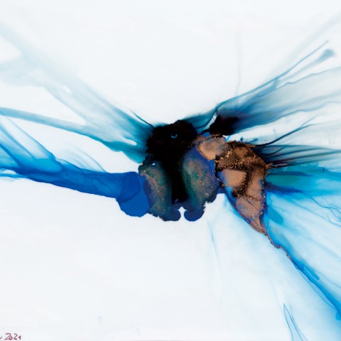
- DIAVOLO
- Carmen Beroiza Williamson(Chile)
-
-
- 2021
- Steven Labadessa(United States of America)
-
- 君はまるで閃光のように、
- CYON(Japan)
-
-
- 迷い込んだ先には
- 田尻恵理菜(Japan)
-
-
- OCTOPUS ATTACK
- LieRossi(Brazil)
-
-
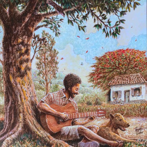
- "Simple life"
- Renato Debs(Brazil)
-
-
- トリラ
- Jin Fuji(Japan)
-
- 僕らの全ての夏の色
- 國安ユウキ(Japan)
-
-
- Scion
- Ashah Grady(Australia)
-
-
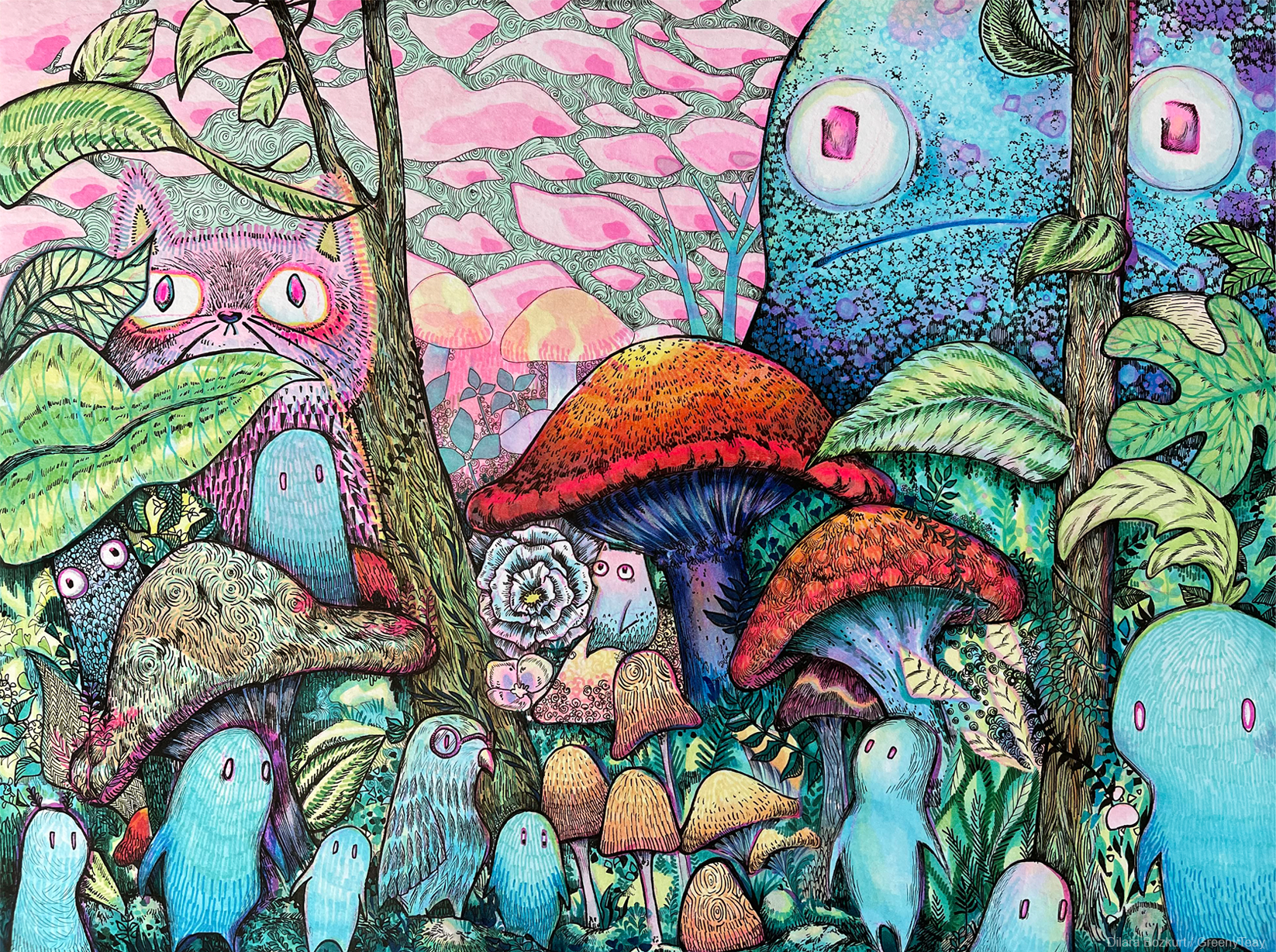
- Fiebertraum
- Dilara Bozkurt (GreenyTeay)(Germany)
-
-
- Afternoon with my friend
- Ari Shi(Uruguay)
-
-
- 泥棒猫
- ゆきまるざうるす(Japan)
-
-

- Koyori Lion
- 櫂あおい(Japan)
-
-
- On Display
- Eliza(United States of America)
-
-
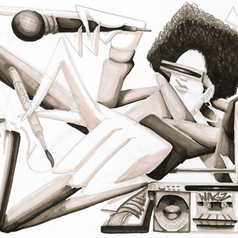
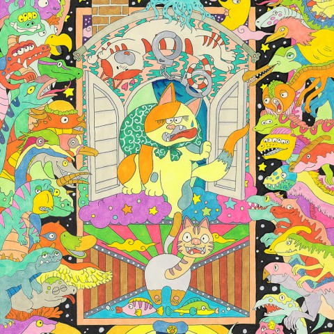
- WE ARE PINK!
- MoltenMagmaa(United States of America)
-
-
- 迷走
- 枷羽あずき(Japan)
-
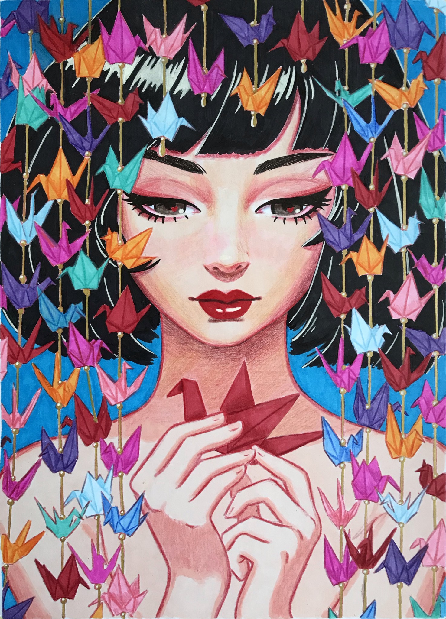
-
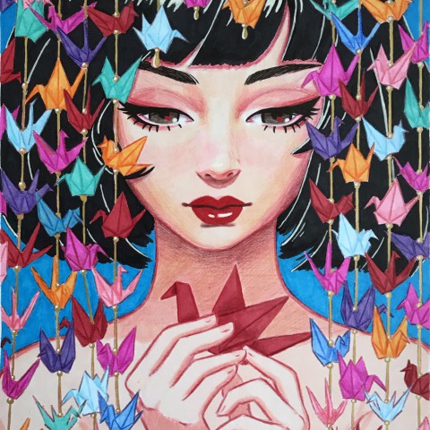
- 千羽鶴
- darkviola(Italy)
-
-
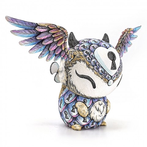
- Oxenlox - (Un)locked Potential
- Jessica Emmett(Singapore)
-
-

- The Lovers
- Nicole Au Yeung(France)


JUDGES
Oh! great (Ito Ogure)
Manga Artist

Kota Nezu
Designer

Chiaki Harada
Illustrator/Manga artist/Manga artist

Kei Matsushita
Art director/Professor of Tokyo National University of Fine Arts and Music (design department)
Tomoko Yabumae
Curator of Museum of Contemporary Art Tokyo
COPIC AWARD final judging report
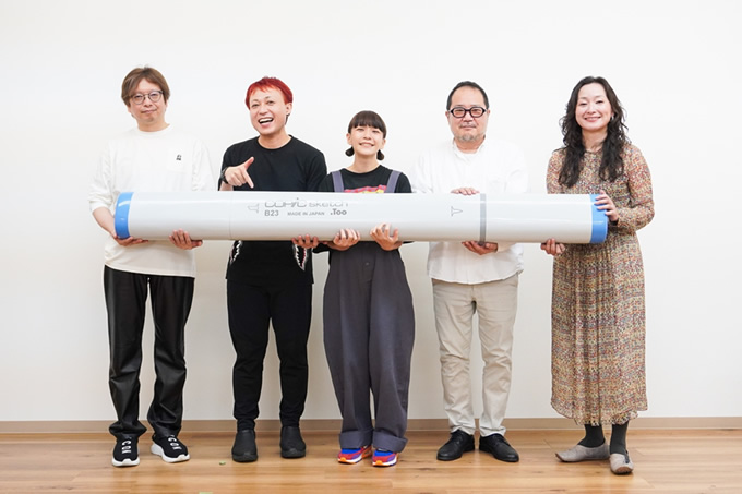
On one day in October 2021, we held the final judging for COPIC AWARD 2021.
Considering the impact of COVID-19, which has been continuing since last year, we postponed the original schedule of judging and announcement of results.
There were various concerns, such as the risk of infection caused by having the judges in one place and the restrictions on importing original works from several countries. However, we decided to hold the final judging face-to-face, going back to the principle of COPIC AWARD: evaluate the artworks by looking at the original piece in person.
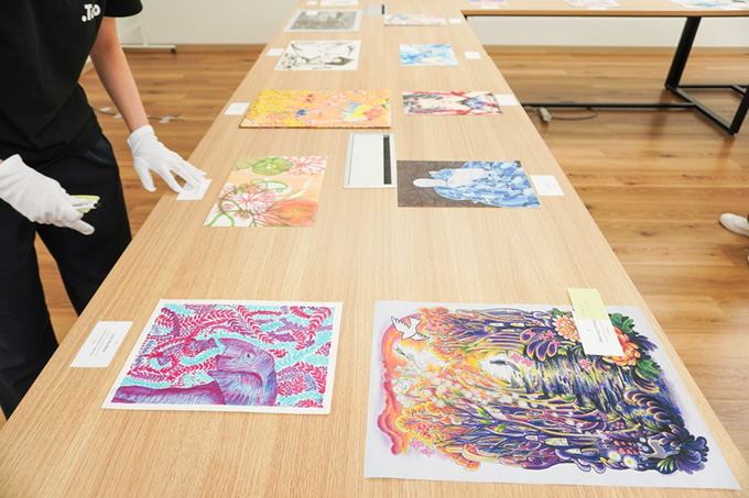
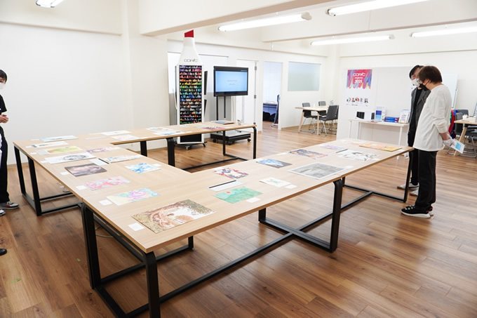
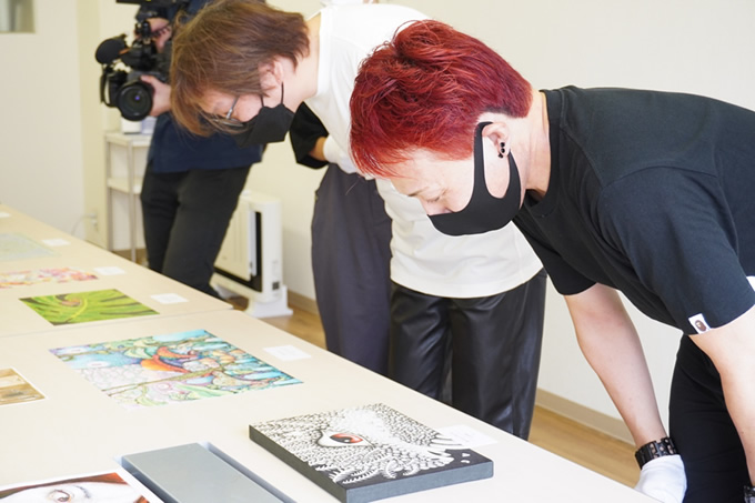
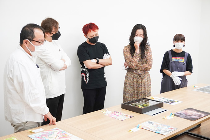
It was a spectacular sight to see all the works lined up in one place, carefully selected by our five judges after a long debate.
The judges genuinely enjoyed looking at the works, but they struggled to pick the winning entries.
Kei Matsushita (professor at Tokyo National University of Fine Arts and Music) served as our judge for the third time. He said the level of the works improved every year, making it more and more challenging to select the winners.
When we asked the judges about their impressions of the entries, two keywords came up frequently: "Fusion with digital" and "expression only possible with analog”.
Some of the selected works were drawn on paper with Copic, photocopied, and then used as one material. There were also works converted to digital data and finally completed on a computer.
Compared to the previous years, many applicants explored expression with a flexible attitude without being confined to a specific tool.
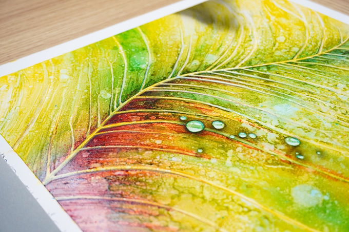
On the other hand, many applicants seemed to challenge themselves to see how far they could go in their expression using only Copic. Coincidentally, Copic Ink (refill ink) was used as an art material in all the Grand Prize and Second Place pieces. We could strongly feel the artists' clear image of the ideal model of their art and their enjoyment of the accidental nature of analog art materials.
One of the main features of the COPIC AWARD is that entries are judged based on the original work, but in the first round of judging, the judges need to look at the images on the web to select the finalist works.
Tomoko Yabumae, one of the judges, also commented on this, saying, "There were times when my impression of the work completely changed when I saw the original piece since I had only seen it through the computer screen during the first round of judging. I believe that all of the works had the potential. So, even if your entry didn't get selected, it's perfectly ok to think: ‘well, you guys aren't ready for (or you didn’t get) my art!’”
Every year, it is impossible to predict which entries will draw the attention of the judges. This is proof that the COPIC AWARD attracts many diverse and fascinating works. In this year's final judging, we were keenly aware of the infinite potential of each entry. And that is the most significant feature of the COPIC AWARD. We are looking forward to seeing more unique works in the next edition.
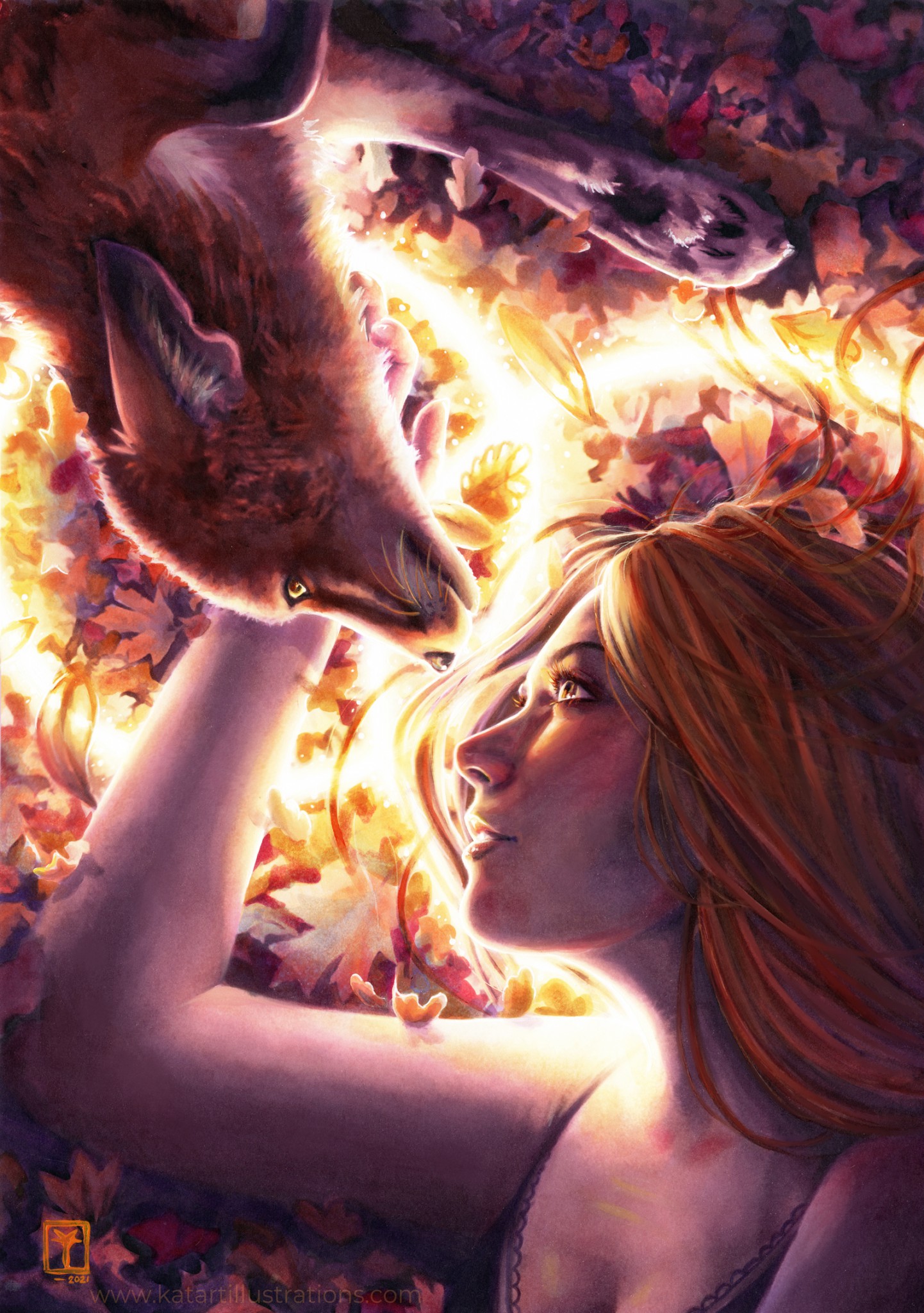
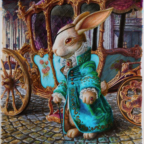
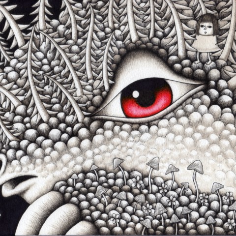
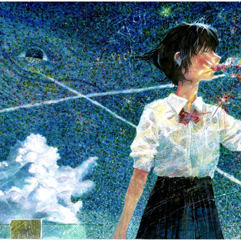
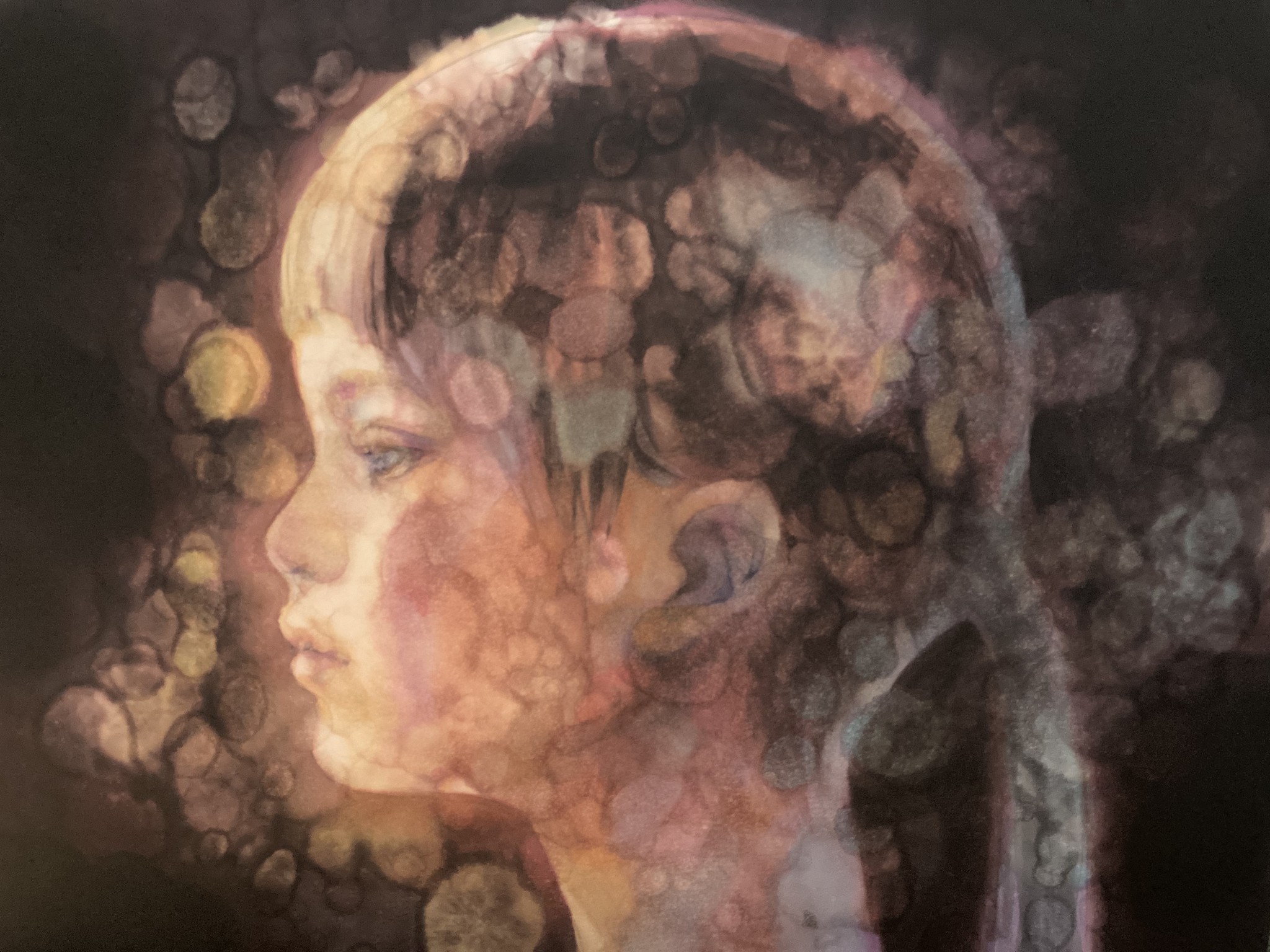
Congratulations on winning the Grand Prize.
I am impressed with the well-calculated composition and advanced technique of this piece. This wonderful artwork is subtle yet powerful and deserves to be awarded. The Colorless Blender shading technique is tricky to control and requires trial and error and years of experience. I could feel the passion of the artist who must have been working hard without people knowing. Passion and love are the strength that transcends all things. The eyes of the girl in the painting are full of love.
(Oh! great)
The style of this piece is very distinctive, giving the feeling of time fading away.
This kind of expression would never be possible using a computer. This artist uses a variety of tricks, like dropping ink directly on the surface.
(Matsushita)