【Interview】COPIC AWARD 2019 Judges: Arina Tanemura, Kei Matsushita, and Tsutomu Okada
[COPIC AWARD Judges Interview: Part 2] Arina Tanemura, Kei Matsushita, and Tsutomu Okada
The interviews cover many topics, such as what aspects the judges emphasized when selecting the entries, the strengths of analog works, and Ms. Tanemura’s techniques and tricks for using Copic products. These interviews contain many words of encouragement for people who make art and are full of worthwhile content, such as a professional’s perspective on the differences between professional and amateur art.
Interview with Arina Tanemura

|
Arina Tanemura Japanese manga artist Arina Tanemura is a widely acclaimed Japanese manga artist. She made her professional debut with The Style of the Second Love" in 1996. |
_Please give us your impressions after judging the entries.
I was moved that there are so many people with amazing technical skill. Also, the judges were all different ages and had different professions, and I discovered that each judge had completely different points they put emphasis on and things that they looked for. I really learned a lot from this experience.
_From what kind of perspective did you judge the entries?
I use Copic markers myself, so the important things that I looked at when judging the artworks were how much the participants were able to express things that were difficult to produce using Copic, and how effectively the Copic was used. For example, I focused on the skill of expressing dark colors. If you continue to layer with the same color, it’s always only going to be the same tone (I could say this is a good aspect of Copic markers). So, when I want to get a deeper color, I layer with a different color - However, there's a catch. The more colors are layered, the more the ink will bleed, and it’s especially difficult to apply those dark colors in a small area. At times like that, I take the cap off the marker and leave it off. When I do that, the ink on the tip hardens a little, and it becomes easier to color in a small area. This is one of my little tricks! When I looked at some of the submitted entries, I thought “It’s amazing how they managed to express dark colors so beautifully.” It’s a basic thing, but I valued things like that because it's very difficult to achieve.
_Aside from the technical aspects, what kind of artworks caught your eye?
Instead of what I like, artworks that conveyed what the artist likes gave me a strong impression. There was an artwork that made me think “Hey, the person who drew this really likes this color”. When the artwork itself can convey that the artist likes that color, it will look very attractive even if it's not your favorite color. I gave higher scores to participants who were able to express things like that.
_The entries covered a wide range of genres. Were there any artworks that you found interesting?
I did not think to use Copic on three-dimensional objects, so I thought that was interesting, and that Copic has amazing possibilities. I thought that the three-dimensional piece called Pineapple Lily was really cute, and I wanted to hang it up on my wall.
_What did you think when you saw the actual artwork, not the image file?
I think that if the entries had been judged separately based on the printed works and on the actual artworks, that there would have been two different results. One good aspect of Copic markers is that they are really good for printing. Copic is designed so that they have high reproducibility even in color copies. So, the first time I used Copic, it was a huge shock, and I thought “Finally there are drawing materials that can withstand printing!” I’ve heard an editor at a publishing company say that Copic has an amazing level of reproduction when printed as art. This time we judged based on the actual artworks. The original works show the true representation of the artists' actual skill, so I was glad that I could judge them based on the originals. But again, one of the significant characteristics of Copic is that the printed works look really good.
With manga artists, in most cases the readers only ever see the printed works, so printing is important. I draw based on the assumption that my work will be printed, so when I color, From the beginning, I take things like “On the original, this color looks like this, but when it’s printed, it will probably look like this, so it will be OK” into consideration. For example, with typical color ink, blues end up looking dull no matter what, and it is difficult to reproduce blues and greens when they are printed. But in a lot of cases, the blue colors in Copic can be reproduced as-is to the original color, so I rely on Copic when I’m using blue.
_Nowadays, there are more places online where people can express themselves, including social media. Please tell us your thoughts on that.
In terms of using Copic, it’s pretty difficult to come up with completely new methods of expression using markers, but I feel like Copic covers that with the number of colors.
Sometimes the situation arises when there is no technique that I can use to convey the images in my head. I have no choice but to find a way to solve the problem! In a desperate struggle, I come up with a lot of ideas - I use methods that even I think are weird (laughs). I think it would be good if professional artists like me continue sharing how-tos for Copic on social media.
I posted this on social media before; one time I wanted to apply blue Copic to a large area, but using the spray was different from what I wanted to express in my head. I wanted to leave some uneven brush strokes, but I was worried that if I colored with Copic the unevenness would be too fine and I would not be able to produce the tone I wanted. So, I poured Copic refill ink on a palette and used a brush to color the area. Some types of brushes were not compatible with Copic ink, and they dried out and hardened. I ended up ruining about three brushes doing that—but I really wanted to get my ideal tone no matter what. I want to tell everyone that you can get what you want if you use your imagination.
_Thank you. How did you start using Copic?
I guess I discovered Copic markers when I was a middle school student. There were a lot of colors, but at that time there was only Copic Classic and I thought I couldn’t use it for creating my artwork. After that, Copic Sketch came out and it became possible to change out the nibs, and I thought “This is it!” Copic was a bit expensive for a student, so I remember that I used the money I made at my part-time job to buy about five markers a month. The Copic Classic nib was broad, but Sketch has an innovative Brush nib and it was sensational when it came out. The first colors that I got were so-called skin tones because they’re important colors for coloring characters. There weren’t many manufacturers who made markers with these skin tones, and their ink was too dark and unsuitable for my works. And of course, they don't have brush type nibs. I was really impressed by the color variations Copic has. The color I like is Salmon Pink. Copic also has many pinks: from light pink to dark pink. Pinks and reds are my favorites.
_Please tell me about your tips and tricks for using Copic markers.
When drawing fine shadows or lines for hair, I purposely take the cap off the Copic. They gradually dry-out if you leave the markers like that, but I can draw impressive lines by controlling how ink comes out. Particularly when drawing hair, this method can produce fine, deep, nice lines. I would have at least three half-dried markers ready when I draw hair. Of course, you need to pay close attention to timing, though. If the nibs get too dry, there's nothing you can do about it. I didn’t expect that no one else does this! When I tell people that I purposely dry the markers out, everyone is surprised.
_When you draw a character, which part are you the most particular about?
The hair. I also put effort into the eyes. A long time ago, an editor I was working with said “In good drawings, the eyes in the piece meet the eyes of the audience, regardless of the viewing angle” and I always try to achieve that. Anyway, I love coloring skin tones, so when I start to color, I start with the skin. I devote all my attention to coloring the skin part. If that part isn’t going well, I feel depressed the whole time I’m coloring.
_If you make a mistake while coloring, how do you recover?
I’ve come up with about 100 ways to patch up mistakes. If you tell me what kind of mistake you made, I’ll tell you how to fix it.
_How do you select the paper that you will draw on?
I think copy paper is very compatible with Copic. The ink spreads well, and bleeding and gradations can be done without uneven areas. I could say copy paper is better than manuscript paper, but it’s thin, so there is the concern that it’s not very suitable in terms of preserving the art. But if the objective is printing, I recommend copy paper because Copic colors come out well on it.
_What is the ratio in terms of how much of your work is done digitally and how much is analog?
It depends on the request. If it’s something like a game character, I am often obligated to provide a digital deliverable, so I do a lot of digital work for that. But even if I start doing digital, I don’t intend to quit doing analog. When I say, “I started doing digital,” sometimes people reply, “I’d be sad if I couldn’t see your analog work anymore,” as if I were going to completely switch over to digital. This kind of reaction surprises me; so, I'd like to declare “I never said I was quitting analog!” . I think I’ve gotten better at using digital recently, so now I create the line drawings on my computer, digitally adjust the color of the lines, then output it to Kent paper and color it using analog.
_If you can’t draw it well using analog, do you think that you can’t draw it using digital either?
I think that artists should do analog. Artists should have as many tools and methods for expression as possible. As a professional artist, I believe that eliminating options for expressing themselves is not a good idea. The more knowledge I have on options, the more ways I will have to express myself. I think it would be a waste if artists stopped doing analog. When artists start with digital and get used to the convenience of that, then they devote themselves to that. This is something that I understand well but I think that it’s good for artists to try analog before they learn digital, and I really think that they will become considerably stronger as artists if they have had the experience of doing analog, even if it’s just a little. So I think artists should do analog for at least 2 years.
_Please give a message to young artists in the world who are planning to create art using Copic products.
A message... Well, it may be a bit presumptuous for me to say this, but I think that there are a lot of people who like drawing but believe themselves to have no skill or talent in creating art. I kind of feel the same way and think I'm not as highly skilled as other manga artists. But the most important thing for artists is to draw carefully. If you draw with the utmost care, something will appear in your piece that inspires people, even if you have no skills. If you do that, you can draw something that people will look at and say, “This is good”. If you think you aren’t skilled enough, please try to create artwork meticulously.
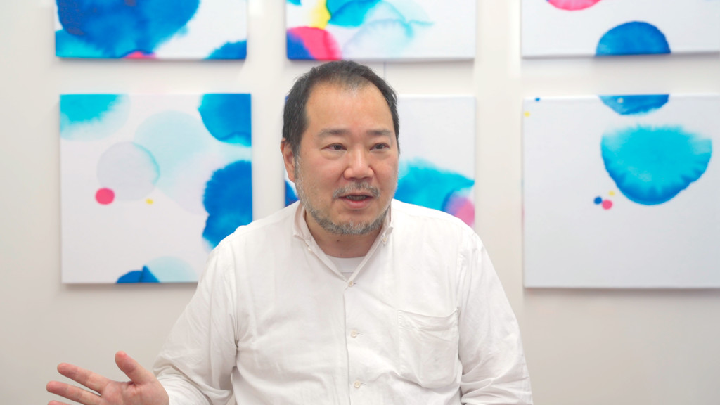
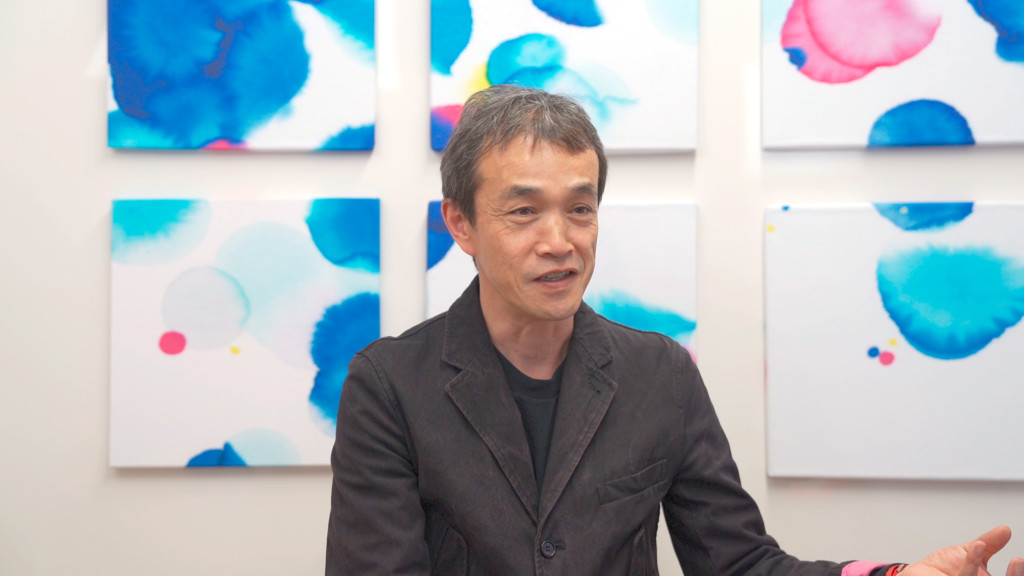
Interview with Kei Matsushita
|
Kei Matsushita Art director Mr. Matsushita graduated in general design from Tokyo National University of Fine Arts and Music and then in 1985 and then in 1987 completed his postgraduate studies. Currently Mr. Matsushita is a professor at the same university. He was awarded with prizes include JAGDA New Designer Awards, TOKYO ADC Awards, Education Minister’s Award and Good Design Award. Recent works include a design for 21_21 DESIGN SIGHT exhibision catalog, and art direction of Good Design Award or Takeo Paper Show. |
_Please give us your impressions after judging the entries.
From the viewpoint of my position as a professor at Tokyo University of the Arts, there are a lot of students who use Copic markers. There is a wide range of variations in how Copic is used, and students are doing various things like saturating paper with Copic ink. At the COPIC AWARD, I realized again that a lot of people still use Copic as an art material to color drawings with clear contours. There weren’t entries in the final judging that were impulsively drawn using Copic from the beginning. I had the impression that many works were created by drawing the contours first, then in an orderly sequence.
_From what kind of perspective did you judge the entries?
Both professionals and people who aren’t professionals participated in this AWARD. I had to change my perspective for judging based on whether it was done by a professional or someone who was drawing as a hobby, and it was a little difficult. In the case of professionals, my eye went to the parts that had good expression and good skills, but I also noticed aspects that were lacking. I look at entries that were created for the artist’s self-expression from the viewpoint of whether the richness of what was inside them was conveyed in the work or not, so I thought that I wanted to change my viewpoint a little.
_Do you think that whether an artist is a professional or an amateur would affect your evaluation criteria?
When I judged the artworks, I was only looking at the drawings, and I didn’t know whether the person who drew that work was a professional or an amateur. But if I saw a particular method being used that seemed more like it was done by a professional, then some technical points started to bother me, and I thought things like “This drawing doesn’t look right.”
_I think you wouldn’t actually know whether the artist was a professional or an amateur, but how would you identify that?
I would identify it by imagining the direction that the entry was aiming for. I would want to separate what the artist was aiming for, whether they created the artwork with the awareness that they were not professional but they wanted to create it professionally, or whether they just created the artwork to express what was inside of them.
_Which type would you be drawn to?
Personally, I would be drawn to the type that expressed what was inside of the artist. But from the position of teaching at a university, I think that both are necessary.
_What do you think about art materials, in terms of drawing and teaching?
The style and quality of art should not be tied by art materials. I believe the right way to deal with art materials is for artists to challenge themselves to aim for the limit of what the art materials can express, with the question “How far can I go?”
_Nowadays, there are more places online where people can express themselves, including social media. Please tell us your thoughts on that.
It's basically a desirable thing and knowing that everyone can express themselves gives people courage. But the next stage may already be here. Now everything becomes more uniform due to the explosive expansion of social media. People started uploading similar photos even though they are different people in completely different parts of the world. I think things will become more commoditized in the future.
_Please give a message to young artists in the world who are planning to create art using Copic products.
We are now in an information society where a wide variety of references keep appearing right before our eyes one after another, and that makes us want to copy. What I'd like to say to young artists is that if they don’t start by sincerely believing in themselves and digging down deep, they won't know what they're doing. They should go through the process of believing in themselves and creating their own art, not mimicking. It doesn't matter whether their art is good or bad and they don’t even have to show it to other people.
Interview with Tsutomu Okada
|
Tsutomu Okada curator Mr. Okada was born in 1963. After graduating from Musashino Art University in 1988, he joined Wacoal Art Center. Currently Mr. Okada is a senior curator of Spiral, a complex of cultural facilities run by Wacoal Art Center. In addition to organizing contemporary art exhibitions at Spiral, he involves various other exhibitions and public art projects for other facilities or local government as producer. |
_Please give us your impressions after judging the entries.
I was surprised that there were actually submissions from so many different countries and regions. I heard that there were over 2,000 submissions, and I wondered how the participants got the information about the AWARD.
_From what kind of perspective did you judge the entries?
I’m a contemporary art curator, so I wanted to encounter expressions that I have never seen before. I was hoping to discover those kinds of entries.
_There were a lot of works influenced by comics or anime that you don't usually see. What did you think?
The forms of expression in the worlds of manga/anime illustrations are getting relatively closer to the territory of art, and I think they have halfway crossed over. From that viewpoint, I could say I'm used to seeing manga/anime. There were many entries that showed the artists’ extremely high skill level and ability to use Copic well, but in the judging process, I was focusing on other points instead.
_What do you think separates manga/anime illustrations from art?
If we are talking in terms of expression, separating them has no meaning now. Even if there's a point that would separate them, it would just be the meaning and the concepts that are incorporated into them, so it would be pretty difficult to draw a line.
When evaluating the artworks just by looking at them, it is actually difficult to discern those types of connotations. In these times, we should be judging the works more comprehensively by including interviews with the artists about what they studied up until this point, what their interests are, and what kind of mindset they have about society. So it’s very difficult to judge the artworks just by looking at them.
_Please tell us your impression of Copic as an art material.
I have heard a little bit from the manufacturer about the areas that Copic can be applied, and I had the feeling that there are still a lot of unexplored fields where Copic could expand. For example, the candy industry. If it's possible to apply Copic to things put in the mouth, the needs for Copic may increase in the food industry. Somehow, I had a strong impression that Copic markers are used by professional artists or designers. It would be nice if people understand Copic isn’t just for professionals.
I thought that there are a lot of unexplored fields where Copic has never been used. It would be interesting if I could help with user-expansion. Nowadays, people can freely take various approaches to express themselves in art. If art materials like Copic were provided to people who aren’t the creators of manga, illustrations, or fine art, what would they express? What would they think? It would be interesting to see what would happen.
_Nowadays, there are more places online where people can express themselves, including social media. Please tell us your thoughts on that.
The moment social media came on the scene, the speed of information diffusion became much faster but also much more uncontrollable and unpredictable. Those social media platforms have proper administrators, and someone is monitoring the information, whether it's automatically or manually. On the other hand, although it has closed down already, there used to be a pure P2P type information sharing system without a central server that wasn’t monitored by administrators. This was very different from social media platforms that are popular now. I think this type of information sharing system may be revived again. If that happens, information and expression will be spread out to the same number as people around the world, theoretically. I'm very excited to see what is going to happen. For example, I don't know much about what is happening on the African continent right now. But in the not-too-distant future, when those African countries gain more economic strength, what kind of information and expressions will be offered from them? It's completely unpredictable, but it's also something to look forward to.
_Please give a message to young artists in the world who are planning to create art using Copic products.
I think Copic is an art material that provides a lot of possibilities. There are so many colors as well. It would be great if the users had opportunities to communicate with the manufacturer. If users speak up and give appropriate feedback from the bottom up, new colors and tools may be developed to meet the users’ needs. A strong relationship between users and the manufacturer will increase the product line-up and even widen the forms of artistic expression, as a result. Also, events like COPIC AWARD are great because users can directly interact with the manufacturer.
We appreciate Arina Tanemura, Kei Matsushita, and Tsutomu Okada taking the time to talk to us.