Winners
Grand Prize
Second place
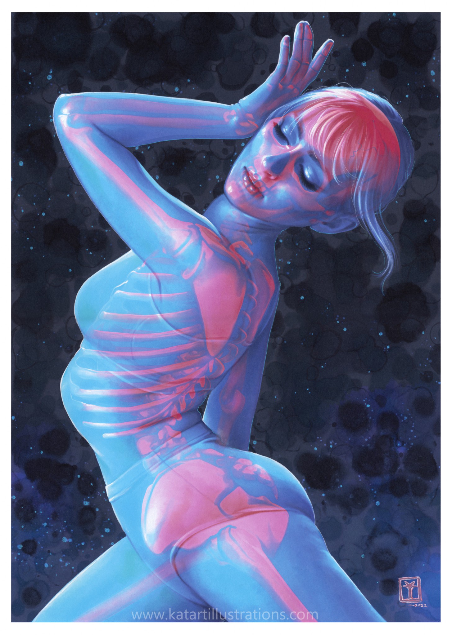
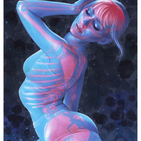
The basis of this entry is to have the audience wear stereoscopic glasses to view the work. But even without that idea, the piece is high-level and excellent in every aspect - Including the skillful rendering and composition, the beautiful pose of the female motif, and the warm balance of the color scheme. The depiction of the skin texture is very detailed, but I still can't tell how it was drawn, even after seeing the original. The more I look at this piece, the more I notice something appealing about it.
(Hikaru Ichijo)
The artist's incredible drawing ability and deep knowledge of the human body are evident. At first glance, it looks like it was created digitally, but I imagine it would be impossible to draw this work digitally in the same way. In this sense, I feel that this piece is a challenge from analog to digital. It is an outstanding piece that makes us feel the potential of Copic.
(Kota Nezu)
Second place
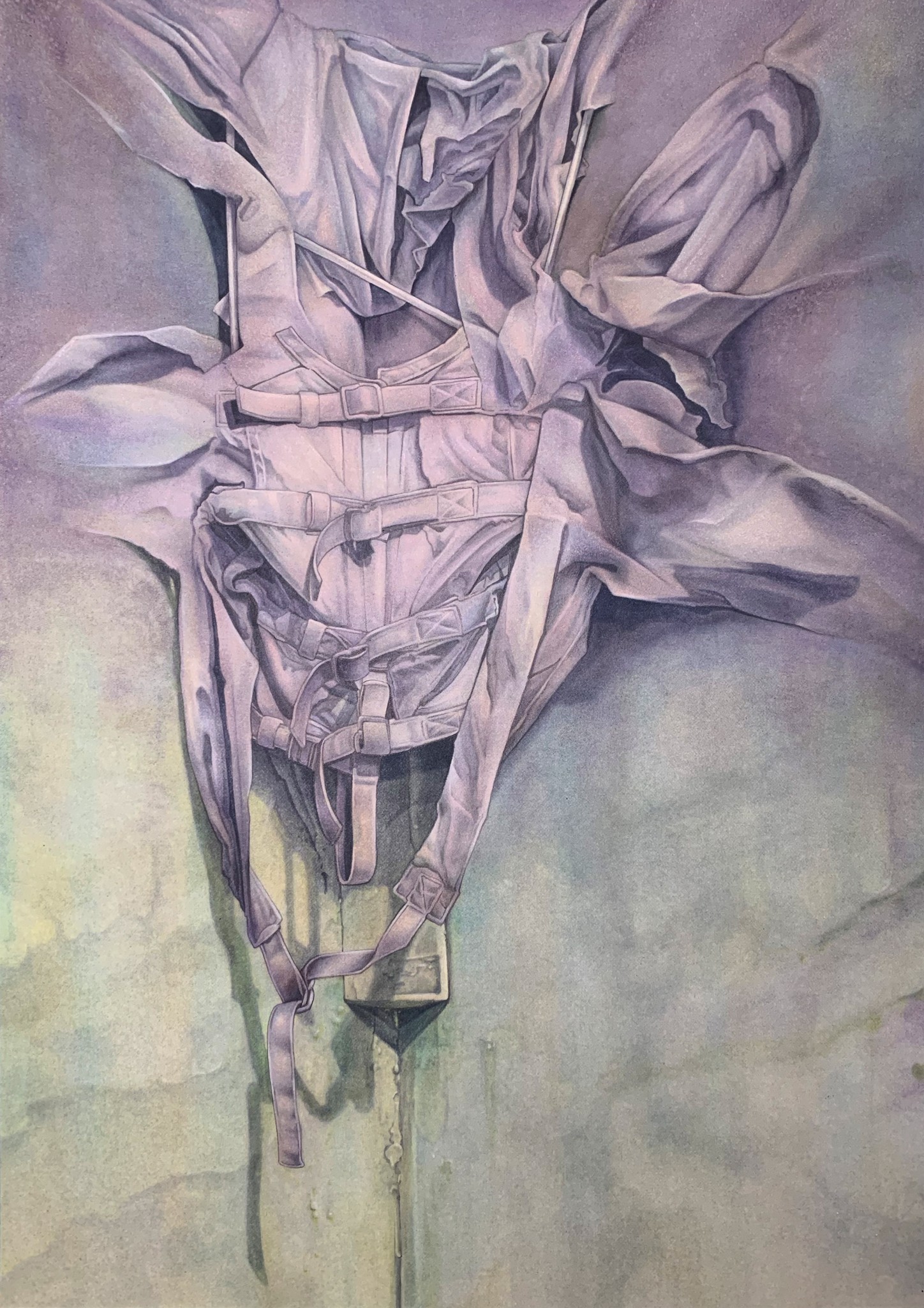
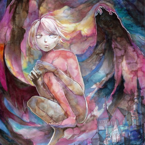
Unlike the Grand Prize entry, this piece uses simple, chic, and muted colors. That's another advantage of Copic, but I didn't know Copic could offer such subtle blurring and gradation of light colors.
Actually, I was not sure what the subject was, and the artwork did not explain it. Nevertheless, the image of the motif leaves a strong impression because it is fascinating somehow, and I never get tired of looking at it.
(Kazutoshi Oshimoto)
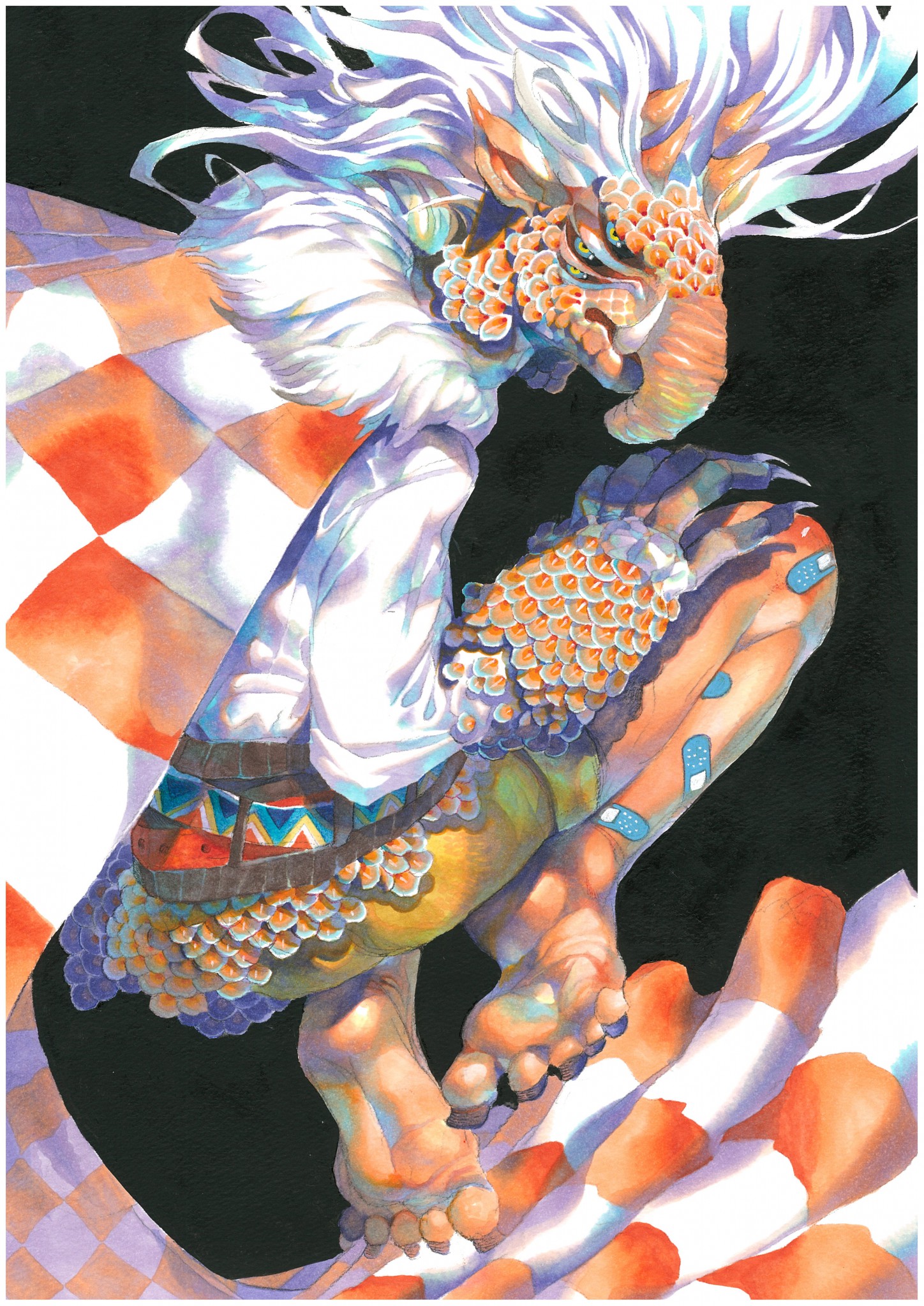
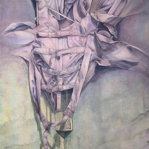
I was immediately intrigued by the rich texture expressed in this entry. The detailed rendering of clothing with lots of belts and its soft textures that seem to melt into the background is brilliant, giving the artwork a three-dimensional feel. I say this piece is technically remarkable.
I can't imagine how such beautiful gradations were created with Copic. Even though it is a pretty realistic piece, it looks mystical with the light coloring. The expression of the texture is indescribably appealing, and I found it to be a very interesting piece.
(Eriko Kimura)
Future Generation Art Prize(Youth Award): Grand Prize
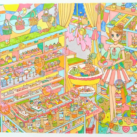
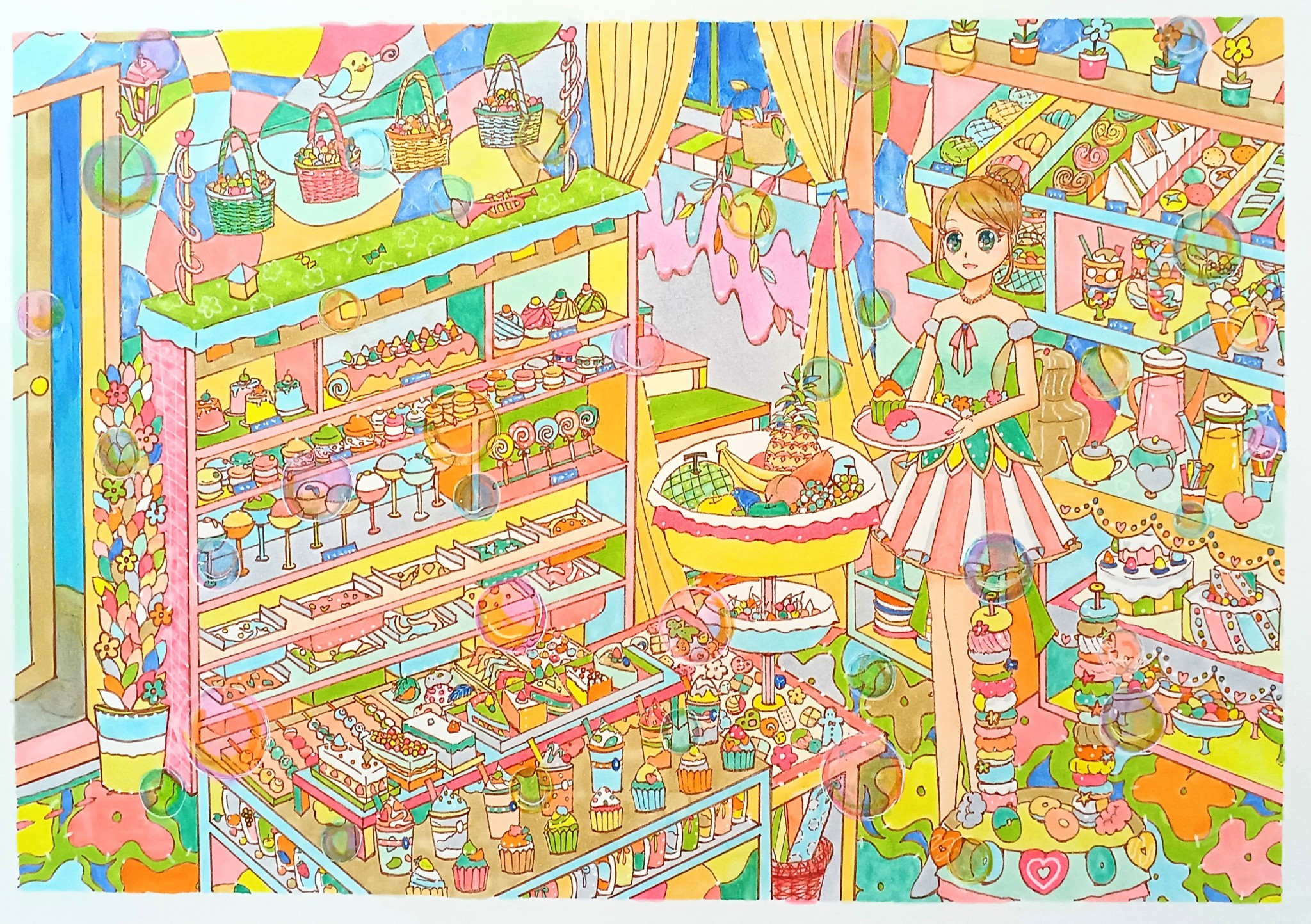
When I first saw this entry, I felt so happy. I wondered if the artist really wanted to open a candy store one day. Every item, including the packaging design, is not sloppily drawn, and every little detail is drawn with a passion that makes us smile. It is such a beautiful piece, and I selected it for the Future Generation Art Prize.
(Kota Nezu)
It is difficult to choose colors with Copic markers because there are too many to choose from, and sometimes you may end up with a messy drawing because of a mistake in selecting colors. Sometimes it's overwhelming to choose colors for my work, but I came across several entries with beautiful color combinations that made me want to know how the artists selected the colors. Especially, this candy-filled, pop-style piece that won the grand prize in the Future Generation Art Prize has beautiful coloring.
(Yuki Suetsugu)
Judges' Awards selected by Hikaru Ichijo
The artwork I selected actually caught my interest from the first round of judging.
When I judge and select a piece, I ask myself, for example, how the image would look if it were used in a book or printed on clothing. Those are my personal criteria. This piece is a bit unique among the other entries, and I just had a positive impression of the drawing. The colors, lines, spacing, and facial expressions of the characters give me a pleasant feeling. Whether or not I would want to take the artwork home was the most important point in my selection process.
Judges' Awards selected by Kota Nezu
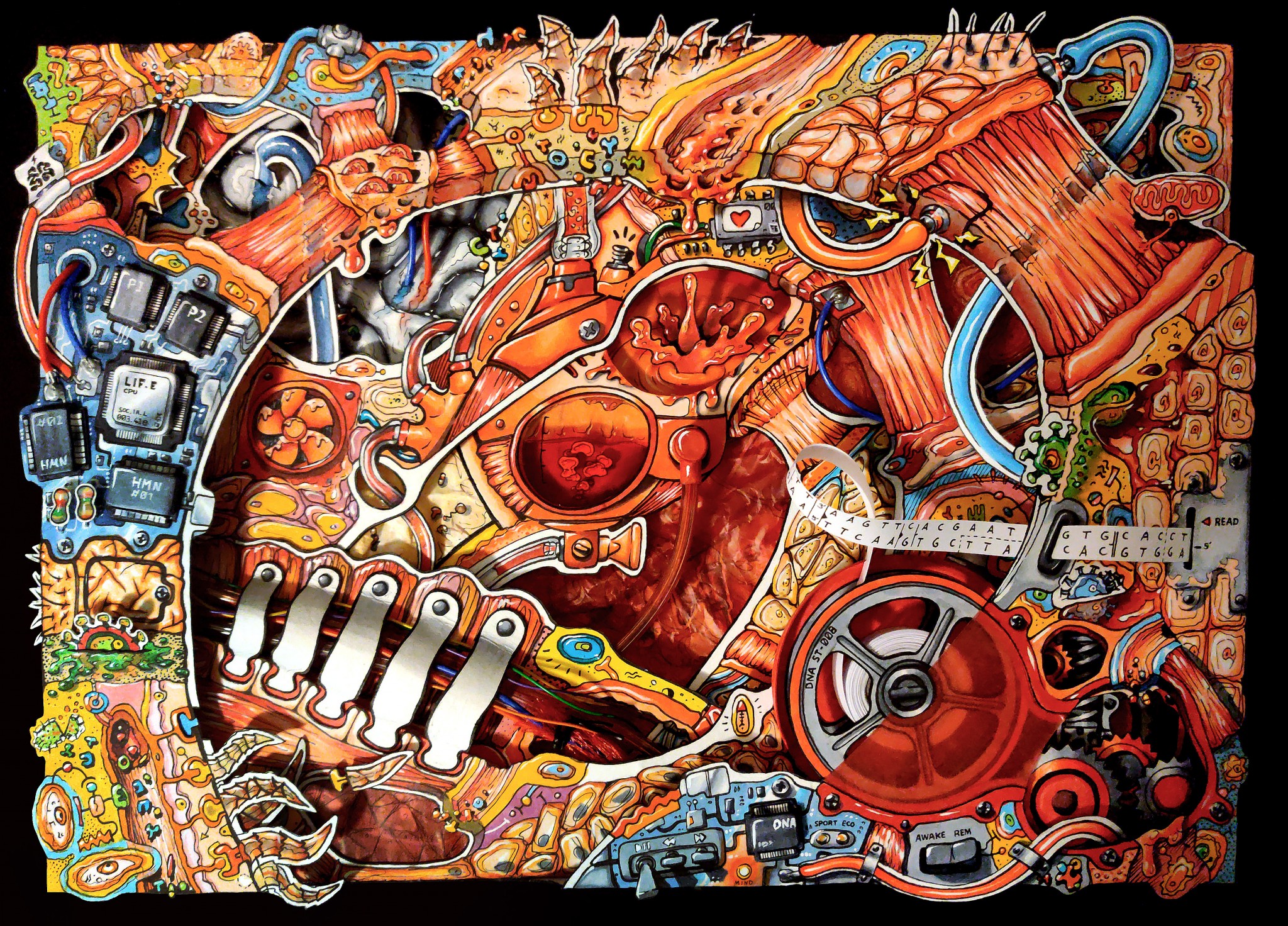
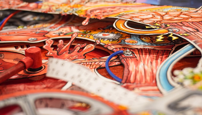
The entry I chose takes the human body as a world and turns it into a mechanical element. Just looking at it makes me excited.The unique three-dimensional expression, composed of multiple layers, gives the viewer a unique view of the world. The artist made good use of a variety of different materials, and I could tell that the artist had fun while creating the drawing. This work makes me feel like I have entered another world, a world in pop-up picture books that I read as a child. It gives me such a pleasant feeling.
Judges' Awards selected by Kazutoshi Oshimoto
I discovered this one after reviewing all the entries several times. At first glance, I thought it had little impact, but when I saw the original drawing in person, I was pretty surprised it was smaller than I had imagined and yet very finely rendered. When I saw the digital image, I imagined a much larger piece, so the gap between the two was so appealing to me.
Judges' Awards selected by Kimura Eriko
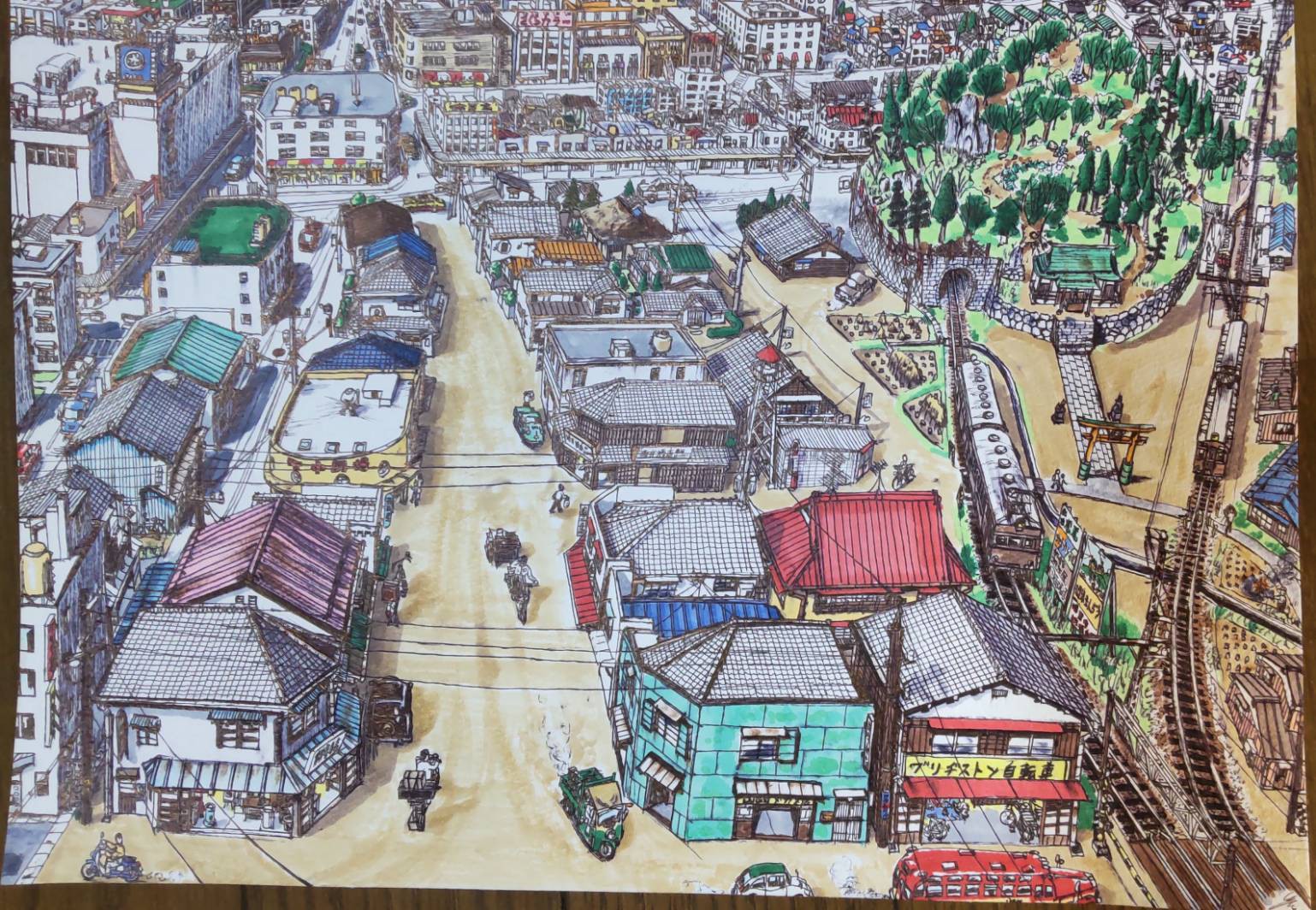
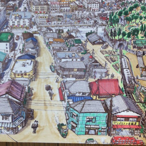
I remember this entry has been on my mind since the first round of judging. It is a nostalgic scenery, but if you look closely, you can see that some things seem a bit strange. There is suddenly a large department store next to a residential area. There is a hill in the middle of a city with a tunnel and a train going into it. These things do not happen in real life. So I think the artist depicted an imaginary city, but everything fits together naturally. I imagine this applicant will be interested in many things in the future and will continue to create artwork. I look forward to seeing more in the future.
Judges' Awards selected by Yuki Suetsugu
Despite the fictional motif, I was attracted to this entry by its lively and dynamic composition, as well as its excellent overall layout. The vermilion and blue colors harmonize well. I really like the colors the artist picked.
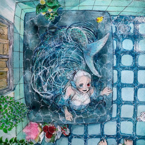
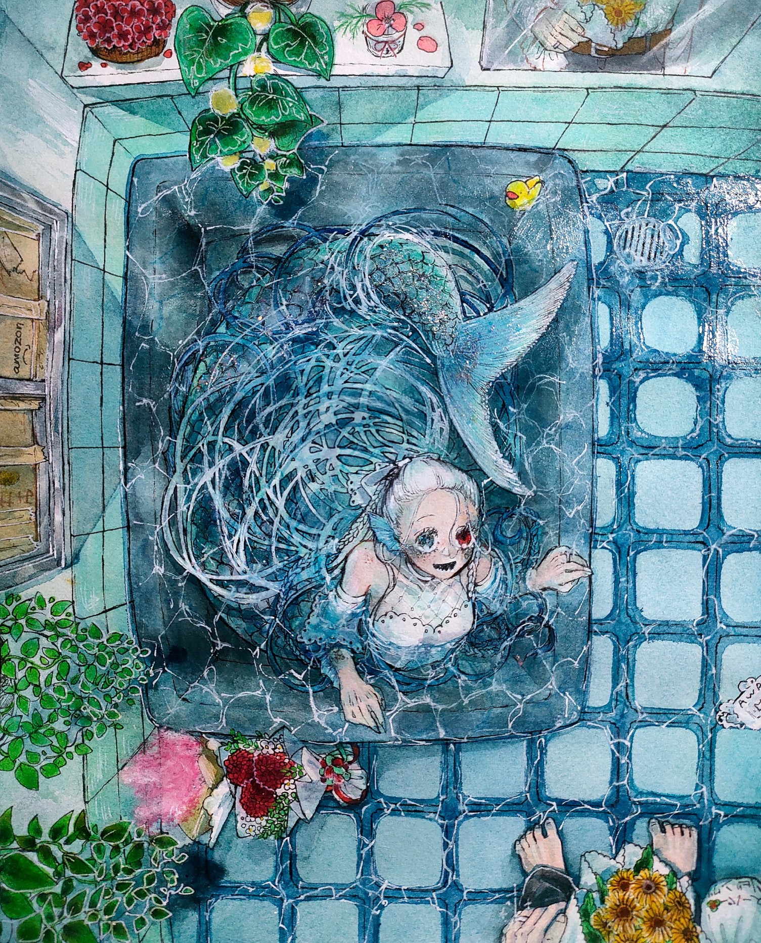
The beautiful gradation of the spreading lines expresses the transparency and smoothness of the water well. In this respect, I feel that the artist has taken the possibilities of the Copic one step further. I appreciate the artist's understanding and use of new techniques using Copic markers, which led me to select this piece for the Judge's Award.
pixiv Award
It was hard to pick one from so many amazing entries nominated for COPIC AWARD, but I thought this one had an attractive character and was worthy of the pixiv Award.
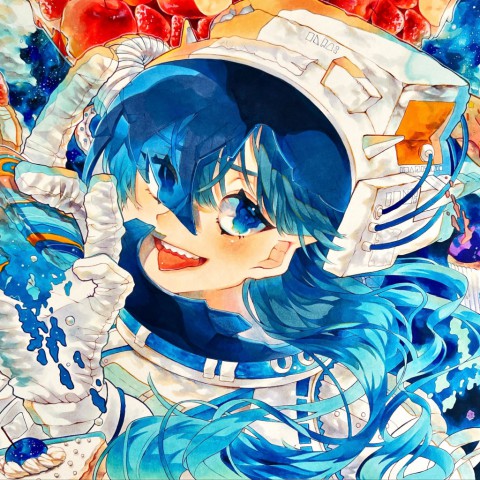
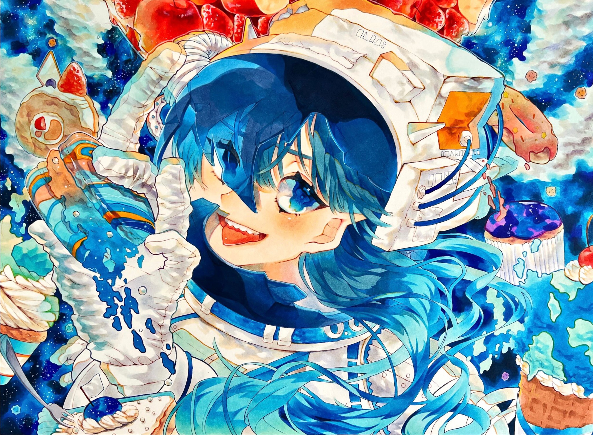
The character is wearing a space suit, so she is supposed to be off Earth, but you can see that the helmet is cracked. I was intrigued by all those little strange ideas. The character is so cute, and the more I look at her, the more I am captivated. If this entry were posted on the pixiv website, it would rank high in our popularity rankings.
Social Media Award
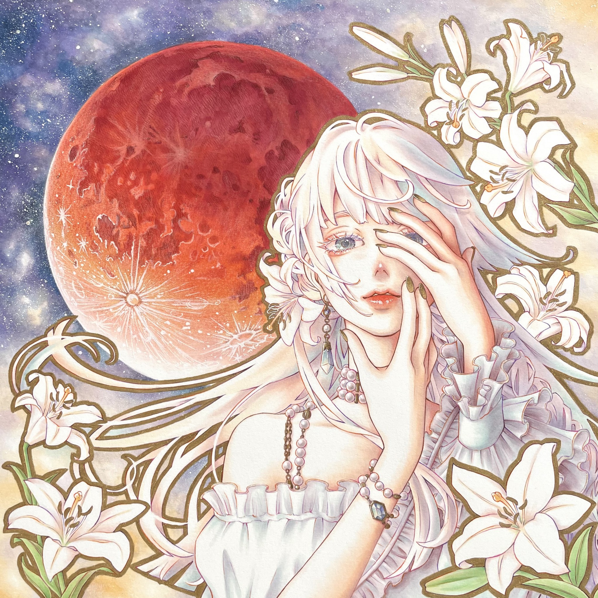
In addition to the charm of the characters, the carefully drawn and colored lunar eclipse was excellent, and it is a very well-done piece. It's obvious the artist enjoyed using his custom Copic Inks and items such as Multiliner pens and Opaque White. This artist's work was also selected for the 2021 COPIC AWARD, but I felt this entry was even more powerful. We want to see more from this artist.
Regional Awards: APAC
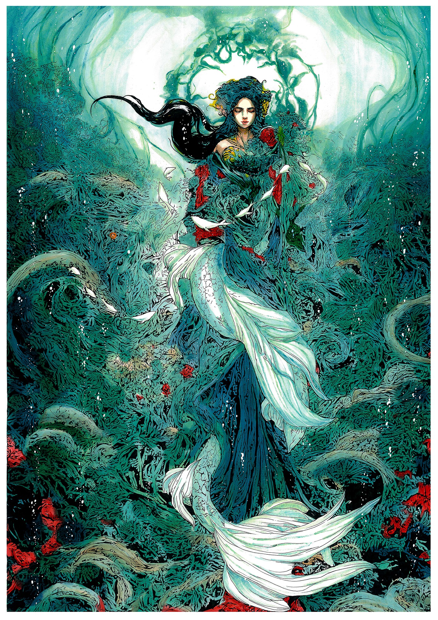
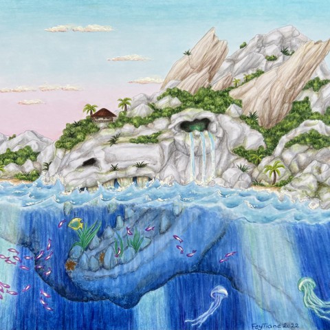
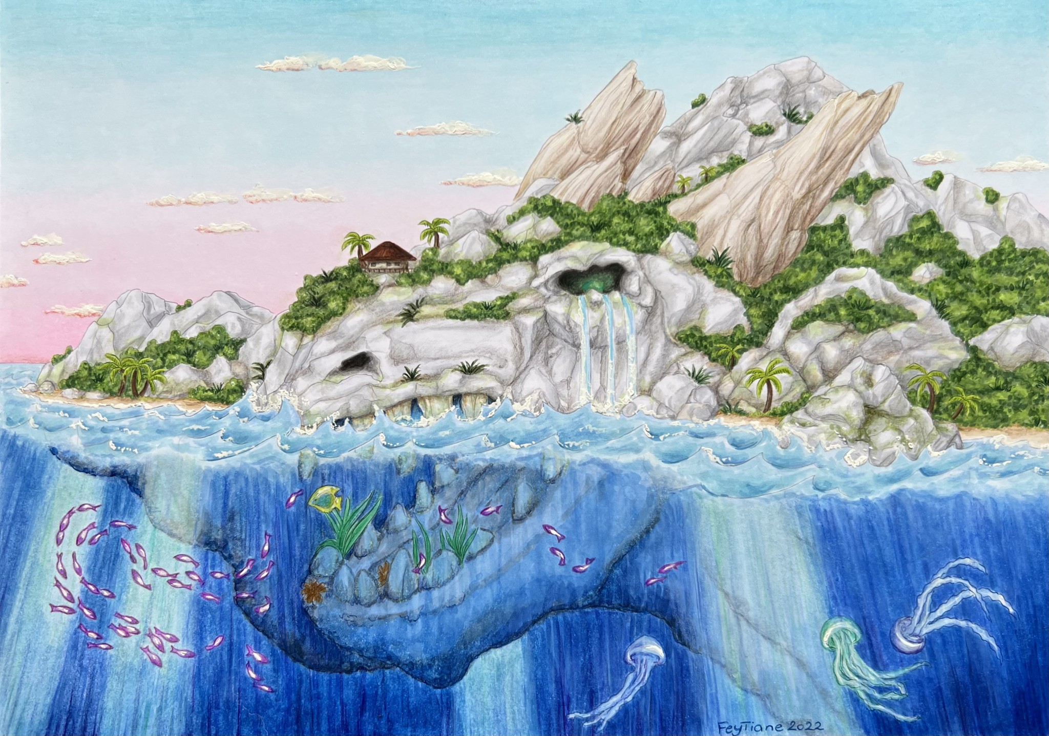
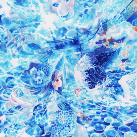
It is beautiful that the bottom of the deep sea is mystically expressed with a very detailed touch.
The image of the work before coloring with Multiliner pens shows the length of time and the dedication of the artist in creating this piece.
Regional Awards: EME
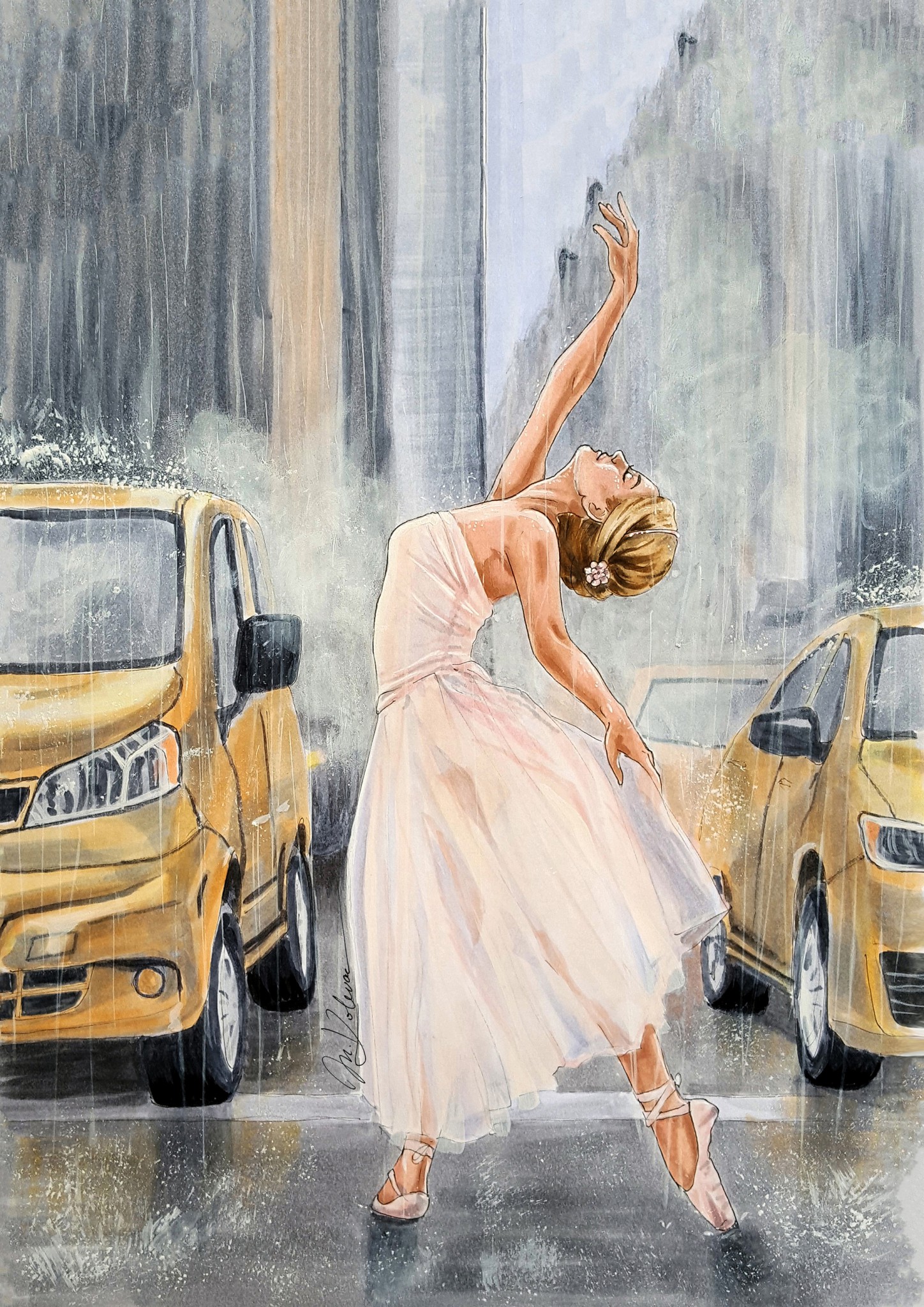
The contrast between the dreary rainy environment and dancer resting in herself is fascinating. She is not influenced by the wetness and traffic around her, but keeps her calm and dances. It seems like pure freedom she feels, as she simply lives in the here and now and enjoys the moment.
Regional Awards: NA
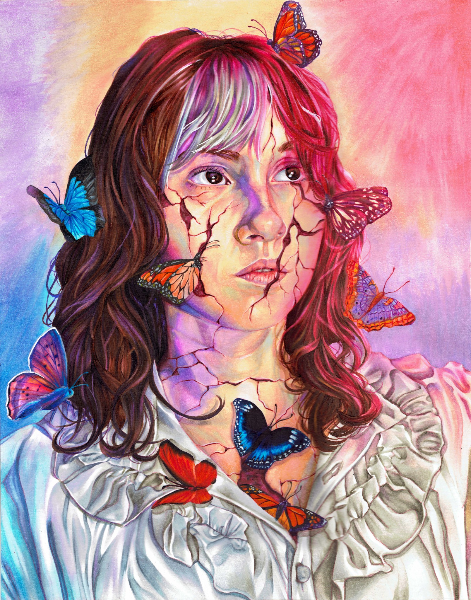
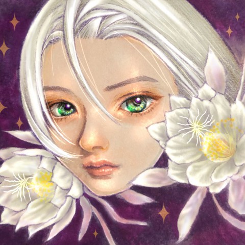
The use of color on this piece is superb. Not only did the artist render the portrait with realistic precision, but the subject's offset gaze creates a narrative and level of intrigue to look closer at the work and see more of what's going on. While the colors are bright and cheerful, her skin is cracking as she looks skyward. Who or what is she looking at? What meaning could the butterflies have surrounding her? Why was the drawing given the title "Trusted Requiem?" Can't stop thinking about this piece.
Regional Awards: LATAM
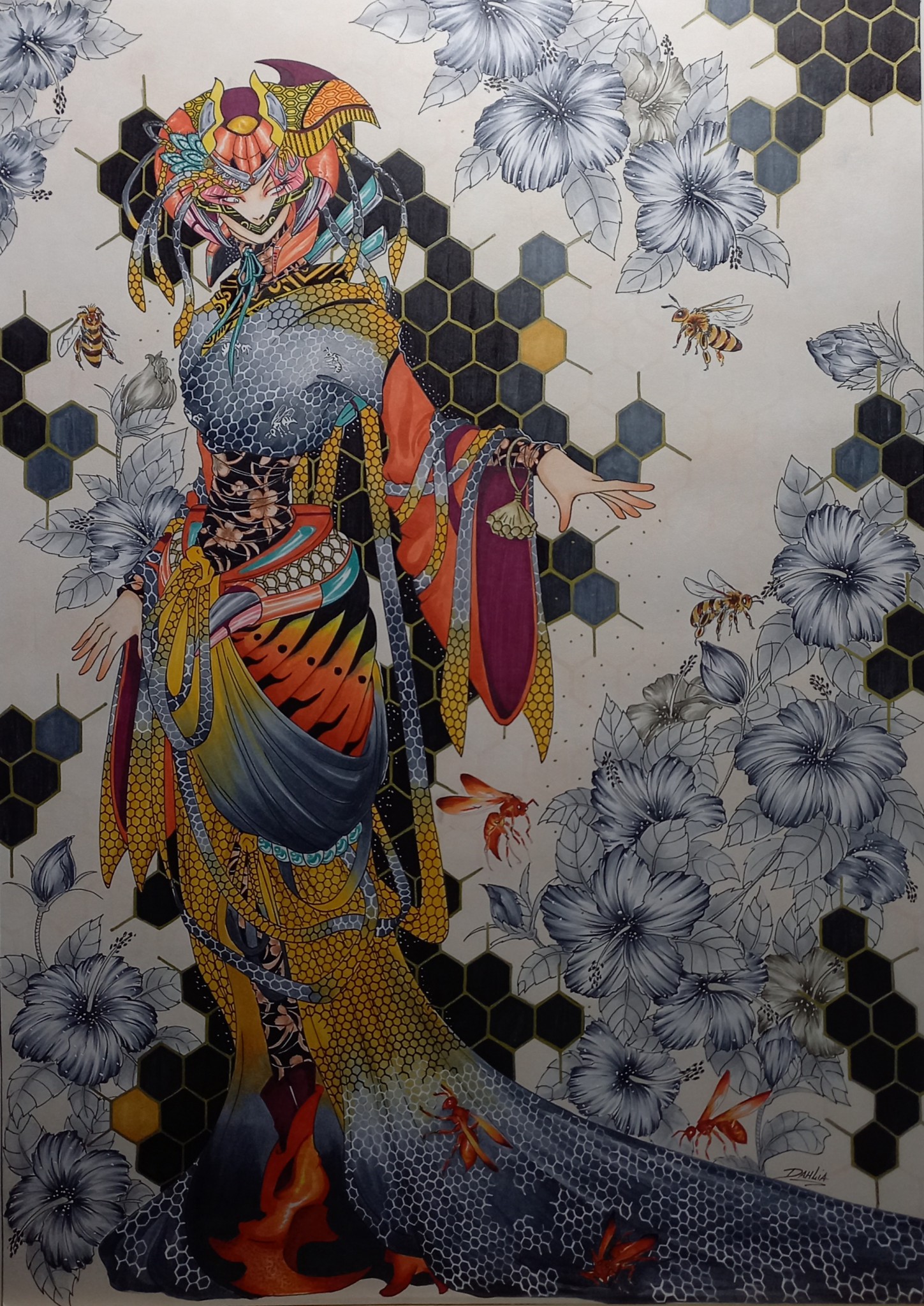
Attracted by the original kimono design with the bee motif and the detailed drawing, which also makes full use of Opaque White and other mediums. The unique contrast and gradation between gray and orange are impressive.
Regional Awards: Africa
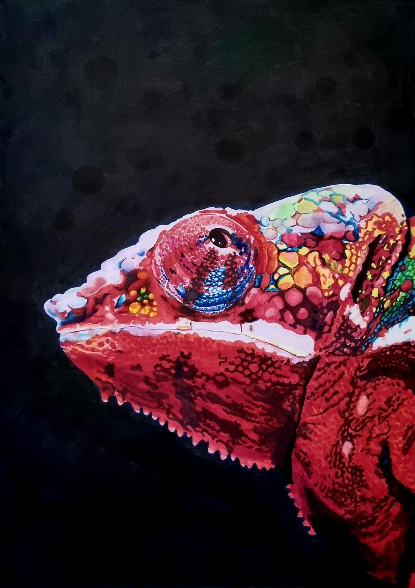
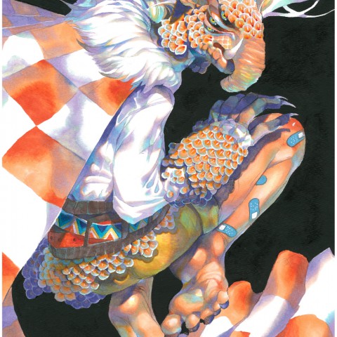
We were very impressed with the combination of Copic Ink, Copic Markers, and Copic Opaque White in one striking piece. The strong, vivid colours contrast beautifully with the dark, velvety background. A remarkable piece, congratulations!
Kids Award
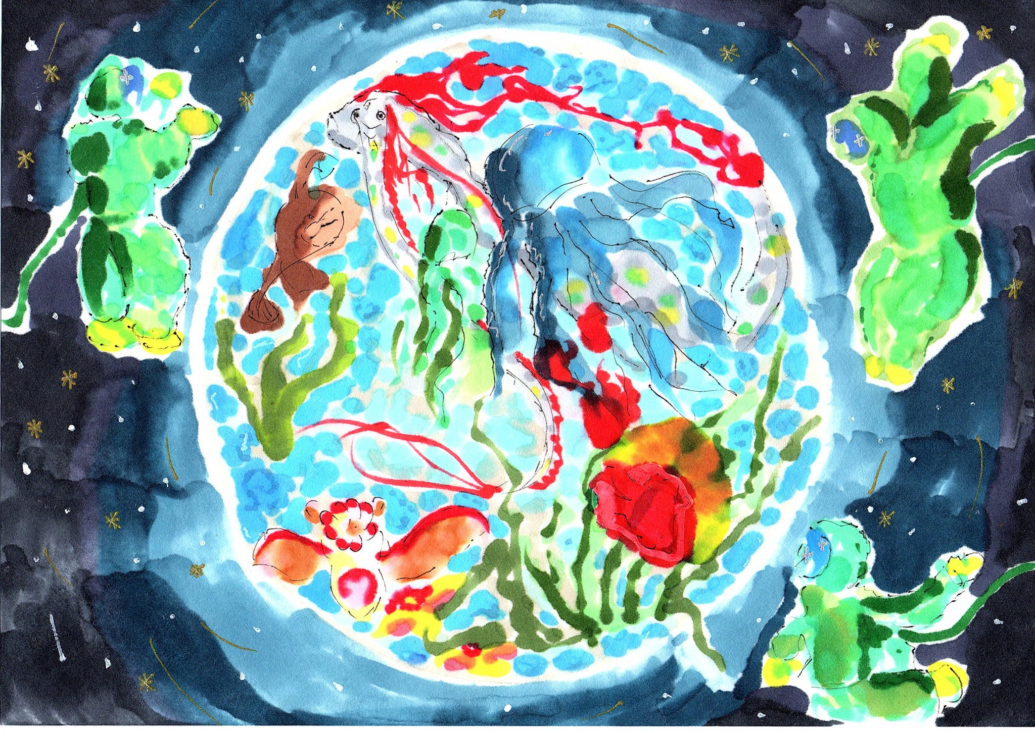
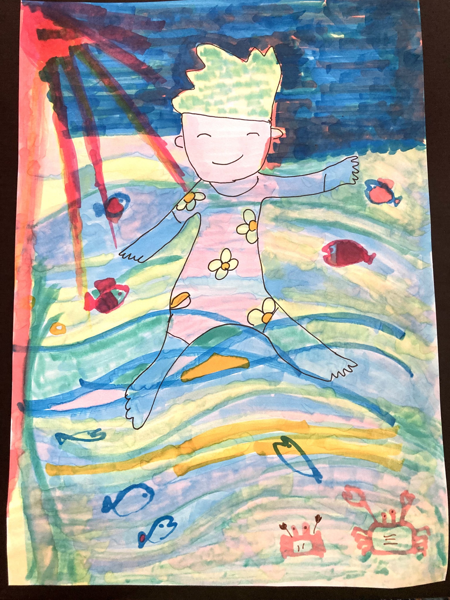
As our eyes follow the obscure lines, we cannot look away from this piece - This entry has such appeal. The natural smudging of the ink is perfect for expressing the mysteries of space and the deep sea. The artist's comments on the work were convincing, and at the same time we were surprised by the theme of the work and its high level of expressiveness.
Kids Award
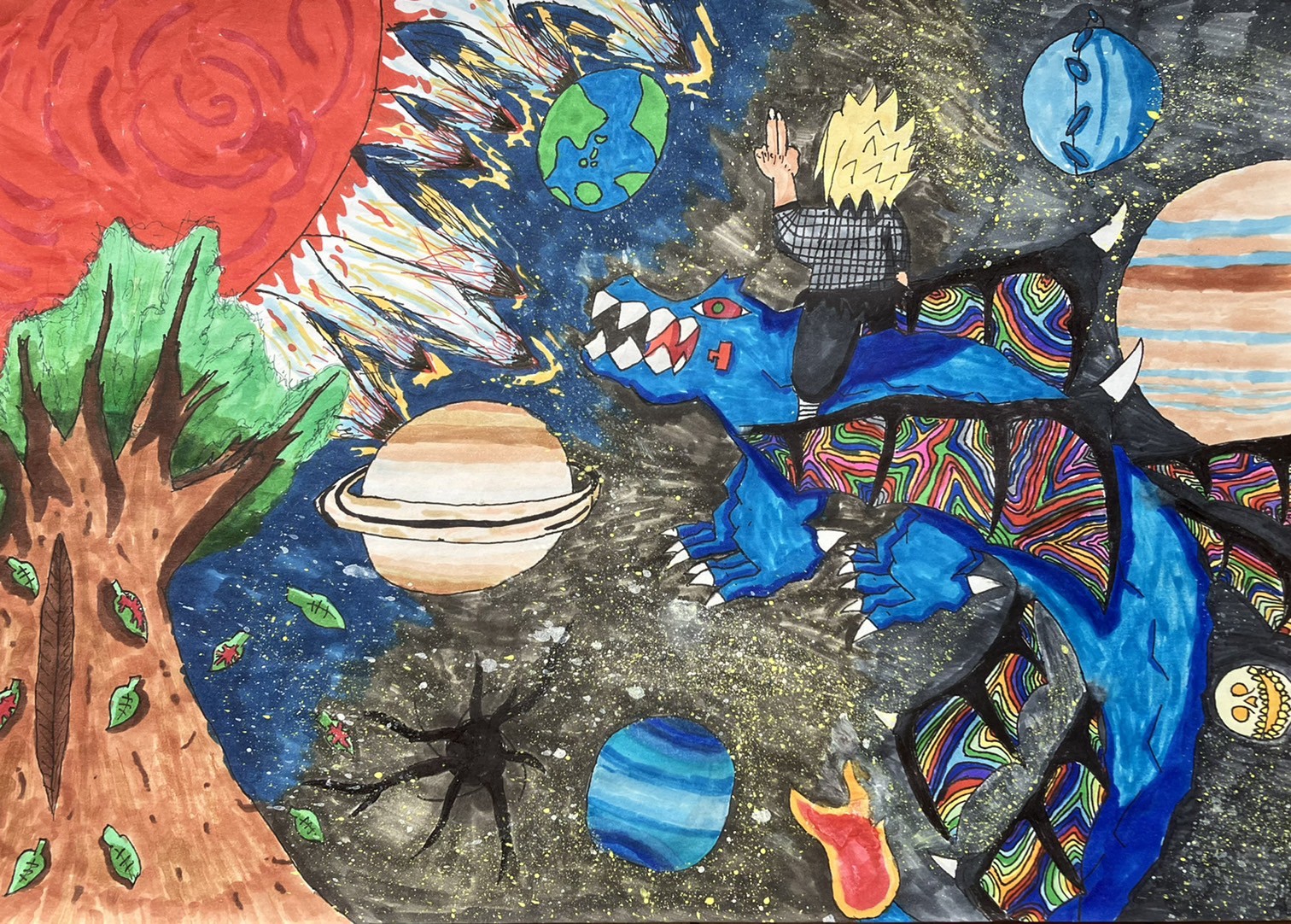
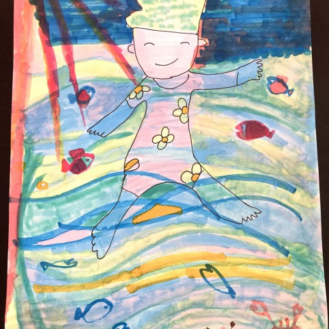
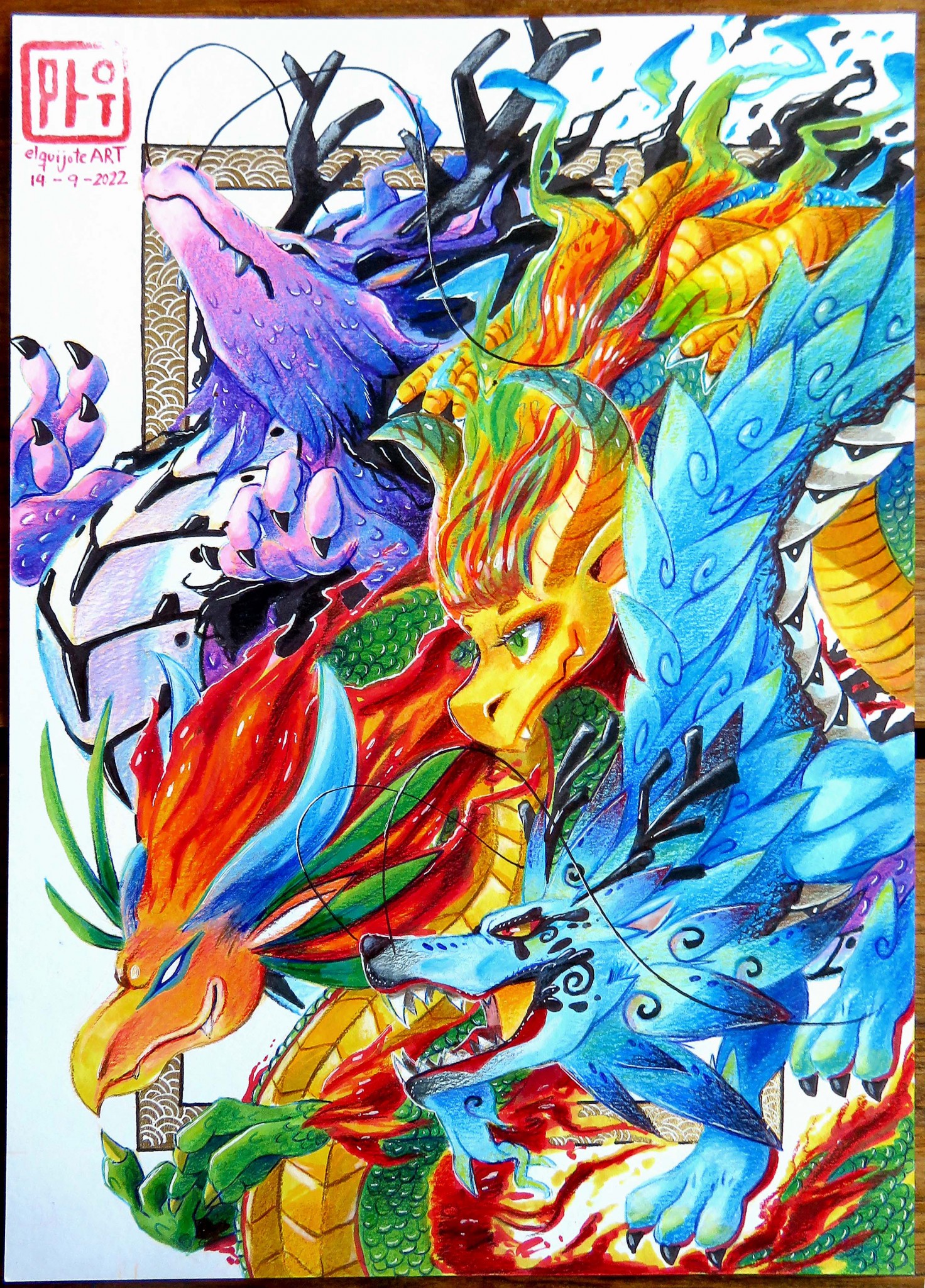
The trees, the sun, and the dragon, which were drawn with great effort, show that this artist had a lot of fun creating this piece. The twinkling lights of the little stars spread out in space are also skillfully expressed in this work, full of rich imagination and exciting expectations for the unknown world.
Kids Award
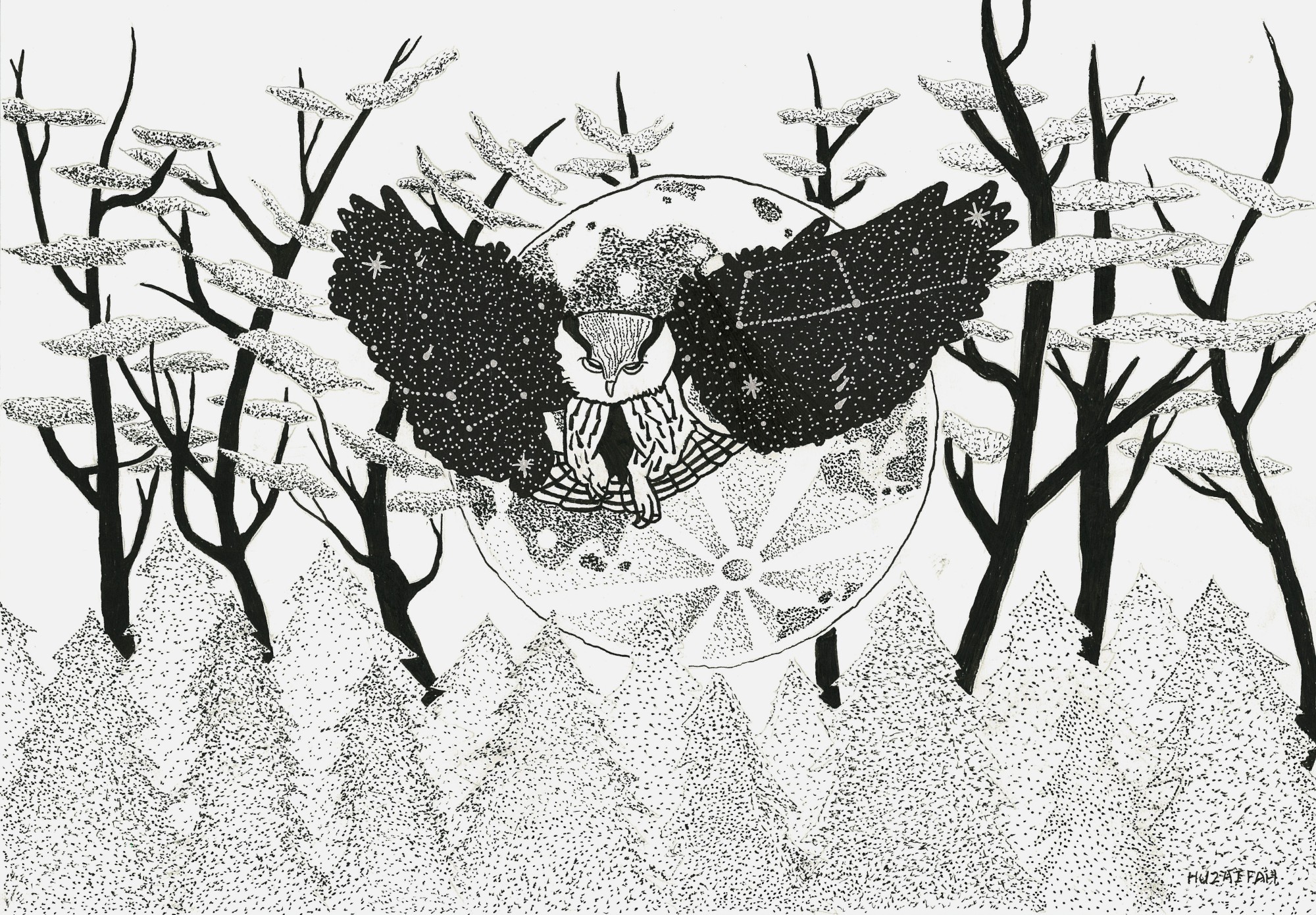
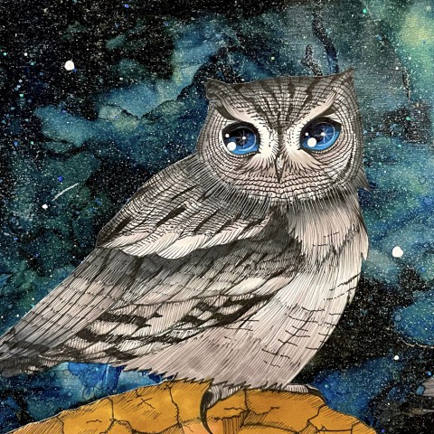
The artist did not describe the owl as he saw it but faithfully recreated the cool image of the owl in his mind. The composition with the moon in the background and the starry sky on the wings is also beautiful. We felt he already had his own style, even though he was only eight years old. We really look forward to seeing more of his work in the future.
Alcohol Ink Art Award
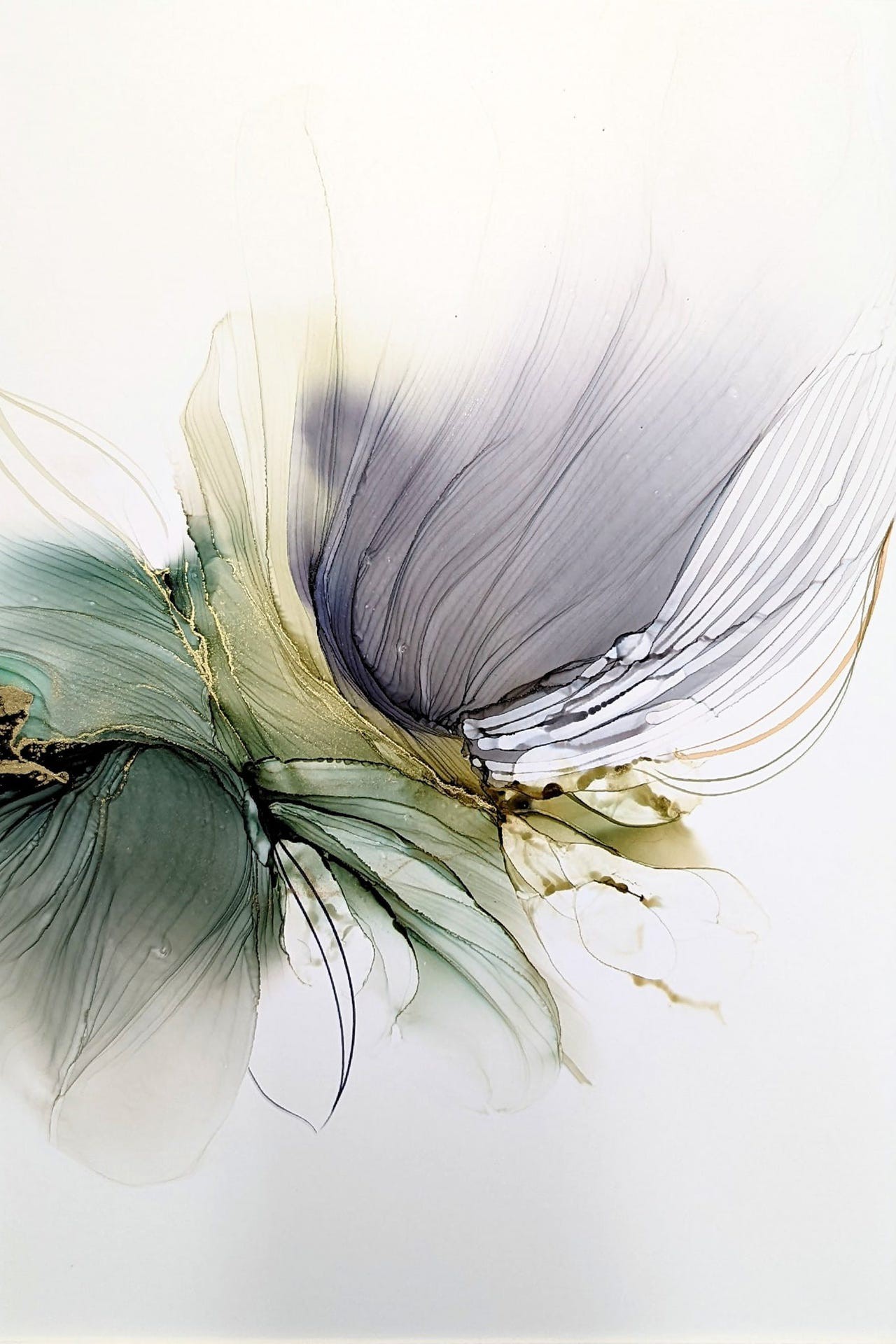
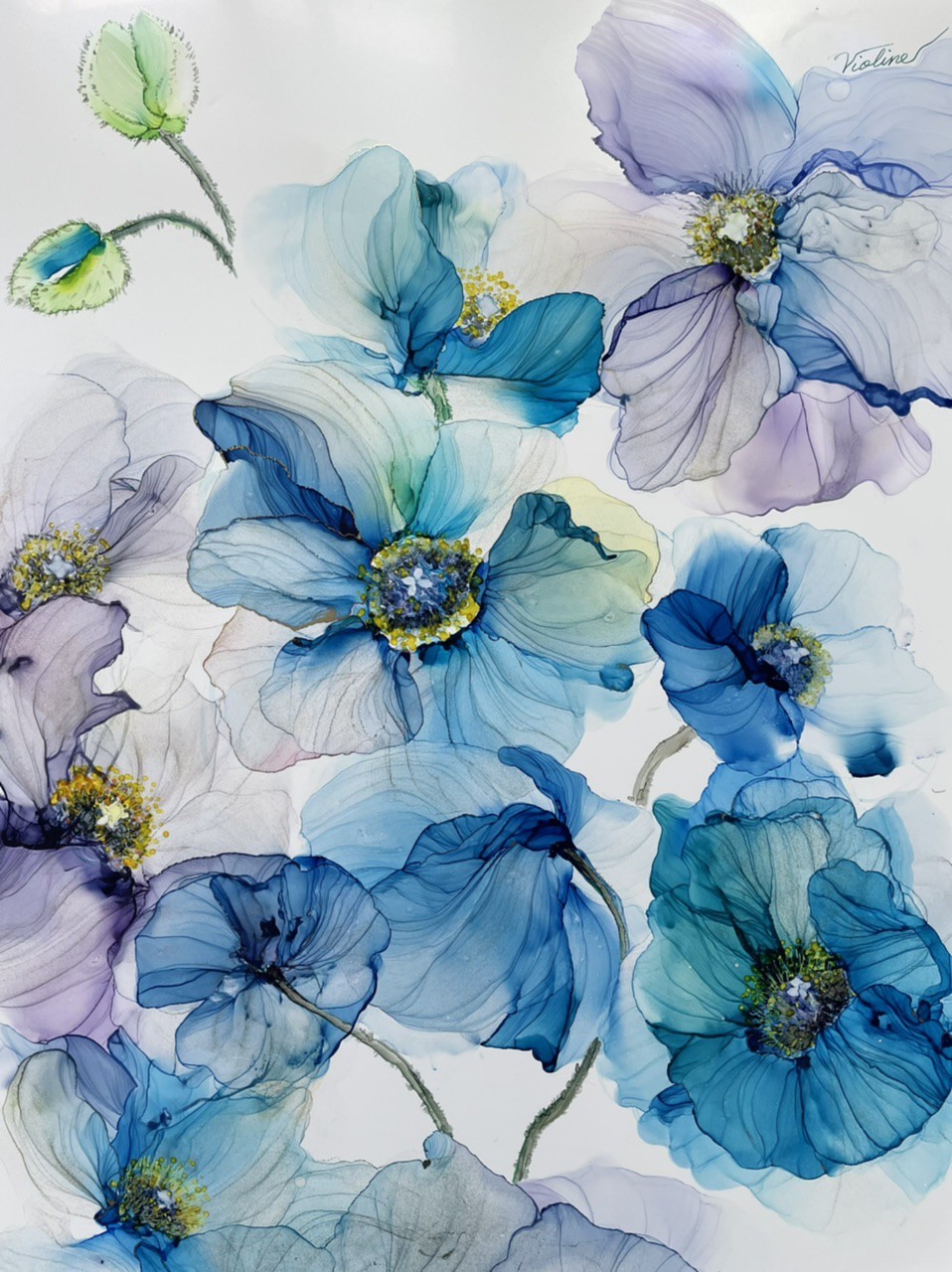
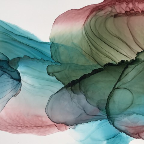
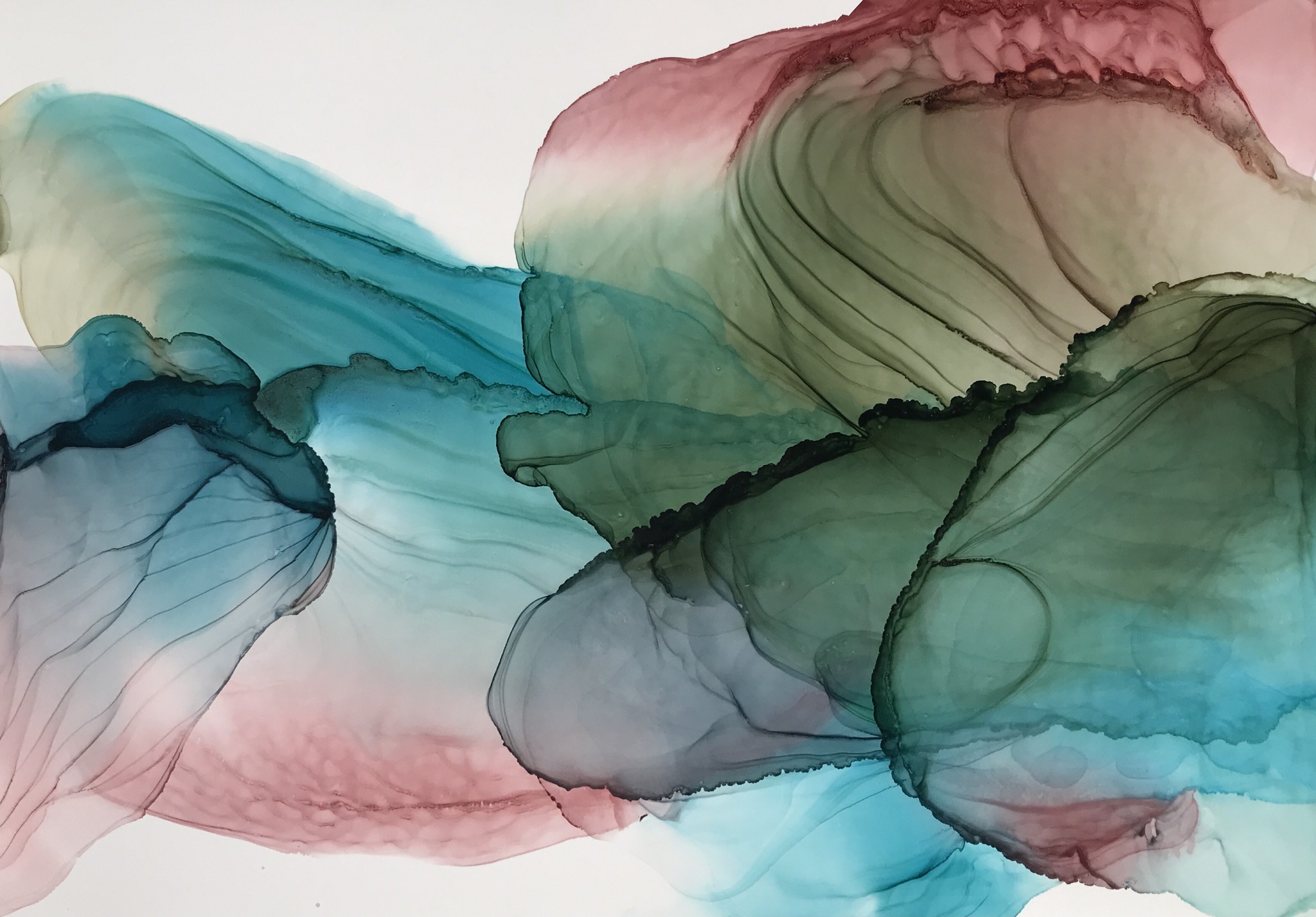
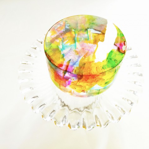
This piece demonstrates an exceptional understanding of alcohol ink technique. Larurane has created a beautiful sense of flow with complicated, yet delicate line work while fading the color to create a beautiful sense of depth. This piece is truly stunning from the color palette to the line work and beyond.
Craft Award
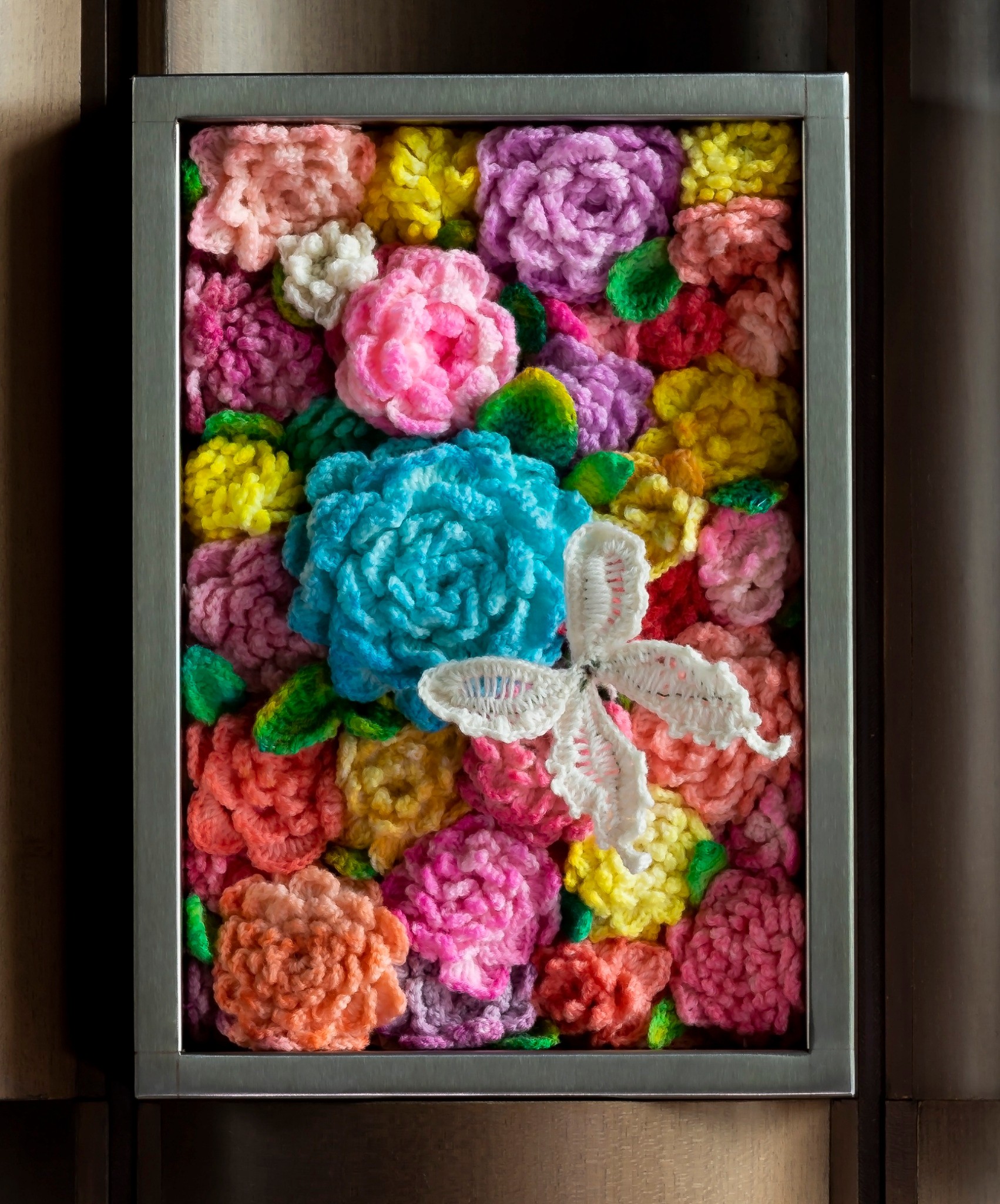
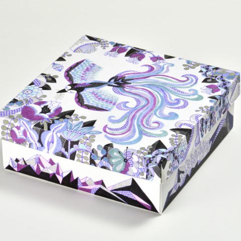
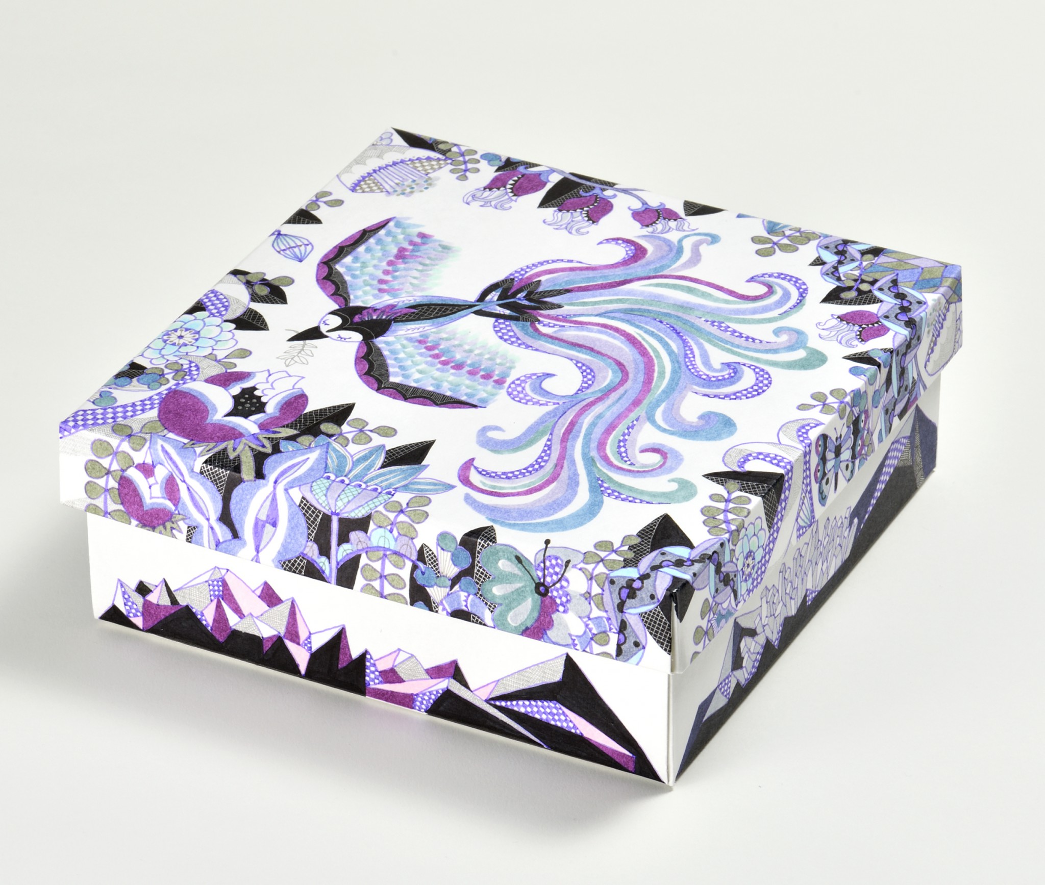
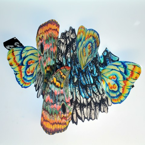
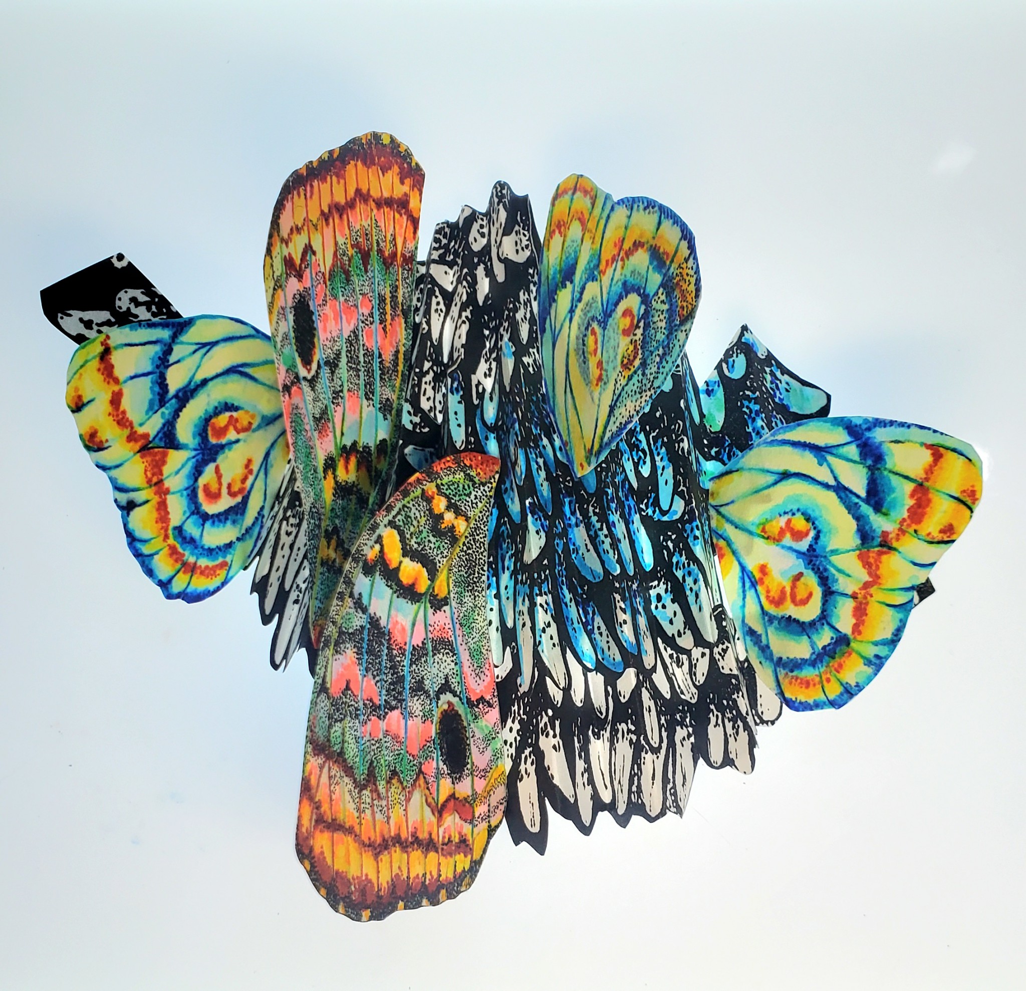
This entry shows the unique features of Copic ink, which brings out vibrant colors even on fabric. It seems to have a story behind it, such as the meaning of the blue flowers and butterflies. This piece was not only beautiful and romantic, but also made us think about the theme and background.
Special Award Selected by Too Corporation Americas
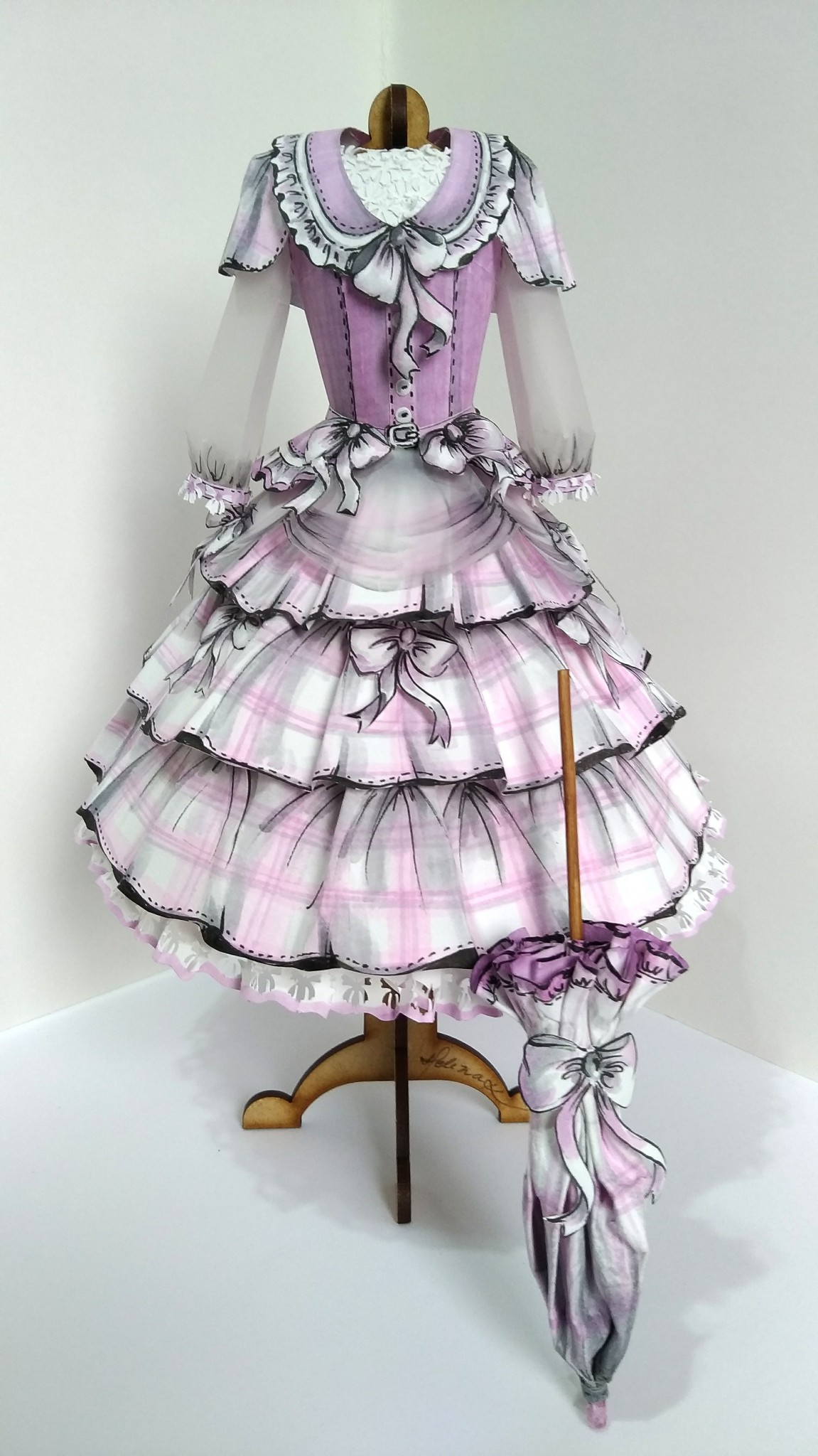
We feel this is the most interesting craft entry for the 2022 AWARD and love how Helena was able to create the texture of cloth just through paper and Copic.
COPIC TEAM Award
We were impressed by the high skills in this entry, which takes full advantage of Copic's unique properties.
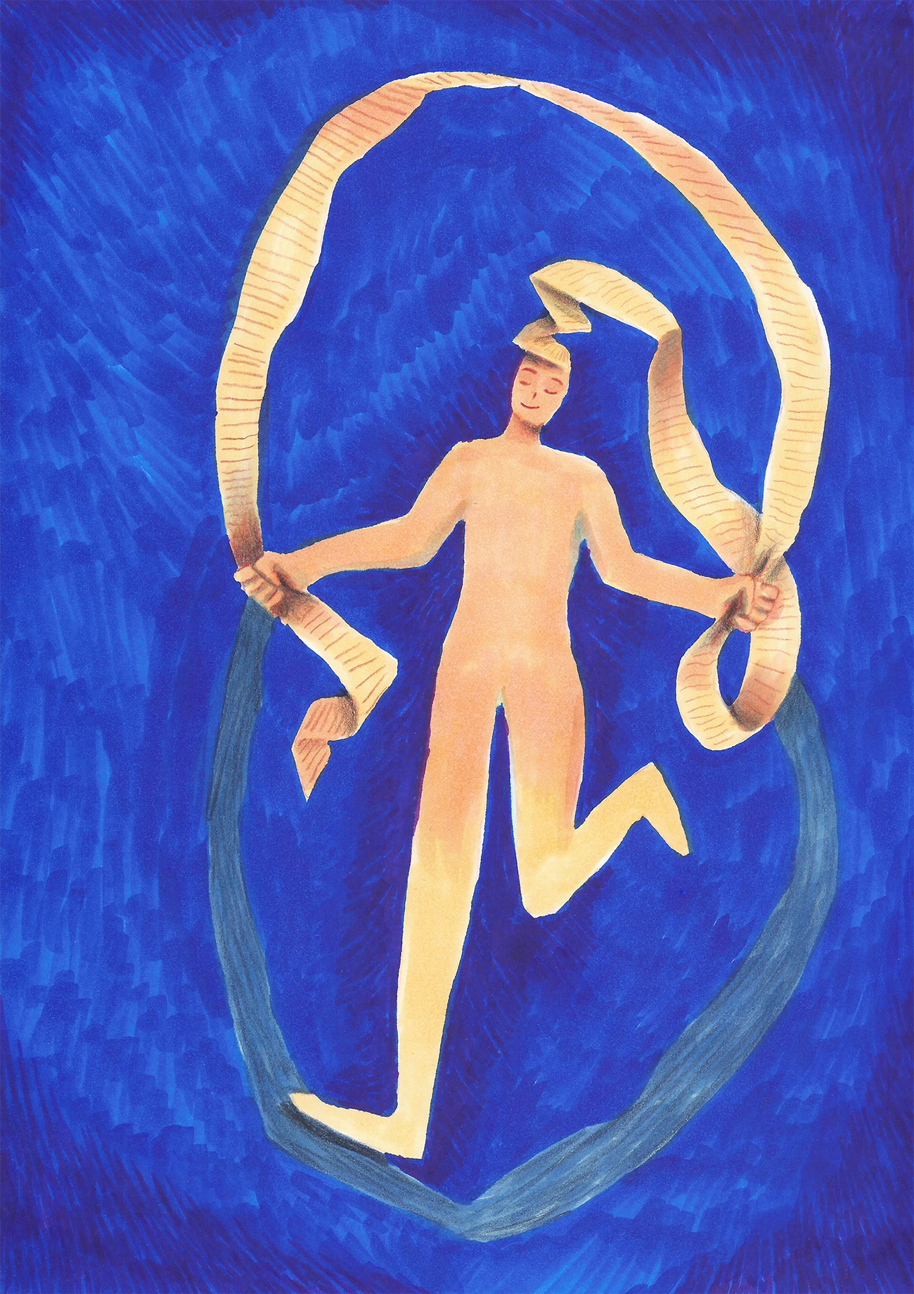
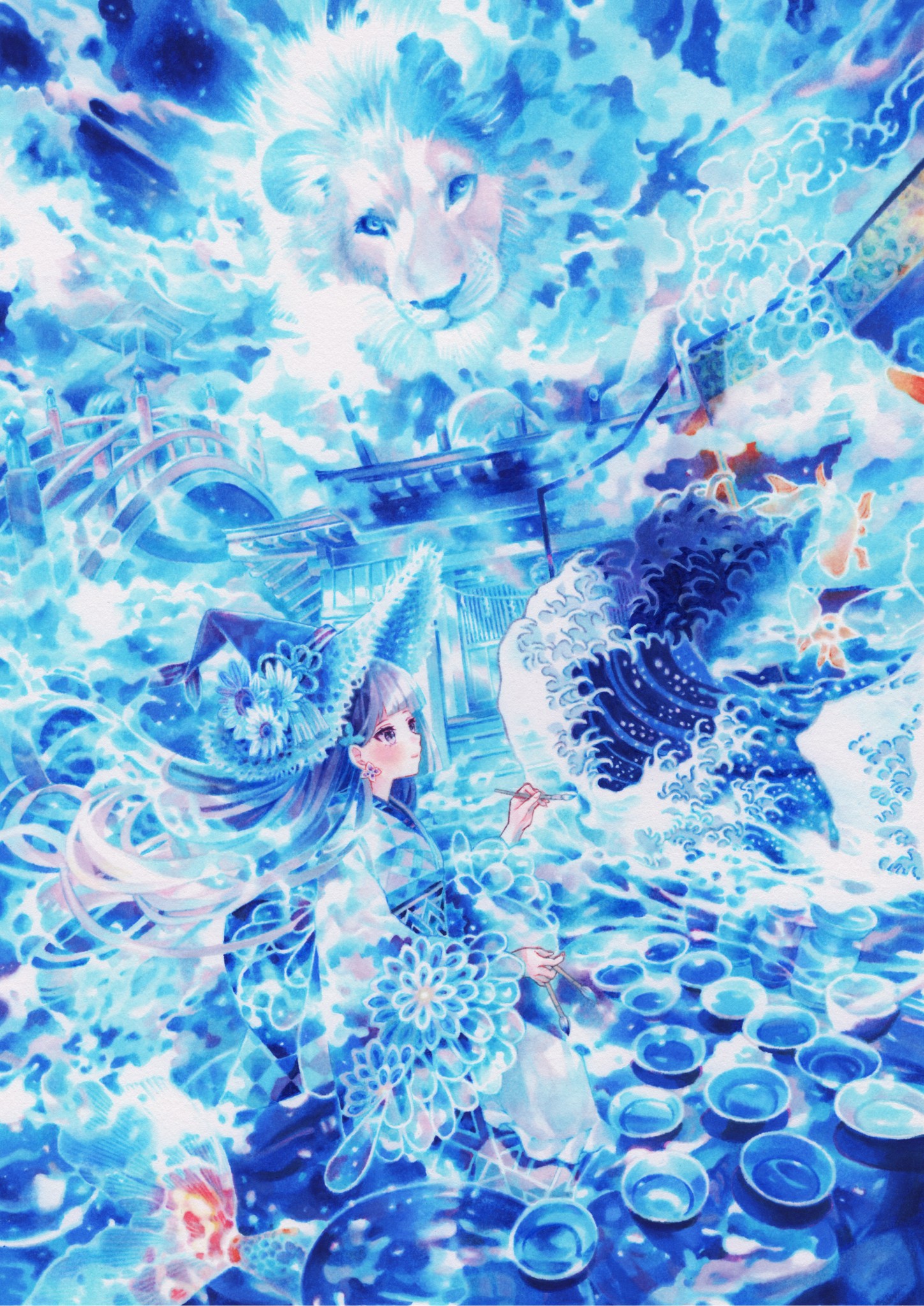
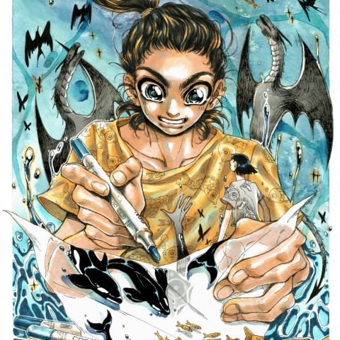
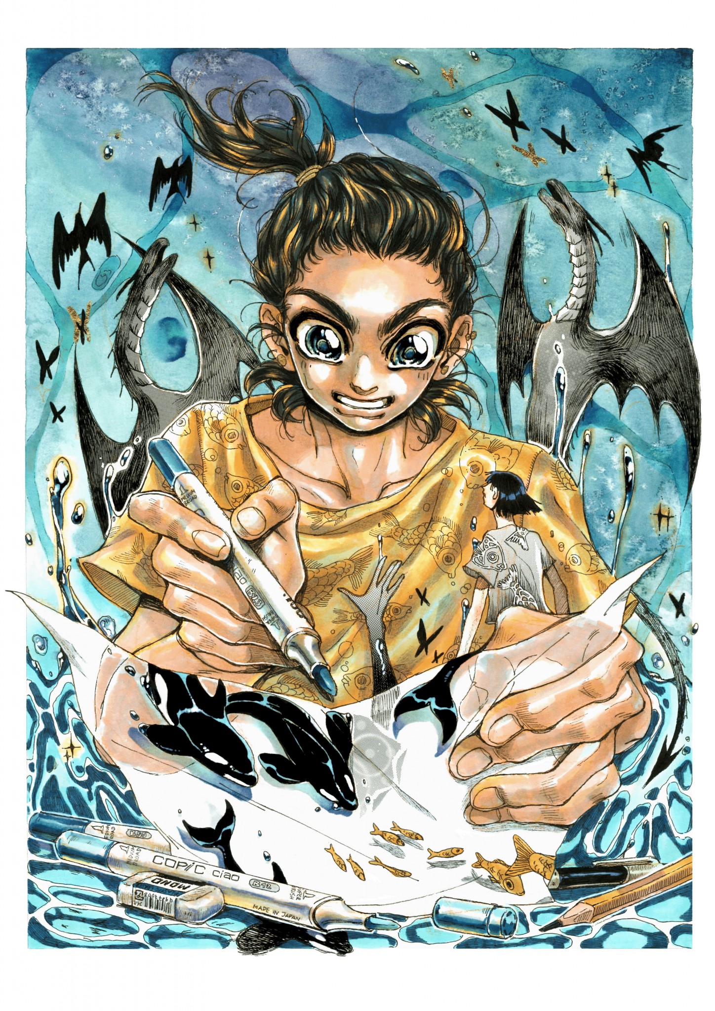
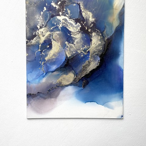
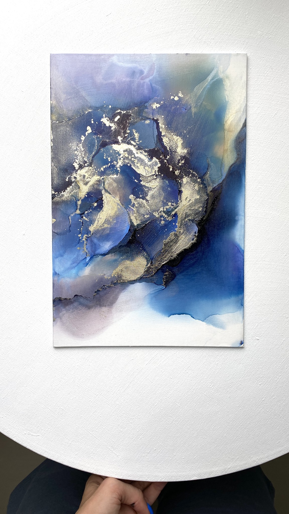
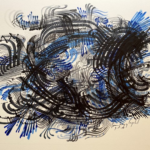
The artist's control over every detail to prevent the ink from bleeding is evident and shows the great concentration the artist has put into this work. Someday we want to ask the artist about his unique method of coloring and his extraordinary commitment to the color blue, which is the same as the entry selected for COPIC AWARD 2020.

























































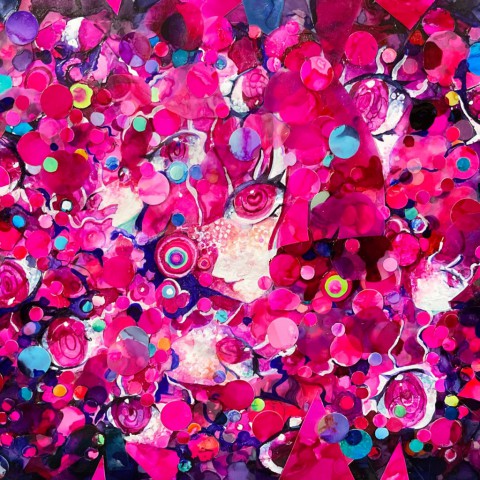
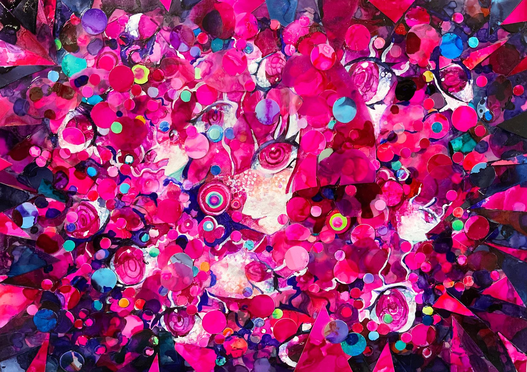


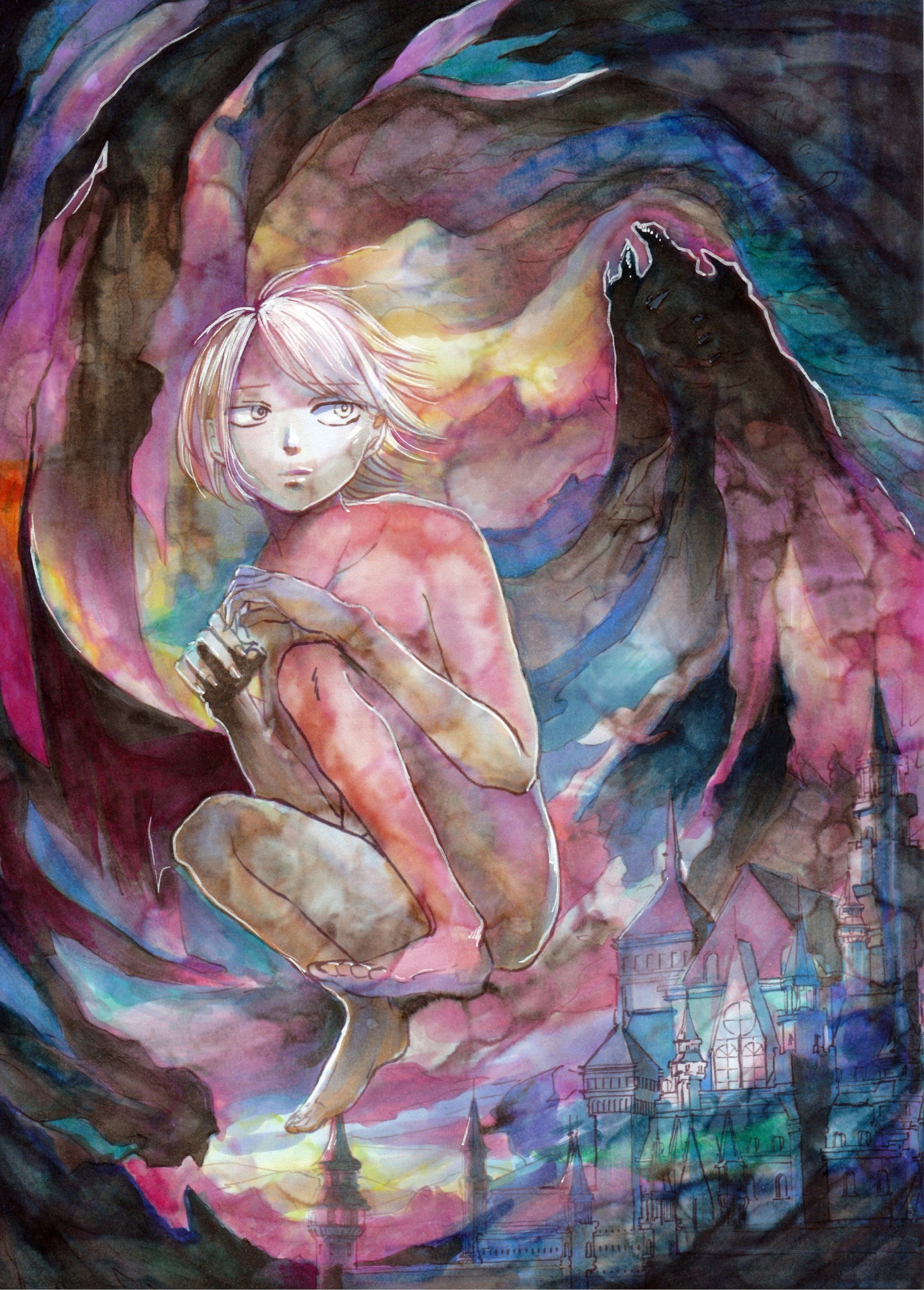
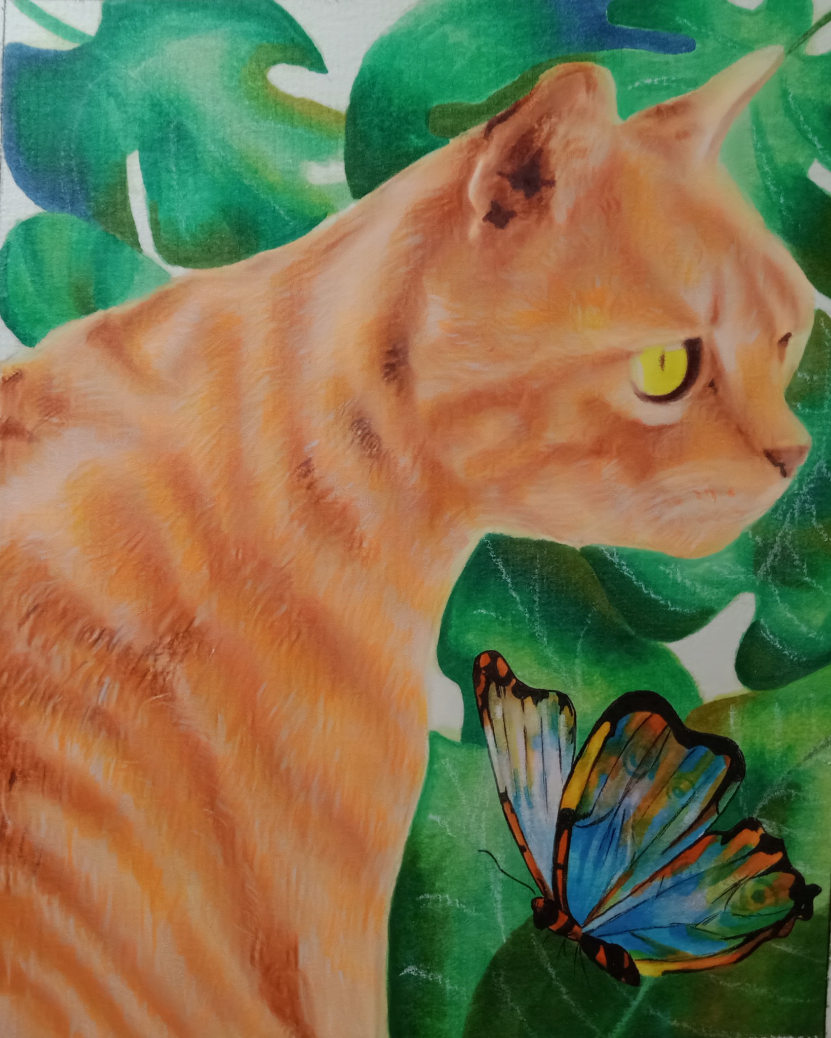
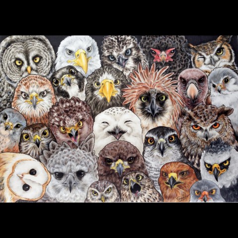
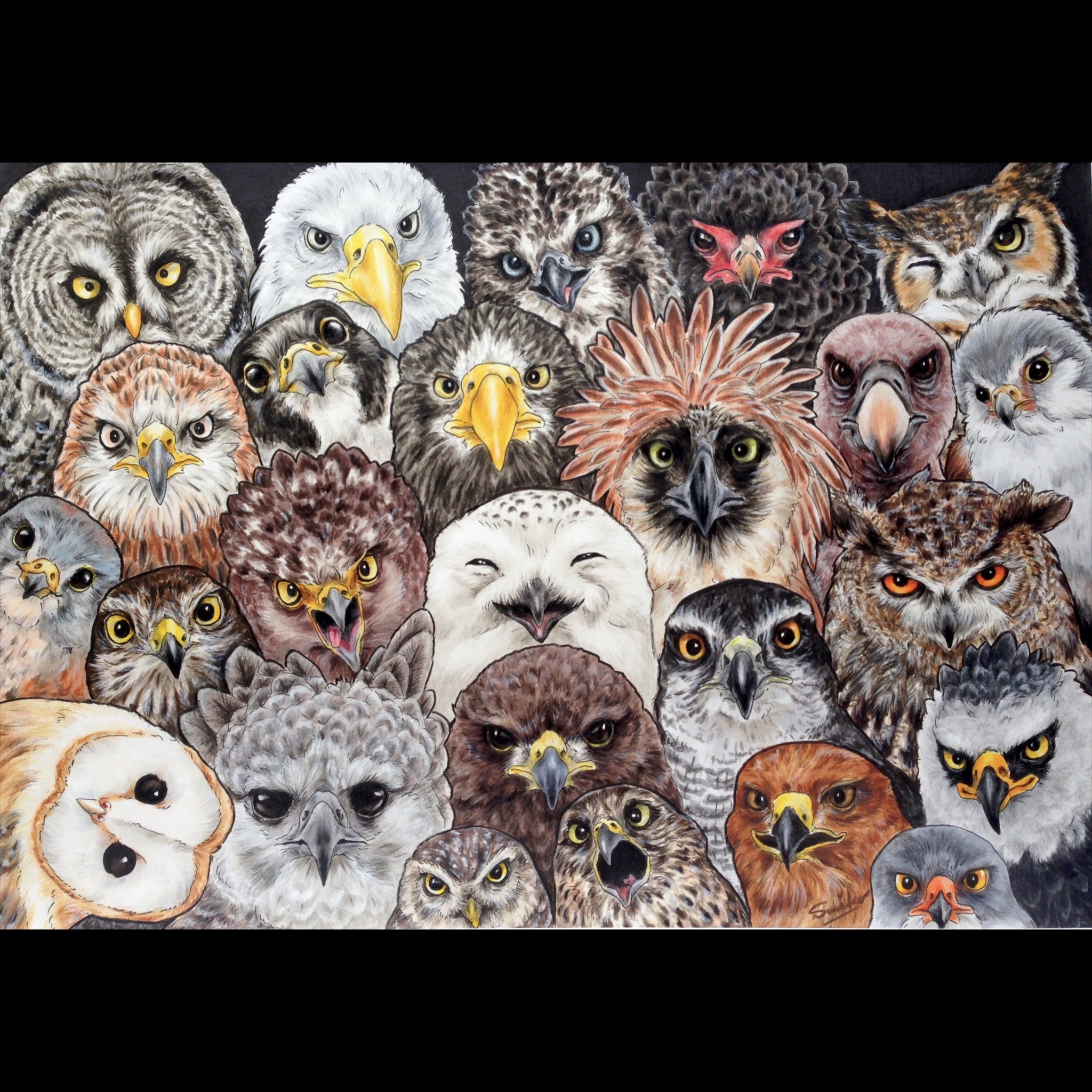
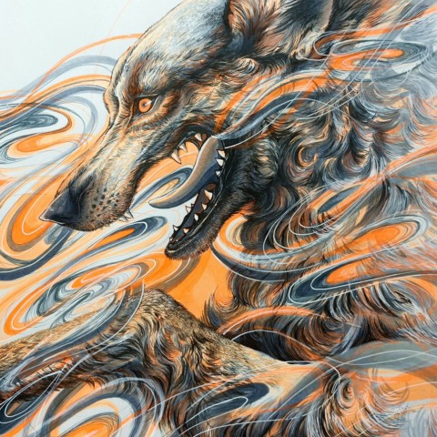
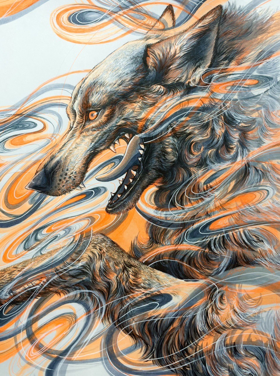
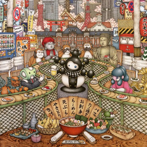
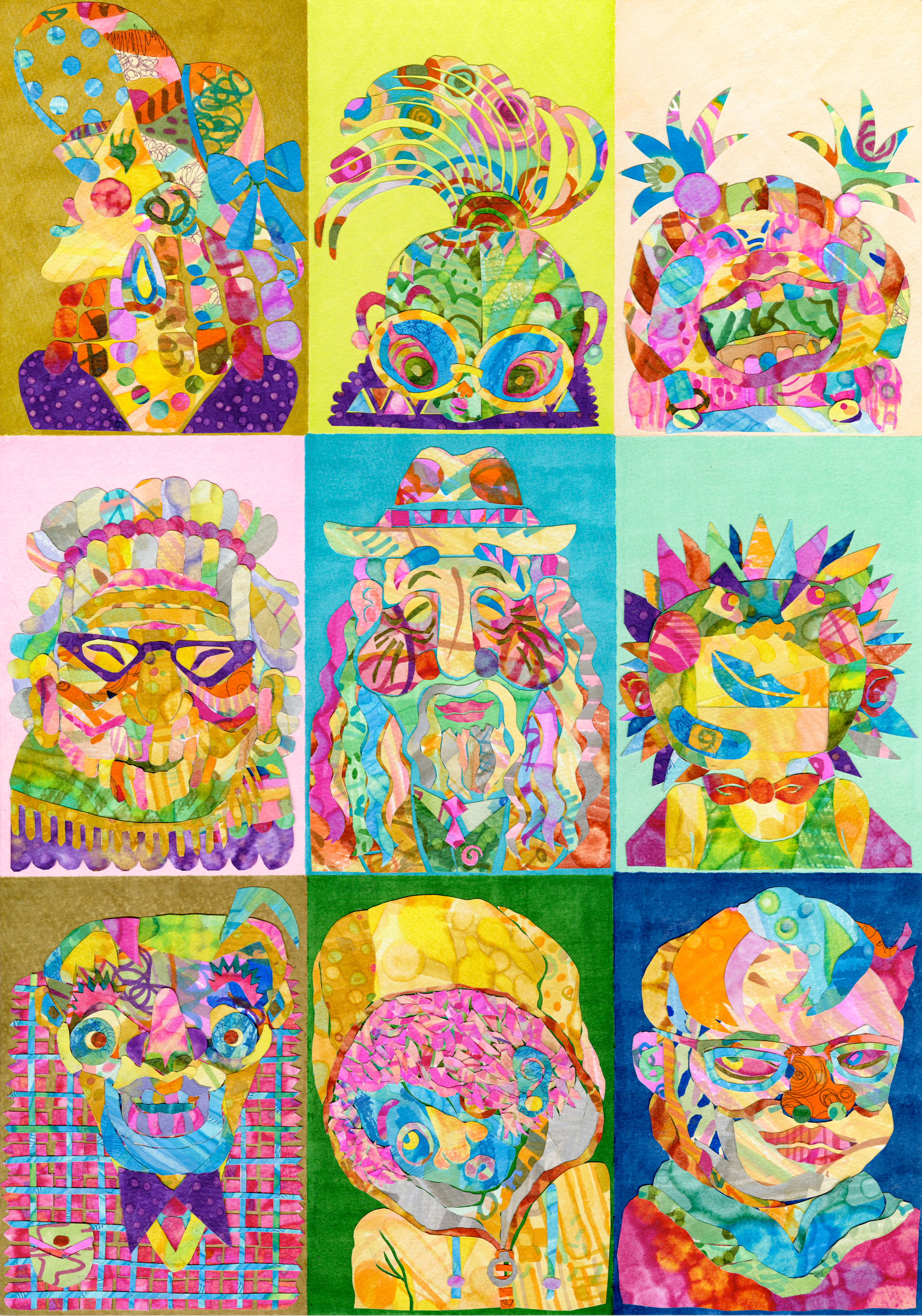












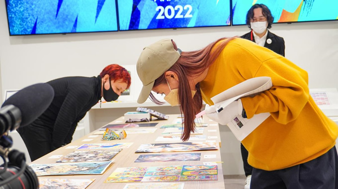
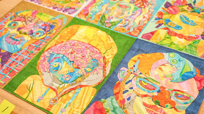


It was not until I saw the original that I realized this entry used the paper cut/collage technique. By pasting paper cutouts together, a solid outline was created. In the background, different colors were applied to each of the nine characters. The combination of these colors and the rich expression on each character's face make this piece very attractive. I am sure the artist spent a lot of time and enjoyed creating this piece.
(Eriko Kimura)
When I first saw this piece, I wondered how it was made. At the same time, I just wanted to enjoy it because it was very satisfying to see.
I think the piece is technically brilliant and shows the qualities of Copic as an art medium, using a variety of colors effectively and showing the potential of gradation techniques. Also, the fact that we can understand the true value of a work by looking at the original is something only analog can offer.
The nine characters in this piece convey the artist's belief that all people are different. It is one of my favorite pieces because I imagine the artist observing many people, and I feel the artist's love for people.
(Yuki Suetsugu)